MEET YOUR FONT PAIRING MATCH
This page is your custom breakdown of the font pairing you were matched with from the Find Your Font Quiz. You’ll discover the history, personality, and style of each font—and see how they can come to life in your personal brand.
If you're a Personal Branding Studio member:
Bookmark this page. We’ll return to it in Part 2 when it’s time to use your font pairing to design your logo and create branded Canva graphics.
Not loving this particular combo? No problem. Explore all 100+ font pairings inside PBS - Part 1, Module 4: Design - to find one that feels just right. Click the button below to go there now.
Not yet a Personal Branding Studio member?
(And wondering what Personal Branding Studio even is?)
Start by scrolling through your results below. At the bottom of this page, you’ll find out how to go deeper with your personal brand through my full Personal Branding Studio program.
And your aligned font pairing match is…


HISTORY
-
HISTORY -
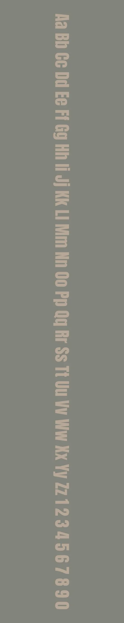
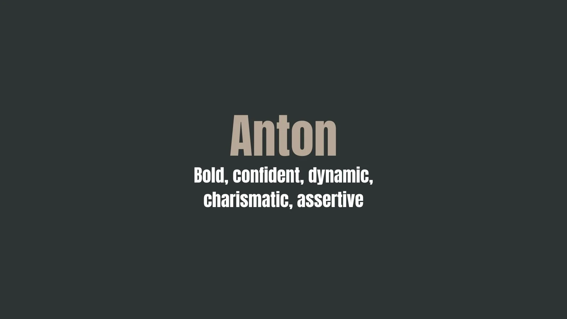
Anton
Overview:
Anton is a bold, sans-serif typeface known for its strong presence and contemporary style. Its geometric construction and wide letterforms make it highly effective for attention-grabbing headlines, advertisements, and branding materials.
History:
Anton was designed by Vernon Adams and released in 2011 as an open-source font. The typeface was created as a modern, condensed sans-serif with a focus on high impact and readability. Its design was inspired by the need for a font that could stand out in large sizes while still maintaining clarity. Anton quickly gained popularity, especially in digital design, for its bold, straightforward aesthetic. The font was also optimized for web usage, further increasing its widespread use.
Characteristics:
Design: Bold and condensed with geometric, angular shapes. The letters are wide and uniform, giving the font a powerful, assertive look. The simple curves and sharp edges make it suitable for large-scale text, but it remains legible at smaller sizes as well.
Usage: Best suited for headlines, posters, logos, and other large-format applications. Its striking appearance is perfect for grabbing attention in both print and digital contexts.
Attributes: Strong, modern, and versatile with a sense of clarity and authority. Anton’s boldness and clean lines make it stand out in a crowded design space while still being highly legible.
Neue Haas Grotesk Text
Overview:
Neue Haas Grotesk Text is a refined and versatile sans-serif typeface designed for high readability in extended text settings. As a part of the larger Neue Haas Grotesk family, it is a more text-focused version of the original, featuring slightly adjusted proportions and spacing to enhance legibility at smaller sizes while maintaining the classic qualities of the grotesque style.
History:
Neue Haas Grotesk Text was created by Swiss type designer Christian Schwartz in collaboration with the Haas Type Foundry. Released in 2010, it is a modern revival and adaptation of the original 1950s-era Haas Grotesk. While Haas Grotesk was designed by Max Miedinger and Eduard Hoffmann in 1957 for the Swiss foundry Haas, the Text version was specifically developed to work well in body text, with adjustments made to the spacing and x-height to ensure clarity and comfort in long reading. It serves as a more practical alternative for text-heavy environments while retaining the elegant, neutral character of its predecessor.
Characteristics:
Design: Slightly condensed with moderate contrast and open apertures. The text version has a larger x-height and slightly wider letterforms compared to the original, which improves legibility at smaller sizes. Its design keeps the clean, functional, and geometric feel typical of the grotesque genre but with added warmth due to subtle humanist features.
Usage: Ideal for editorial and print use, particularly in books, magazines, websites, and other extended reading materials. Its balanced structure allows it to perform well in both small and large point sizes, making it suitable for body copy as well as headings.
Attributes: Highly legible, neutral in tone with a professional aesthetic, and very versatile. It offers a harmonious balance between formality and readability, making it a strong choice for a variety of typographic needs, especially in long-form text.


FONT PERSONALITY
-
FONT PERSONALITY -

Why Anton and Neue Haas Grotesk Text are a Match Made in Heaven:
When combined, Anton and Neue Haas Grotesk Text create a powerful balance of boldness and refinement. Anton’s strong, assertive personality takes center stage with its commanding presence, making it ideal for attention-grabbing headlines and key brand messaging. Its bold, dynamic nature is perfectly complemented by the quiet elegance of Neue Haas Grotesk Text, which brings sophistication and clarity to the design. The contrast between Anton’s charismatic forcefulness and Neue Haas Grotesk Text’s dependable, precise quality results in a harmonious pairing that works across a wide variety of contexts—whether it's a striking logo, a professional website, or impactful promotional materials.
This font pairing would appeal to a person who exudes confidence and sophistication. Someone who is a natural leader, not afraid to make bold decisions but also values precision, reliability, and clarity in their communication. This could be a business executive or entrepreneur in a fast-paced industry, such as tech, fashion, or consulting, who wants their brand to convey both an energetic, forward-thinking approach and a polished, trustworthy image. This person is likely to be dynamic and charismatic, yet dependable and clear in their messaging, ready to make a statement in the business world while maintaining a sense of elegance and refinement.

CELEBRITY MATCH
-
CELEBRITY MATCH -

The font pairing of Anton and Neue Haas Grotesk Text aligns perfectly with the character of Lara Croft, as portrayed by Angelina Jolie in the movie "Lara Croft: Tomb Raider (2001)" .
Summary: Angelina Jolie’s portrayal of Lara Croft in Lara Croft: Tomb Raider (2001) is a perfect match for the combination of Anton and Neue Haas Grotesk Text. Anton represents Lara’s boldness, dynamic energy, and assertiveness, all traits that define her as an action-packed, charismatic leader. Meanwhile, Neue Haas Grotesk Text reflects her ability to stay composed, precise, and adaptable, essential for solving puzzles and navigating complex challenges in her adventure. Together, this pairing encapsulates Lara Croft’s multifaceted personality: the daring, confident adventurer and the precise, thoughtful strategist.

HIERARCHY
-
HIERARCHY -
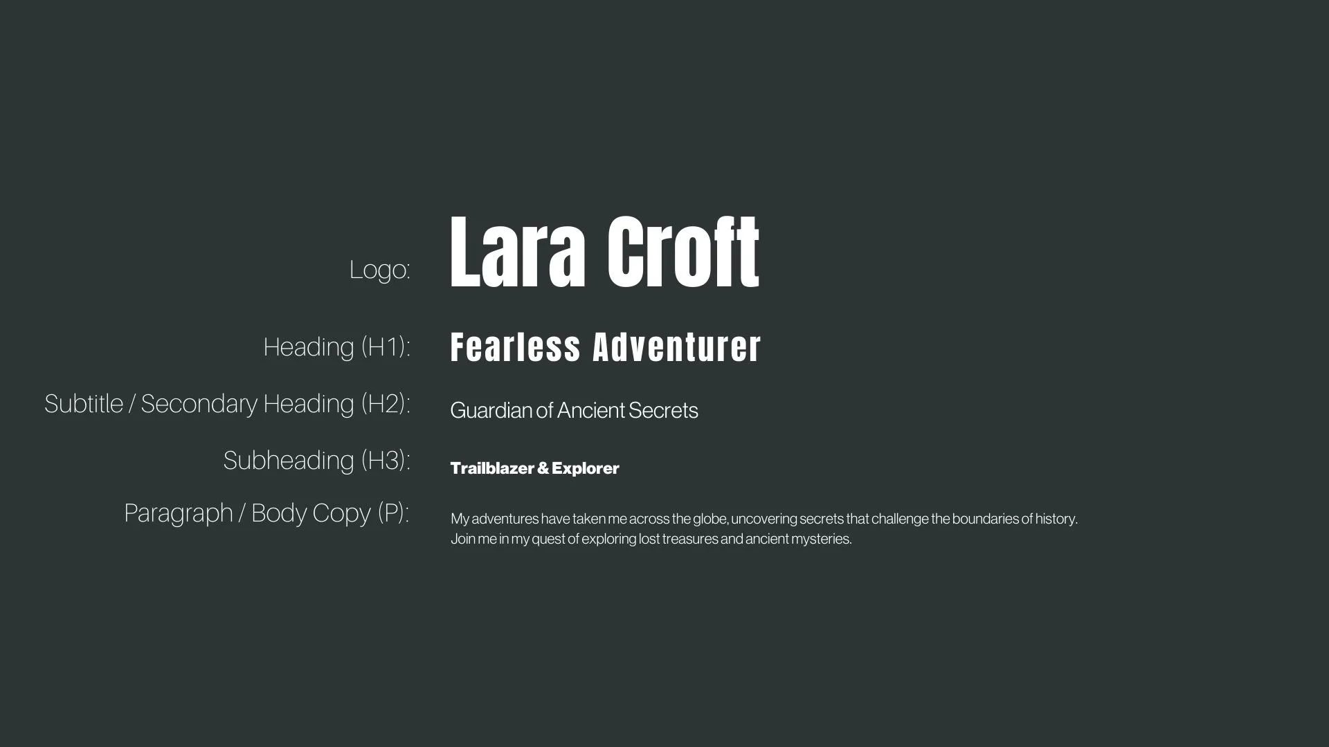
Font Hierarchy for Anton and Neue Haas Grotesk Text:
Logo
Usage: Primary logo text, initials, brand name
Anton, Regular, 48px (Canva), Heading 1 (Squarespace)
Heading (H1)
Usage: Main headings on pages, prominent titles
Anton, Regular, 36px (Canva), Heading 2 (Squarespace)
Subtitle / Secondary Heading (H2)
Usage: Section titles, important subtitles
Neue Haas Grotesk Text, Regular, 24px (Canva), Heading 3 (Squarespace)
Subheading (H3)
Usage: Subsection headings, less prominent titles
Neue Haas Grotesk Text, Bold, 18px (Canva), Heading 4 (Squarespace)
Paragraph / Body Copy (P)
Usage: Main body text, paragraphs, descriptions
Neue Haas Grotesk Text, Regular, 16 px (Canva), Body (Squarespace)