MEET YOUR FONT PAIRING MATCH
This page is your custom breakdown of the font pairing you were matched with from the Find Your Font Quiz. You’ll discover the history, personality, and style of each font—and see how they can come to life in your personal brand.
If you're a Personal Branding Studio member:
Bookmark this page. We’ll return to it in Part 2 when it’s time to use your font pairing to design your logo and create branded Canva graphics.
Not loving this particular combo? No problem. Explore all 100+ font pairings inside PBS - Part 1, Module 4: Design - to find one that feels just right. Click the button below to go there now.
Not yet a Personal Branding Studio member?
(And wondering what Personal Branding Studio even is?)
Start by scrolling through your results below. At the bottom of this page, you’ll find out how to go deeper with your personal brand through my full Personal Branding Studio program.
And your aligned font pairing match is…


HISTORY
-
HISTORY -
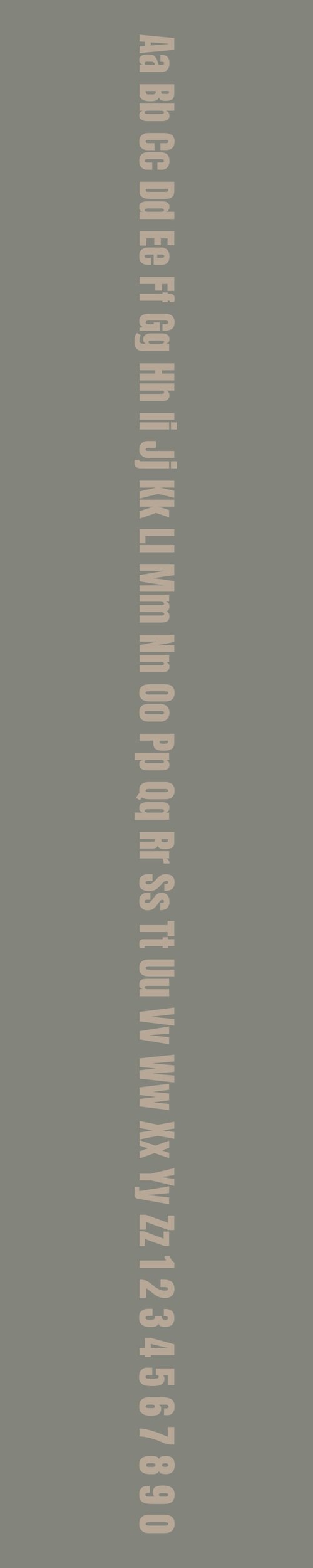
Anton
Overview:
Anton is a bold and impactful sans-serif typeface designed for high visibility and strong presence. It is characterized by its thick strokes and clean lines, making it an ideal choice for attention-grabbing headlines and display text.
History:
Anton was designed by the Argentine type designer Vernon Adams in 2011. Originally conceived as a free and web-friendly alternative to high-impact display fonts, Anton was intended to offer a bold and modern aesthetic while being easily readable across various digital platforms. The design was influenced by classic sans-serif styles but with a more contemporary twist, making it versatile for use in both print and digital formats.
Characteristics:
Design: Anton features bold, wide letterforms with geometric precision. The letterforms are uniform and have a strong, solid presence, giving the font a dynamic, commanding look. It has a slight influence from grotesque sans-serif styles, with straight edges and little to no contrast in stroke thickness.
Usage: Primarily used for headlines, banners, and advertisements, Anton excels in large sizes where its bold nature can be fully appreciated. It's also well-suited for posters, branding, and any design where maximum impact is required.
Attributes: Anton is highly legible, especially in large sizes, with a clean, modern feel. Its bold weight and sharp, geometric shapes make it ideal for making a statement, while its simplicity ensures that it remains legible and accessible in various contexts.
Epilogue
Overview:
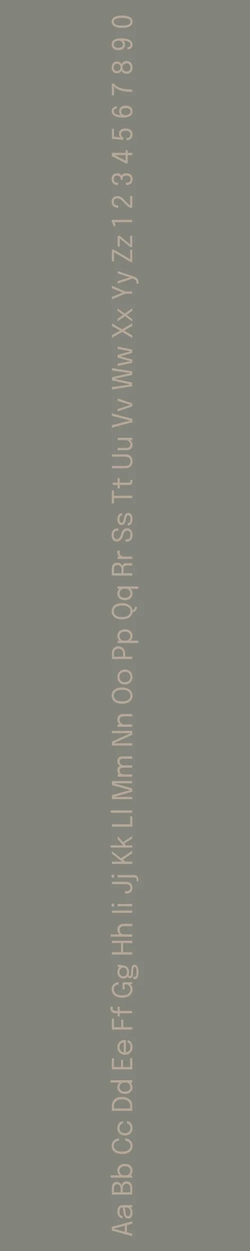
Epilogue is a contemporary sans-serif typeface known for its minimalist design and excellent legibility. With a clean and functional aesthetic, it blends classic and modern elements, making it ideal for both digital and print uses. It’s versatile enough for a wide range of design applications, from body text to display uses.
History:
Epilogue was designed by Russian type designer, Alexandra Korolkova, and was released in 2019 by the type foundry *Paratype*. The typeface was conceived as a modern sans-serif family that merges functionality with elegance. Korolkova, known for her work in digital type, designed Epilogue with the intention of creating a highly readable typeface suitable for modern screens, while maintaining the flexibility to work well in print.
Characteristics:
Design: Epilogue features clean, geometric letterforms with subtle humanist traits. Its proportions are carefully balanced, offering a harmonious mix of openness and structure. The curves of the letters are soft, contributing to its friendly and approachable feel. The family includes a range of weights and styles, making it adaptable to various typographic needs.
Usage: Epilogue works well in a wide variety of contexts, such as user interfaces, branding, headlines, and long-form text. Its strong legibility makes it an excellent choice for web design, while its modern aesthetic also lends itself to use in advertising, posters, and packaging.
Attributes: Highly versatile, legible, and modern with a refined, neutral tone. Its even stroke weight and open apertures allow for excellent readability at any size, making it perfect for both digital and print media.

FONT PERSONALITY
-
FONT PERSONALITY -
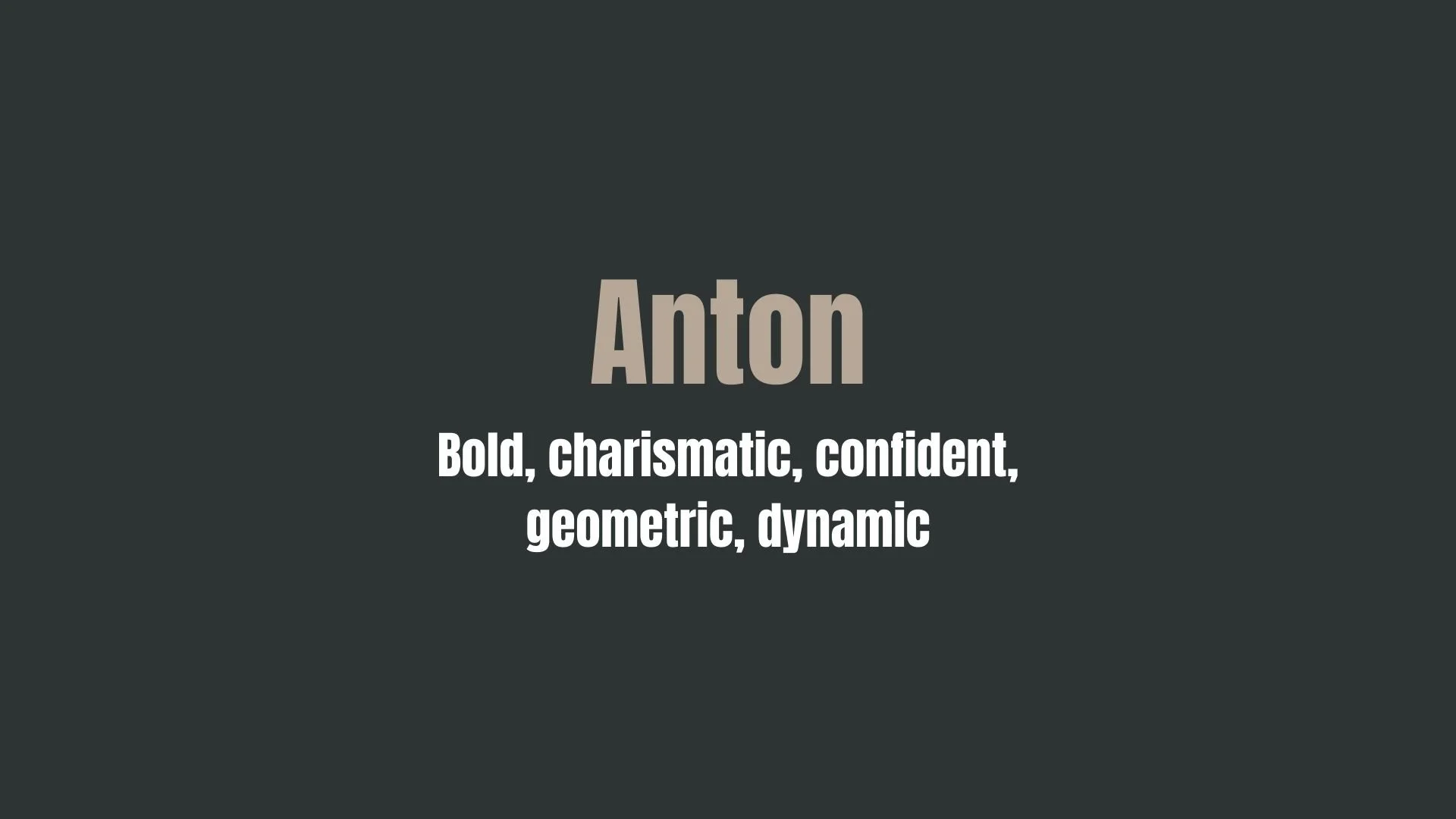

Why Anton and Epilogue are a Match Made in Heaven:
When combined, Anton and Epilogue create a striking contrast that is both bold and approachable, resulting in a dynamic and harmonious pairing. Anton’s strong, charismatic presence brings a confident and impactful energy, making it perfect for headlines and logos that demand attention. Meanwhile, Epilogue’s friendly and adaptable nature balances Anton's boldness, offering a warm, supportive backdrop that ensures the design remains readable and inviting. Together, they strike the perfect balance between authority and approachability, ensuring that the message is clear while maintaining an engaging and human touch.
This pairing would appeal to someone who values a strong yet welcoming personal brand—an individual who is confident in their abilities but also wants to come across as relatable and down-to-earth. The person using this font combination might be a leader in their field, whether in business, design, or marketing, with a dynamic, approachable persona. They may be someone who takes charge but also understands the importance of creating connections and fostering trust, someone whose presence is both commanding and welcoming to those around them.

CELEBRITY MATCH
-
CELEBRITY MATCH -

The font pairing of Anton and Epilogue aligns perfectly with the character of Amy Dunne, as portrayed by Rosamund Pike in the movie "Gone Girl (2014)" .
Summary: Rosamund Pike’s portrayal of Amy Dunne in Gone Girl captures the essence of the Anton and Epilogue font pairing. Anton reflects Amy’s commanding and manipulative tendencies, while Epilogue complements her with a warm and relatable exterior that hides her true intentions. Together, this pairing mirrors Amy’s striking complexity, making it a perfect representation of her character.

HIERARCHY
-
HIERARCHY -

Font Hierarchy for Anton and Epilogue:
Logo
Usage: Primary logo text, initials, brand name
Anton, Regular, 60pt, (Canva), 48pt (Squarespace)
Heading (H1)
Usage: Main headings on pages, prominent titles
Anton, Regular, 36pt, (Canva), 32pt (Squarespace)
Subtitle / Secondary Heading (H2)
Usage: Section titles, important subtitles
Anton, Regular, 28pt, (Canva), 24pt (Squarespace)
Subheading (H3)
Usage: Subsection headings, less prominent titles
Epilogue, Regular, 22pt, (Canva), 18pt (Squarespace)
Paragraph / Body Copy (P)
Usage: Main body text, paragraphs, descriptions
Epilogue, Regular, 14pt, (Canva), 16pt (Squarespace)