MEET YOUR FONT PAIRING MATCH
This page is your custom breakdown of the font pairing you were matched with from the Find Your Font Quiz. You’ll discover the history, personality, and style of each font—and see how they can come to life in your personal brand.
If you're a Personal Branding Studio member:
Bookmark this page. We’ll return to it in Part 2 when it’s time to use your font pairing to design your logo and create branded Canva graphics.
Not loving this particular combo? No problem. Explore all 100+ font pairings inside PBS - Part 1, Module 4: Design - to find one that feels just right. Click the button below to go there now.
Not yet a Personal Branding Studio member?
(And wondering what Personal Branding Studio even is?)
Start by scrolling through your results below. At the bottom of this page, you’ll find out how to go deeper with your personal brand through my full Personal Branding Studio program.
And your aligned font pairing match is…


HISTORY
-
HISTORY -
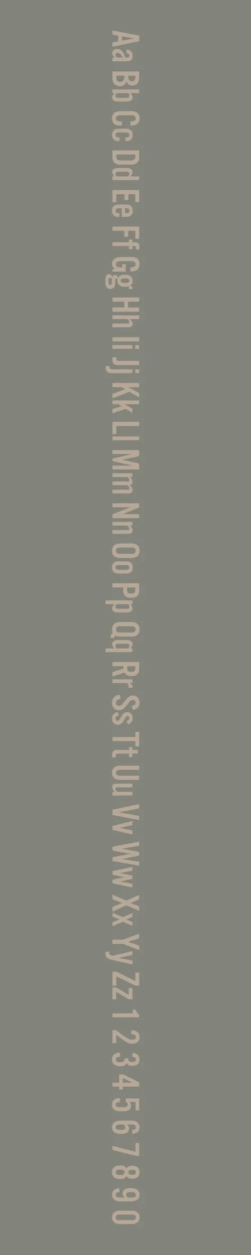
Alternate Gothic No. 3
Overview:
Alternate Gothic No. 3 is a distinctive sans-serif typeface known for its bold, condensed style and strong presence. It is part of the larger family of Alternate Gothic fonts, which have become iconic for their use in advertising, posters, and headlines, thanks to their compact, attention-grabbing design.
History:
Alternate Gothic No. 3 was designed by Morris Fuller Benton in 1905, as part of the larger group of typefaces he created for the American Type Founders (ATF). Benton, one of the most influential type designers of the early 20th century, created the Alternate Gothic series as part of his efforts to expand and diversify the range of condensed sans-serif options available for advertising and display use. The font was specifically designed to stand out in print, maximizing space while maintaining legibility. Over the years, it has been used extensively in commercial design, particularly in the 20th century, for posters, headlines, and other bold, impactful applications.
Characteristics:
Design: Alternate Gothic No. 3 features condensed letterforms with a tall, narrow structure. It is bold and geometric, with a strong, no-nonsense appearance. The letters have an even stroke weight, and some characters, like the "A" and "G," show subtle variations in their design, giving it a slightly industrial but still highly readable feel.
Usage: This typeface is perfect for high-impact display use, especially for headlines, posters, and signage. Its condensed width allows for fitting longer text into tighter spaces, making it ideal for applications where space is limited but visibility is crucial. It is also popular in branding and logo design when a strong, authoritative typeface is needed.
Attributes: Bold, condensed, and highly legible, Alternate Gothic No. 3 has a strong, assertive character. It is a timeless choice for designs that require a sense of strength, modernity, and focus. Its tight spacing and geometric forms make it particularly effective for high-contrast, attention-grabbing compositions.
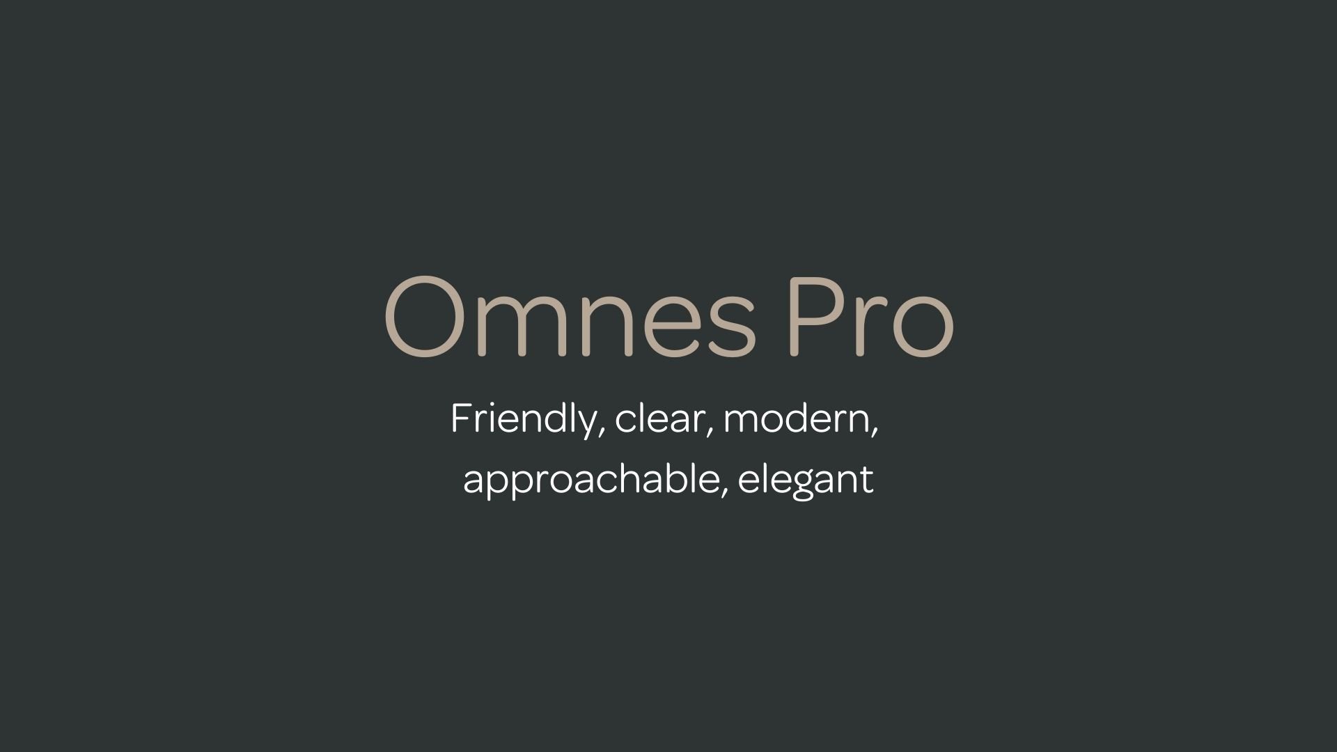
Omnes Pro
Overview:
Omnes Pro is a clean and modern sans-serif typeface with a geometric design. It is known for its friendly and approachable personality, making it versatile for both print and digital applications. Its neutral yet contemporary feel allows it to work in a variety of contexts, from branding to body text, while maintaining strong readability.
History:
Omnes Pro was created by type designer Jean-François Porchez in 2009 and was released by his type foundry, Typofonderie. The design was a response to the need for a geometric sans-serif with humanistic qualities. Jean-François Porchez, an influential French typographer, aimed to create a typeface that combined the precision of geometric forms with a warm, approachable character. Omnes Pro was developed as a highly versatile font family, designed to be adaptable across various mediums and industries, especially in editorial, web design, and corporate branding.
Characteristics:
Design: Omnes Pro is characterized by its clean, geometric shapes combined with subtle humanist influences, such as open apertures and soft curves. It features a balanced structure with moderately condensed proportions, giving it a harmonious and contemporary appearance.
Usage: Ideal for both display and text usage, Omnes Pro excels in editorial design, corporate branding, websites, and any application that demands readability and modern aesthetics. Its wide range of weights makes it suitable for diverse purposes, from headlines and logos to long-form text.
Attributes: Omnes Pro is versatile, friendly, and highly legible. It strikes a balance between geometric precision and humanist warmth, making it approachable and professional. Its clean design ensures clarity, while its gentle curves provide a sense of openness and accessibility.


FONT PERSONALITY
-
FONT PERSONALITY -

Why Alternate Gothic No. 3 and Omnes Pro are a Match Made in Heaven:
The combination of Alternate Gothic No. 3 and Omnes Pro creates a harmonious balance between bold assertiveness and approachable elegance. Alternate Gothic No. 3 stands out with its industrial, dynamic presence, lending the pairing a sense of strength and confidence, perfect for grabbing attention in headlines or brand logos. Meanwhile, Omnes Pro provides the perfect complement with its friendly, clear, and modern qualities. Its rounded shapes bring a soft, welcoming contrast to the sharp, angular lines of Alternate Gothic No. 3, ensuring that the overall design is not only striking but also inviting and accessible. Together, they create a pairing that is both eye-catching and easy to connect with, blending a sense of power with warmth and clarity.
This font pairing would be perfect for someone who is confident, yet approachable—someone who wants to make a bold statement but also values building genuine connections. It would appeal to a brand that is energetic and dynamic, yet warm and relatable. A person using this combination for their personal brand might be a forward-thinking entrepreneur or a creative professional in an industry that blends innovation with human connection—such as a branding consultant, a digital strategist, or a content creator. This person understands the importance of making an impact while maintaining a sense of elegance and approachability.

CELEBRITY MATCH
-
CELEBRITY MATCH -

The font pairing of Alternate Gothic No. 3 and Omnes Pro aligns perfectly with the character of Harley Quinn, as portrayed by Margot Robbie in the movie "Suicide Squad" (2016)".
Summary: Margot Robbie’s portrayal of Harley Quinn in Suicide Squad embodies the essence of the Alternate Gothic No. 3 and Omnes Pro pairing. Harley’s bold confidence and captivating presence reflect the commanding design of Alternate Gothic No. 3, while her modern, adaptable charm mirrors the friendly and elegant nature of Omnes Pro. This pairing showcases Harley’s duality: an unpredictable rebel with a timeless, enduring appeal.

HIERARCHY
-
HIERARCHY -
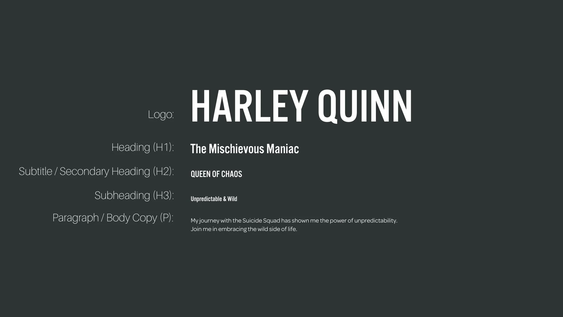
Font Hierarchy for Alternate Gothic No 3 and Omnes Pro:
Logo
Usage: Primary logo text, initials, brand name
Alternate Gothic no 3 D Omnes Pro, Regular, Custom, typically larger for impact (adjustable based on design)
Heading (H1)
Usage: Main headings on pages, prominent titles
Alternate Gothic no 3 D Omnes Pro, Regular, 36px (Canva), 2em (Squarespace)
Subtitle / Secondary Heading (H2)
Usage: Section titles, important subtitles
Alternate Gothic no 3 D Omnes Pro, Regular, 24px (Canva), 1.5em (Squarespace)
Subheading (H3)
Usage: Subsection headings, less prominent titles
Alternate Gothic no 3 D Omnes Pro, Regular, 18px (Canva), 1.25em (Squarespace)
Paragraph / Body Copy (P)
Usage: Main body text, paragraphs, descriptions
Omnes Pro, Regular, 16 px (Canva), 1em (Squarespace)