MEET YOUR FONT PAIRING MATCH
This page is your custom breakdown of the font pairing you were matched with from the Find Your Font Quiz. You’ll discover the history, personality, and style of each font—and see how they can come to life in your personal brand.
If you're a Personal Branding Studio member:
Bookmark this page. We’ll return to it in Part 2 when it’s time to use your font pairing to design your logo and create branded Canva graphics.
Not loving this particular combo? No problem. Explore all 100+ font pairings inside PBS - Part 1, Module 4: Design - to find one that feels just right. Click the button below to go there now.
Not yet a Personal Branding Studio member?
(And wondering what Personal Branding Studio even is?)
Start by scrolling through your results below. At the bottom of this page, you’ll find out how to go deeper with your personal brand through my full Personal Branding Studio program.
And your aligned font pairing match is…


HISTORY
-
HISTORY -
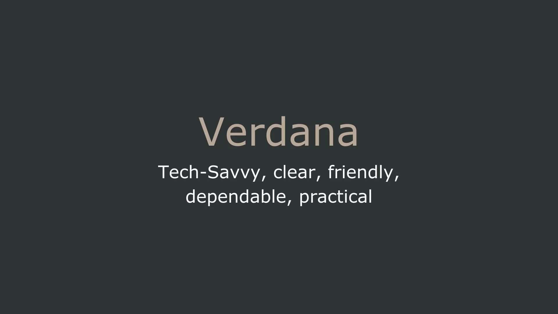
Verdana
Overview:
Verdana is a widely recognized sans-serif typeface created with a strong focus on digital readability. Known for its generous spacing and wide letterforms, Verdana is optimized for clarity on low-resolution screens, making it a popular choice for both web and screen-based interfaces.
History:
Verdana was created by renowned type designer Matthew Carter and released by Microsoft in 1996. Commissioned as part of Microsoft’s initiative to improve on-screen readability, Verdana was designed to solve legibility issues in digital text displays, where pixel density was often low. Carter, collaborating with hinting specialist Tom Rickner, crafted Verdana to retain clarity even at small sizes. The typeface quickly gained popularity as a default font across Microsoft platforms and became a key part of the early web’s visual identity.
Characteristics:
Design: Verdana features a distinctive structure with wide proportions and ample spacing between characters. The x-height is notably tall, enhancing readability at small sizes, while the wide apertures and minimal contrast between thick and thin strokes help maintain clarity. The rounded, open shapes of letters like “e” and “a” reduce ambiguity and make each character distinct, even in dense or pixelated environments.
Usage: Verdana is ideal for on-screen text, especially body copy and interface elements where clarity is essential. While it was initially optimized for digital displays, it has since found applications in print as well, particularly for signage and documents requiring high readability. Due to its iconic appearance, it is also used in branding and communications where a neutral yet readable sans-serif is needed.
Attributes: Verdana is a functional, highly legible typeface with a neutral yet approachable personality. It is known for its practicality in digital media but is versatile enough to adapt to various contexts, particularly where readability is a top priority.

Georgia
Overview:
Georgia is a serif typeface known for its classic, readable design tailored for screen use. With its warm, traditional style and high legibility, Georgia is often used for online and print body text, particularly in editorial and blog settings.
History:
Georgia was designed by typeface designer Matthew Carter and released by Microsoft in 1993. It was part of Microsoft’s efforts, alongside Verdana, to improve font readability on digital screens during the rise of the internet. Georgia was specifically created to offer the legibility of traditional serif typefaces while retaining clarity in low-resolution displays, where fine details can be challenging to render. Carter’s design prioritized robust letterforms with ample spacing and open apertures, ensuring Georgia’s legibility at small sizes.
Characteristics:
Design: Georgia features high x-height, wide letterforms, and relatively thick strokes, which contribute to its readability on screen. Its serifs are distinct but not overly ornate, and the contrast between thick and thin strokes is designed to be more subtle than in traditional print typefaces, enhancing clarity on digital displays. Georgia’s letterforms have a soft, approachable quality, with rounded shapes and details that lend it a humanistic feel.
Usage: Georgia is widely used in digital and print body text, especially in blogs, news articles, and other long-form content, where readability is key. Its warm, classic appearance also makes it a popular choice for headers in editorial design and branding. While it was originally designed for screens, Georgia’s versatility and readability have made it equally valuable for print use, particularly in settings that benefit from a traditional yet accessible serif.
Attributes: Georgia is highly legible, with a classic yet accessible personality. Its warm and slightly humanistic appearance provides a sense of familiarity, while its clarity at small sizes ensures readability across different media, making it one of the most enduring serif typefaces for both digital and print applications.

FONT PERSONALITY
-
FONT PERSONALITY -

Why Verdana and Georgia are a Match Made in Heaven:
The combination of Verdana and Georgia brings together two complementary yet contrasting personalities, creating a harmonious and versatile font pairing. Verdana, with its clean, tech-savvy, and approachable traits, ensures the design feels modern and user-friendly, making it perfect for digital environments. Its clarity and practicality make it easy to read on screens, while Georgia adds a touch of sophistication with its elegant, traditional, and warm serif design. Together, they strike a perfect balance between contemporary clarity and timeless professionalism, making this pairing ideal for a wide range of branding needs.
This font pairing would be perfect for someone who values both tradition and innovation—a person who understands the importance of clear communication but also appreciates a sense of heritage and refinement. They are likely to be a professional who works in an industry where both modern technology and established values are important, such as in the fields of digital marketing, publishing, or consultancy. This individual is someone who blends reliability with sophistication, making them approachable yet authoritative in their field.

CELEBRITY MATCH
-
CELEBRITY MATCH -

The font pairing of Verdana and Georgia aligns perfectly with the character of Elle Woods, as portrayed by Reese Witherspoon in the movie "Legally Blonde".
Summary: Reese Witherspoon’s portrayal of Elle Woods in Legally Blonde is a perfect match for the font pairing of Verdana and Georgia. Elle embodies a blend of modernity, clarity, and approachability—qualities reflected in Verdana’s tech-savvy, dependable, and clear design. At the same time, she maintains a timeless, elegant presence, similar to the classic, reliable, and warm qualities of Georgia. Elle Woods, like these fonts, proves that success comes through practicality, adaptability, and the ability to connect with others while remaining true to oneself.

HIERARCHY
-
HIERARCHY -

Font Hierarchy for Verdana and Georgia:
Logo
Usage: Primary logo text, initials, brand name
Verdana, Regular or Bold, 48-60 px (Canva), 4.5-6 rem (Squarespace)
Heading (H1)
Usage: Main headings on pages, prominent titles
Verdana, Bold, 36 px (Canva), 36px (Squarespace)
Subtitle / Secondary Heading (H2)
Usage: Section titles, important subtitles
Verdana, Regular, 24px (Canva), 24px (Squarespace)
Subheading (H3)
Usage: Subsection headings, less prominent titles
Georgia, Italic, 18px (Canva), 18px (Squarespace)
Paragraph / Body Copy (P)
Usage: Main body text, paragraphs, descriptions
Georgia, Regular, 16 px (Canva), 16 px (Squarespace)