MEET YOUR FONT PAIRING MATCH
This page is your custom breakdown of the font pairing you were matched with from the Find Your Font Quiz. You’ll discover the history, personality, and style of each font—and see how they can come to life in your personal brand.
If you're a Personal Branding Studio member:
Bookmark this page. We’ll return to it in Part 2 when it’s time to use your font pairing to design your logo and create branded Canva graphics.
Not loving this particular combo? No problem. Explore all 100+ font pairings inside PBS - Part 1, Module 4: Design - to find one that feels just right. Click the button below to go there now.
Not yet a Personal Branding Studio member?
(And wondering what Personal Branding Studio even is?)
Start by scrolling through your results below. At the bottom of this page, you’ll find out how to go deeper with your personal brand through my full Personal Branding Studio program.
And your aligned font pairing match is…

HISTORY
-
HISTORY -
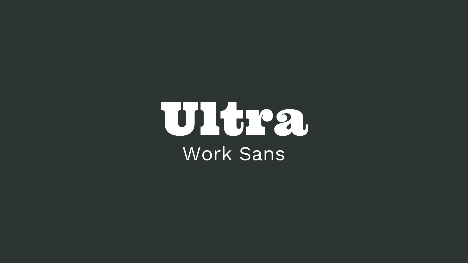
Ultra
Overview:
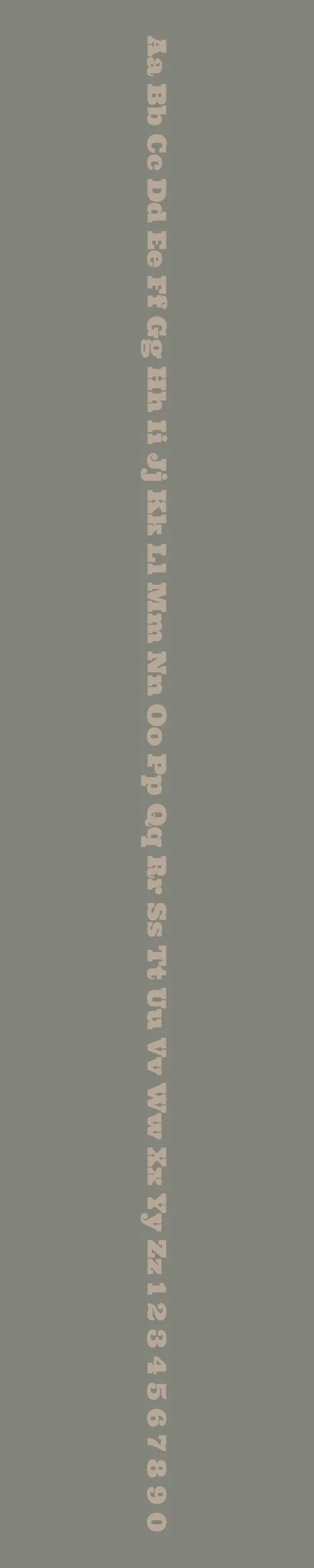
Ultra is a robust and eye-catching slab-serif typeface known for its bold weight and distinct clarity. It’s commonly used for headlines and display settings where impactful, attention-grabbing text is desired. Ultra’s heavy design is inspired by classic slab-serif "fat face" fonts and serves well in both digital and print formats, particularly in situations requiring strong visual emphasis.
History:
Ultra was created by the Astigmatic One Eye Font Foundry and was designed to channel the essence of early slab-serif fonts, often linked to 19th-century advertising and display type. This historical influence is visible in Ultra’s pronounced weight and structured form. The font pays homage to styles like Clarendon and Egyptian, popular for their sturdy presence in commercial signage and posters. Released as a free-to-use typeface, Ultra has become a versatile choice for various designers.
Characteristics:
Design: Ultra’s structure is defined by thick strokes and solid geometric forms, with subtle variations in stroke width that add depth and visual interest. The font is available in a single, heavyweight style that emphasizes its role as a display font.
Usage: Due to its bold and legible characteristics, Ultra is often chosen for large-scale applications like banners, posters, and logo designs. It’s especially effective for titles and headers, where strong visibility is key.
Attributes: Ultra is recognizable for its pronounced "fat face" aesthetic, with a design that remains clear and effective even in low-quality print. It pairs well with cleaner, lighter fonts that balance its bold appearance, creating a striking contrast when used in combination.
Work Sans
Overview:
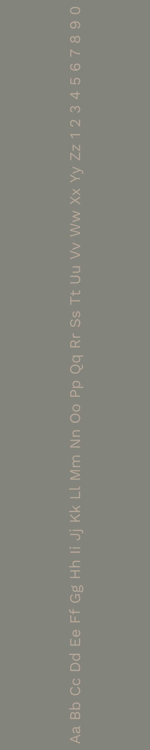
Work Sans is a modern, versatile sans-serif typeface optimized for on-screen readability. It is rooted in early 20th-century grotesque sans-serifs but designed specifically for digital usage, balancing functionality with aesthetic appeal. Its minimal, clean structure makes it ideal for a range of digital and print applications, from body text to headlines.
History:
Work Sans was created by Australian designer Wei Huang and released in 2015. Inspired by grotesque typefaces from the late 19th and early 20th centuries, Huang aimed to create a typeface that would perform well on screens, especially at smaller text sizes. The project was initially funded through Google Fonts, and its design has continued to evolve to address both print and screen-based needs. The font family includes multiple weights, allowing designers flexibility in establishing hierarchy and emphasis.
Characteristics:
Design: Work Sans is characterized by its clean, simplified forms with a humanist touch. The lighter weights are optimized for text readability, while the heavier weights are designed with a bit more width and structure, making them suited for display text. Its rounded corners soften the overall look, giving it a more friendly appearance without compromising clarity.
Usage: Work Sans is highly adaptable, making it ideal for digital interfaces, websites, mobile applications, and branding. It can be used effectively across different media due to its legibility and range of weights, which allows designers to use it both as a body text and for headings.
Attributes: With its high legibility, modern feel, and versatile range, Work Sans is highly functional yet friendly in tone. It pairs well with other typefaces, especially for projects requiring a clean, professional appearance with a humanistic touch.

FONT PERSONALITY
-
FONT PERSONALITY -


Why Ultra and Work Sans are a Match Made in Heaven:
The pairing of Ultra and Work Sans creates a harmonious balance between boldness and reliability, making it a match made in heaven. Ultra’s charismatic, fearless nature makes it perfect for high-impact headlines or branding that needs to stand out and make a statement. Its dynamic geometric forms infuse energy and modernity, ensuring an immediate visual impact. Meanwhile, Work Sans offers a grounded counterbalance, providing clarity and approachability with its clean, structured design. The pairing thrives in its contrast—Ultra grabs attention with its confident presence, while Work Sans ensures that the content remains legible and accessible, making it perfect for both headlines and body text.
This font pairing would appeal to a person who is bold yet dependable—someone who wants their personal brand to reflect a strong, dynamic presence while also maintaining a sense of professionalism and reliability. This person might be an entrepreneur or creative professional who combines confidence with a methodical approach. They could be a leader in a forward-thinking industry, such as tech, design, or marketing, where striking a balance between innovation and clarity is key to success.

CELEBRITY MATCH
-
CELEBRITY MATCH -
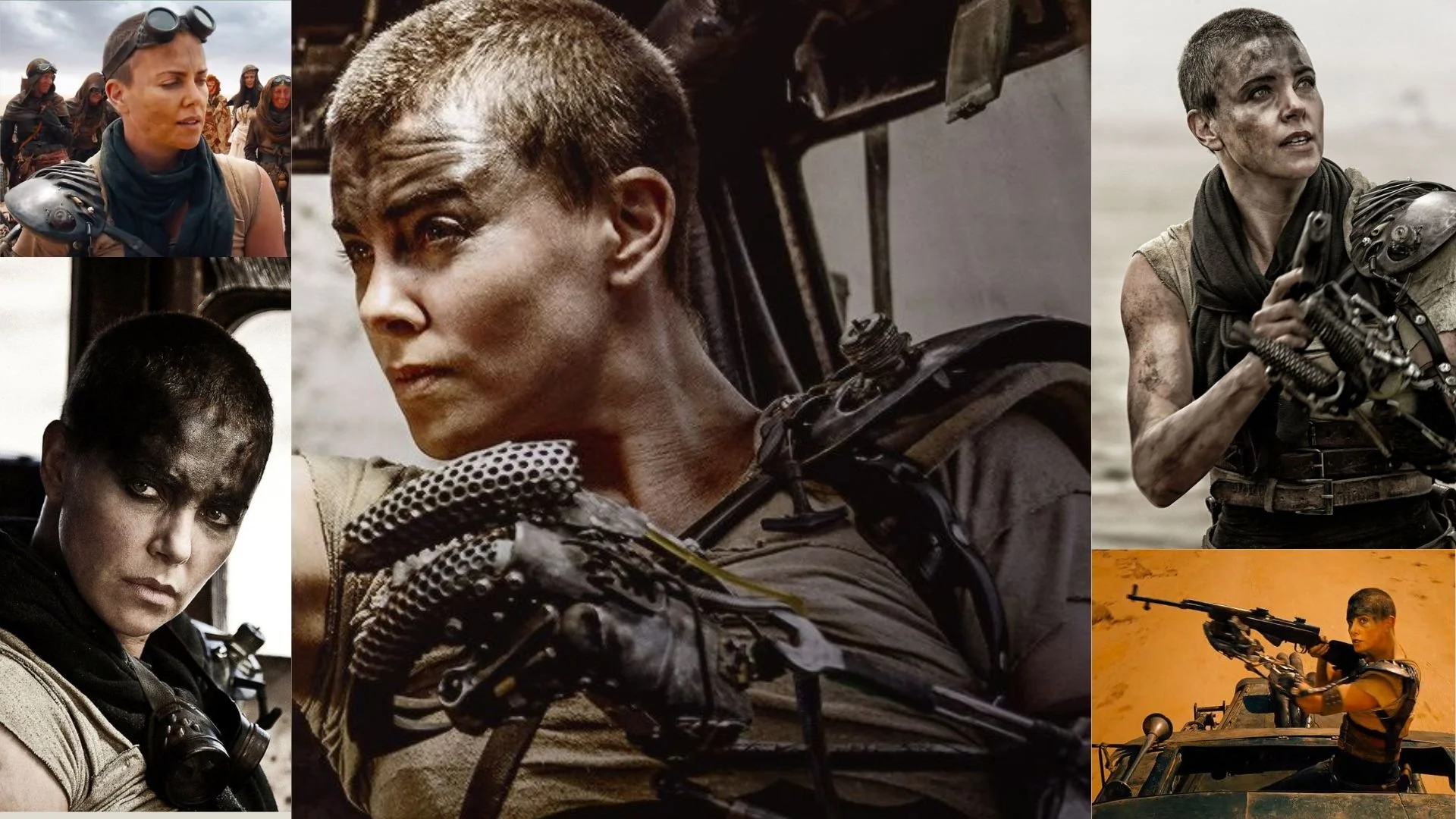
The font pairing of Ultra and Work Sans aligns perfectly with the character of Imperator Furiosa, as portrayed by Charlize Theron in the movie "Mad Max: Fury Road".
Summary: Charlize Theron’s portrayal of Imperator Furiosa in Mad Max: Fury Road matches perfectly with the Ultra and Work Sans font pairing. Furiosa is a commanding, fearless leader whose strength and confidence are captured by the bold, dynamic nature of Ultra, while her more grounded, organized side—essential for leading her group of survivors—aligns with the reliability and clarity of Work Sans. Just as Ultra brings an unforgettable impact while Work Sans provides clarity and structure, Furiosa's leadership is both powerful and methodical, ensuring both the survival and liberation of those she leads. This pairing highlights a compelling balance of boldness and reliability, making it an ideal match for a character like Furiosa.

HIERARCHY
-
HIERARCHY -

Font Hierarchy for Ultra and Work Sans:
Logo
Usage: Primary logo text, initials, brand name
Ultra, Regular, 48-60 pt (Canva), 48-60 px (Squarespace)
Heading (H1)
Usage: Main headings on pages, prominent titles
Ultra, Regular, 36-48 pt (Canva), 36-48 px (Squarespace)
Subtitle / Secondary Heading (H2)
Usage: Section titles, important subtitles
Work Sans, Bold, 24-30 pt (Canva), 24-30 px (Squarespace)
Subheading (H3)
Usage: Subsection headings, less prominent titles
Work Sans, Regular, 18-24 pt (Canva), 18-24 px (Squarespace)
Paragraph / Body Copy (P)
Usage: Main body text, paragraphs, descriptions
Work Sans, Regular, 12-16 pt (Canva), 12-16 px (Squarespace)