MEET YOUR FONT PAIRING MATCH
This page is your custom breakdown of the font pairing you were matched with from the Find Your Font Quiz. You’ll discover the history, personality, and style of each font—and see how they can come to life in your personal brand.
If you're a Personal Branding Studio member:
Bookmark this page. We’ll return to it in Part 2 when it’s time to use your font pairing to design your logo and create branded Canva graphics.
Not loving this particular combo? No problem. Explore all 100+ font pairings inside PBS - Part 1, Module 4: Design - to find one that feels just right. Click the button below to go there now.
Not yet a Personal Branding Studio member?
(And wondering what Personal Branding Studio even is?)
Start by scrolling through your results below. At the bottom of this page, you’ll find out how to go deeper with your personal brand through my full Personal Branding Studio program.
And your aligned font pairing match is…


HISTORY
-
HISTORY -
Trocchi
Overview:
Trocchi is a slab-serif typeface known for its distinct presence and readability, combining traditional serif elements with a contemporary touch. It is designed to perform well in both headlines and body text, making it suitable for digital and print applications where a classic yet approachable look is desired.
History:
Trocchi was designed by Vernon Adams, a British type designer known for creating popular open-source typefaces. Named after the Scottish writer Alexander Trocchi, the font was released in 2012 as part of Google Fonts, with the goal of providing a reliable, versatile serif that would be freely available for web and print usage. This font reflects Adams' emphasis on clean, highly legible typefaces accessible to all users.
Characteristics:
Design: Trocchi’s design features robust slab serifs and an even texture, giving it a balanced, readable structure with a traditional aesthetic. The letterforms are slightly condensed, creating a compact appearance that still maintains good readability at various sizes. Trocchi’s solid, consistent strokes and moderate contrast make it versatile for both display and paragraph text.
Usage: Ideal for headlines, editorial design, and body text in both print and digital contexts, Trocchi’s blend of traditional serif form and modern readability makes it suitable for projects needing a grounded and professional tone. It is often used in blogs, articles, and academic texts where a classic serif look is appropriate.
Attributes: Trocchi is known for its stability, legibility, and neutral personality. The font’s open-source status also aligns with accessibility in design, making it a common choice among designers seeking a no-cost serif with professional appeal.
Syne
Overview:
Syne is a distinctive, multi-style sans-serif typeface known for its quirky and experimental personality. This font family mixes geometric elements with unique stylistic traits, making it particularly suited for creative and bold visual design projects. It stands out for its ability to convey personality through its varied styles, from a clean Regular to an expressive Extra.
History:
Designed by Lucas Descroix with Bonjour Monde, Syne was originally developed in 2017 for a cultural project in France called Synesthésie, which inspired its design approach. Created to reflect the complex experience of synesthesia—where senses interconnect—it combines diverse typographic forms, pushing the boundaries of traditional font design. Bonjour Monde’s involvement also brought a playful spirit to the font, aligning with the cultural and artistic nature of the Synesthésie project, and it was later released for public use with an SIL Open Font License.
Characteristics:
Design: Syne’s bold, sometimes eccentric letterforms draw from various influences, including retrofuturism and Eurostile. The font offers six styles, including Regular, Bold, Extra, Mono, and Italic. The Extra style notably expands in width as the weight increases, creating a distinctive visual impact. Its Mono style, developed with custom software, features a unique distortion effect, blending straight lines and arcs to produce an almost glitchy aesthetic.
Usage: Given its unconventional shapes and variations, Syne works best in headlines, branding, and projects that benefit from a strong, individualistic typeface. It’s less suited for body text but can make a striking impact in logos, posters, and digital media.
Attributes: Syne’s attributes center around its strong personality, experimental forms, and broad versatility within its family. With an emphasis on conveying artistic identity, it embodies a mix of playfulness and seriousness, ideal for creating memorable, visually striking designs.


FONT PERSONALITY
-
FONT PERSONALITY -


Why Trocchi and Syne are a Match Made in Heaven:
The pairing of Trocchi and Syne brings together the best of both classic and contemporary design sensibilities, resulting in a harmonious balance between sophistication and simplicity. Trocchi, with its elegant, charismatic, and slightly eccentric personality, lends a refined yet unconventional touch to the design, making it ideal for headlines, logos, and brand elements that demand attention and high status. Syne, on the other hand, anchors the design with its modern, minimalist aesthetic, bringing clarity and approachability. The clean lines and effortless style of Syne perfectly complement the timeless elegance of Trocchi, creating a dynamic yet cohesive look.
This font pairing would resonate with a person who embodies a blend of tradition and innovation—someone with a strong sense of personal style, but also a modern, forward-thinking mindset. They are likely to be a creative professional or entrepreneur who values both timeless elegance and contemporary functionality. This individual could be someone in the fashion, luxury, or high-end lifestyle industries, where sophistication is key but there is also a need for clarity and accessibility in their brand messaging. They are someone who wants their brand to convey both prestige and approachability, seamlessly combining the old with the new.

CELEBRITY MATCH
-
CELEBRITY MATCH -
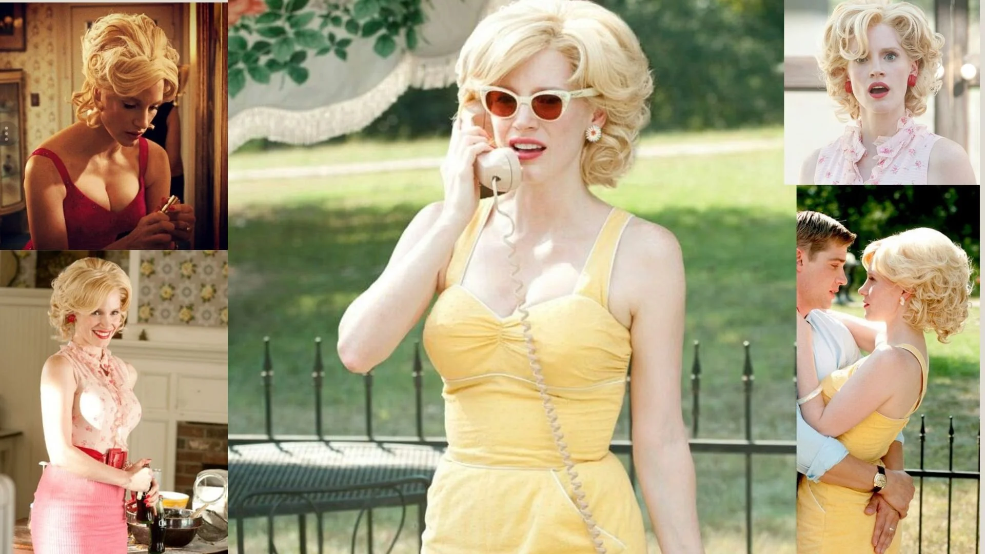
The font pairing of Trocchi and Syne aligns perfectly with the character of Celia Foote, as portrayed by Jessica Chastain in the movie "The Help (2011)".
Summary: Jessica Chastain’s portrayal of Celia Foote in The Help embodies the characteristics of the Trocchi and Syne font pairing with remarkable accuracy. Trocchi reflects Celia’s classic elegance and unique charm, bringing an element of sophistication and quirky individuality to her character. Meanwhile, Syne mirrors her modern, approachable, and effortless style, emphasizing clarity, simplicity, and warmth. Together, they create a balanced and complementary dynamic—combining tradition with modernity, much like Celia herself, who merges the elegance of the past with the evolving social changes around her. Both the font pairing and the character represent a harmonious fusion of timeless appeal and contemporary ease.

HIERARCHY
-
HIERARCHY -
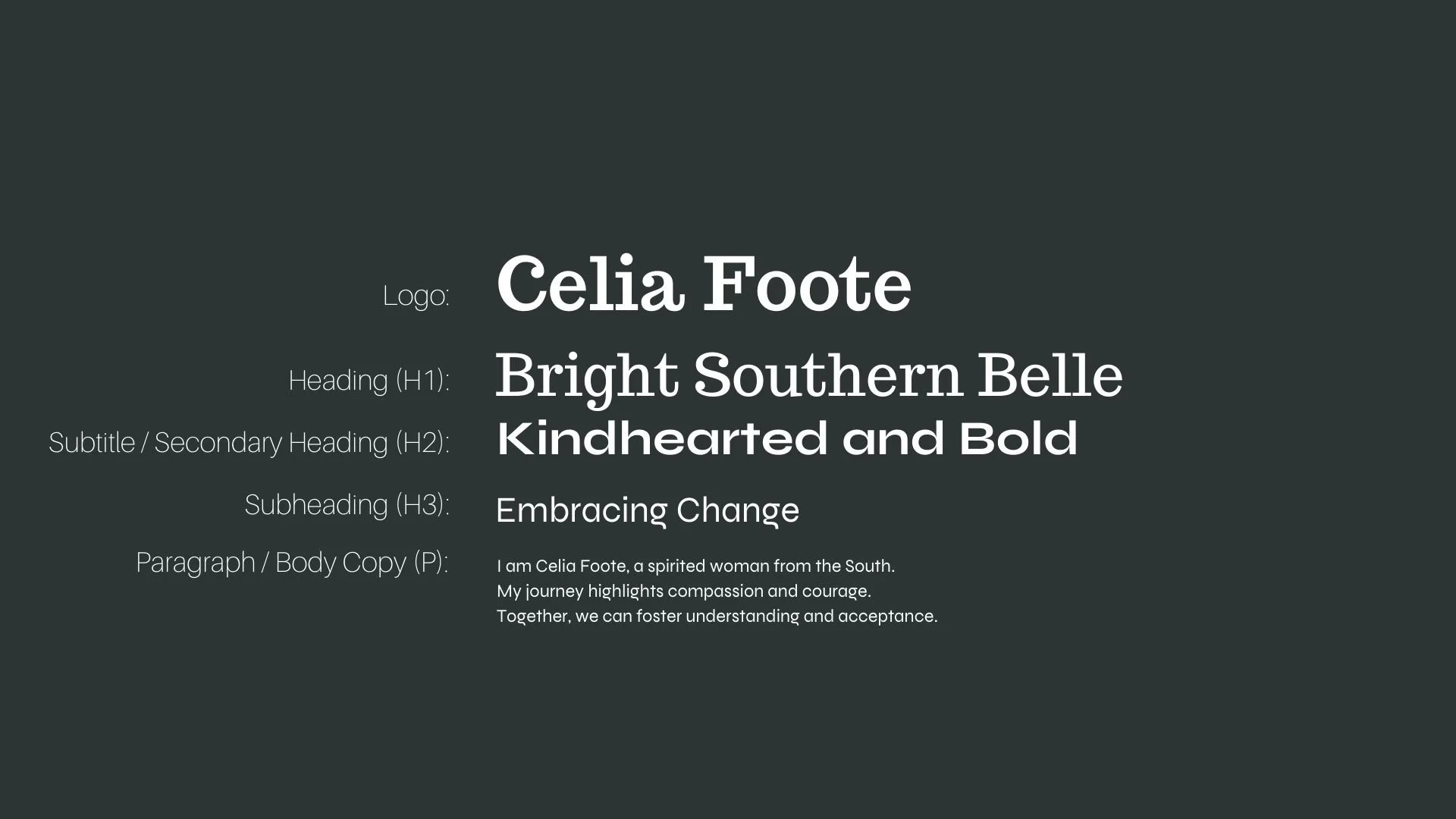
Font Hierarchy for Trocchi and Syne:
Logo
Usage: Primary logo text, initials, brand name
Trocchi, Regular, 72 pt (Canva), 48 pt (Squarespace)
Heading (H1)
Usage: Main headings on pages, prominent titles
Trocchi, Regular, 60 pt (Canva), 40 pt (Squarespace)
Subtitle / Secondary Heading (H2)
Usage: Section titles, important subtitles
Syne, Bold, 48 pt (Canva), 32 pt (Squarespace)
Subheading (H3)
Usage: Subsection headings, less prominent titles
Syne, Regular, 36 pt (Canva), 24 pt (Squarespace)
Paragraph / Body Copy (P)
Usage: Main body text, paragraphs, descriptions
Syne, Regular, 18 pt (Canva), 16 pt (Squarespace)