MEET YOUR FONT PAIRING MATCH
This page is your custom breakdown of the font pairing you were matched with from the Find Your Font Quiz. You’ll discover the history, personality, and style of each font—and see how they can come to life in your personal brand.
If you're a Personal Branding Studio member:
Bookmark this page. We’ll return to it in Part 2 when it’s time to use your font pairing to design your logo and create branded Canva graphics.
Not loving this particular combo? No problem. Explore all 100+ font pairings inside PBS - Part 1, Module 4: Design - to find one that feels just right. Click the button below to go there now.
Not yet a Personal Branding Studio member?
(And wondering what Personal Branding Studio even is?)
Start by scrolling through your results below. At the bottom of this page, you’ll find out how to go deeper with your personal brand through my full Personal Branding Studio program.
And your aligned font pairing match is…

HISTORY
-
HISTORY -
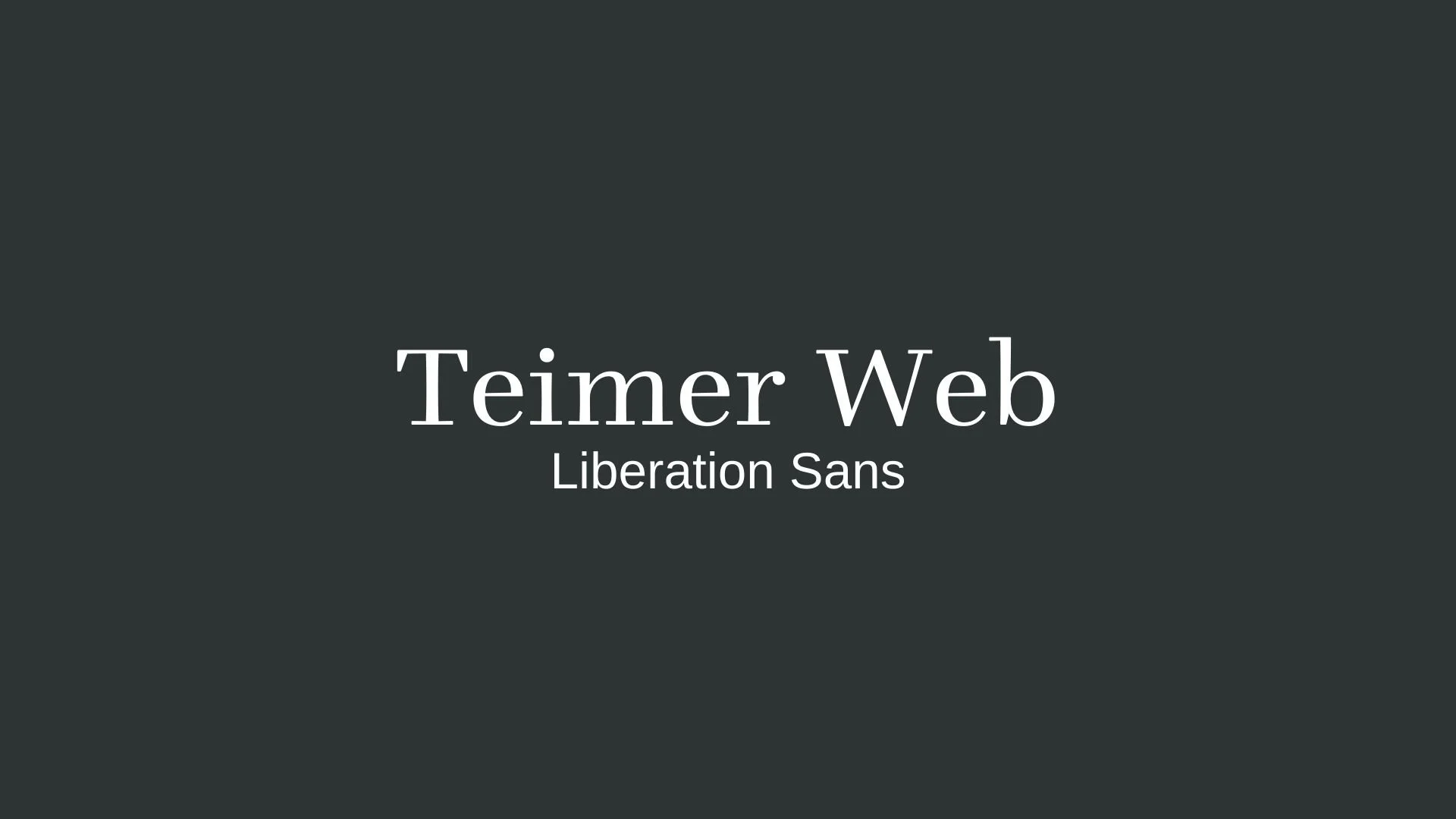
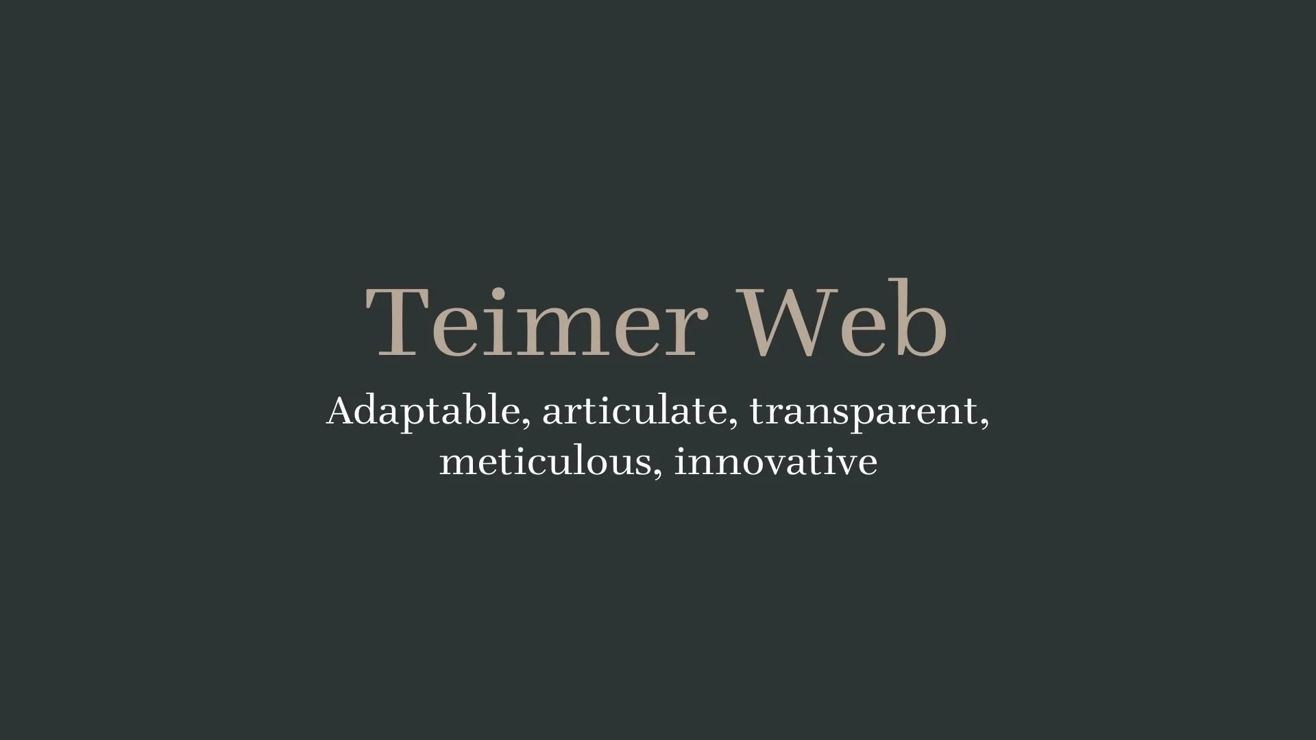
Teimer Web
Overview:
Teimer Web is a distinctive serif font known for its refined lines and vintage elegance. This typeface has a timeless appeal, capturing the essence of 19th-century design while introducing subtle modern adjustments. It’s suited for projects that require a classic yet approachable look, particularly in editorial, print, and digital settings.
History:
The original Teimer typeface was designed in 1967 by Czech designer Pavel Teimer, who sought inspiration from the refined serif styles of Walbaum and Didot. Although the font design was originally submitted to the Czechoslovak foundry Grafotechna, it was never cast. In 2005, Czech design group Storm Type Foundry revived Teimer’s work, digitizing it based on archival documents and interpretations of Teimer’s original intentions. The modern Teimer Web version offers both roman and italic styles, updated for digital and web use, with several new weights and refinements for broader applicability.
Characteristics:
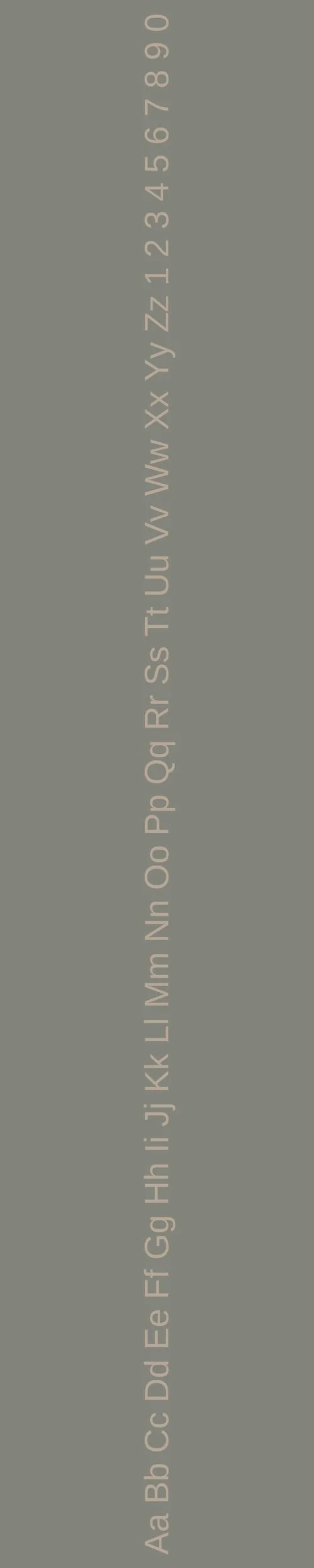
Design: Teimer Web features long, elegant serifs and a low-contrast style, giving it a softer and more approachable look compared to other serif fonts from the same era. Its character set balances historical influence with unique adjustments in stroke width and letter proportions.
Usage: Ideal for both headings and body text in high-end editorial designs, branding, and online media, especially where an air of sophistication and readability is desired. Its digital adaptations make it suitable for responsive web environments, ensuring a polished look across screens.
Attributes: Teimer Web's thoughtful proportions and serene italic rhythm make it well-suited for extended text, as well as short, impactful phrases. Its design exudes calmness and precision, with a touch of classical European sophistication.

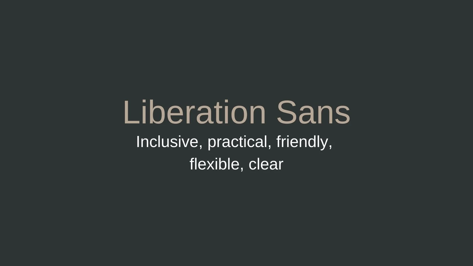
Liberation Sans
Overview:
Liberation Sans is a widely used sans-serif typeface known for its clean design and versatility. Created as a metrically compatible alternative to popular typefaces like Arial, it’s favored in both open-source environments and commercial applications due to its readability and free licensing.
History:
Liberation Sans was created by Steve Matteson at Ascender Corporation in 2007, commissioned by Red Hat to provide an open-source font compatible with Microsoft’s widely used Arial font. This project aimed to address the need for freely distributable fonts that maintain the same metrics as proprietary options. The Liberation font family was released under an open-source license, supporting compatibility in documents and digital applications without font substitution issues.
Characteristics:
Design: Liberation Sans has a modern, geometric appearance, with clear letterforms and balanced spacing that make it highly legible on screens and in print. Its design shares similarities with Arial and Helvetica but maintains a distinctive look, offering subtle differences that suit various styles.
Usage: Ideal for body text in both digital and print formats, Liberation Sans performs well in web design, application interfaces, and documents where readability is crucial. It’s also used in professional contexts, particularly when open-source or cross-platform compatibility is a requirement.
Attributes: Liberation Sans is celebrated for its neutrality, accessibility, and clarity. As an open-source font, it aligns with the ideals of accessibility and universal design, making it a go-to choice for Linux distributions and open-source projects.

FONT PERSONALITY
-
FONT PERSONALITY -
Why Teimer Web and Liberation Sans are a Match Made in Heaven:
Teimer Web and Liberation Sans create a pairing that is dynamic, engaging, and built for clarity. Teimer Web, with its adaptable and articulate nature, offers a modern, refined look that is ideal for more sophisticated uses like headers and key content. It communicates with precision and innovation, making it an excellent choice for a forward-thinking brand. Meanwhile, Liberation Sans adds a sense of inclusivity and friendliness, ensuring that the design remains welcoming and easy to engage with. Its clarity and practical design ground the pairing, making sure that even with Teimer Web’s bold presence, the overall message remains clear and accessible.
This font combination would appeal to someone who is both progressive and people-oriented—a creative professional who balances innovation with accessibility. The person using this pairing might be an entrepreneur or brand strategist who wants to convey a modern, approachable, and effective brand identity. They would be someone who values clarity and functionality in communication while also being forward-thinking and mindful of their audience’s diverse needs. Whether in tech, design, or digital media, this individual strives to make their work both cutting-edge and universally accessible.

CELEBRITY MATCH
-
CELEBRITY MATCH -

The font pairing of Teimer Web and Liberation Sans aligns perfectly with the character of Natasha Romanoff, as portrayed by Scarlett Johansson in the movie "Black Widow".
Summary: Teimer Web aligns with Scarlett Johansson's portrayal of Natasha Romanoff (Black Widow) due to the character's modern, adaptable, and meticulous nature. Natasha's ability to adapt to various roles, maintain clarity in her interactions, and focus on the finer details matches the personality of Teimer Web, making her a perfect fit for this font. Liberation Sans suits Scarlett Johansson's role as Lucy in Lucy(2014) because of the character's journey toward simplicity, clarity, and universal accessibility as her cognitive abilities expand. Lucy’s ability to evolve and adapt, while keeping her communication clear and approachable, mirrors the traits of Liberation Sans, which is clean, practical, and inclusive. Both fonts represent clarity, modernity, and versatility, but Teimer Web’s focus on detail and transparency fits best with Natasha Romanoff’s complex, strategic personality, while Liberation Sans’ simplicity and adaptability align more closely with Lucy’s evolving intellect and universal understanding.

HIERARCHY
-
HIERARCHY -

Font Hierarchy for Teimer Web and Liberation Sans:
Logo
Usage: Primary logo text, initials, brand name
Teimer Web, Regular, 48pt (Canva), 36px (Squarespace)
Heading (H1)
Usage: Main headings on pages, prominent titles
Teimer Web, Bold, 36 pt (Canva), 24px (Squarespace)
Subtitle / Secondary Heading (H2)
Usage: Section titles, important subtitles
Liberation Sans, Regular, 24pt (Canva), 18px (Squarespace)
Subheading (H3)
Usage: Subsection headings, less prominent titles
Liberation Sans, Italic, 18pt (Canva), 16px (Squarespace)
Paragraph / Body Copy (P)
Usage: Main body text, paragraphs, descriptions
Liberation Sans, Regular, 14pt (Canva), 14px (Squarespace)