MEET YOUR FONT PAIRING MATCH
This page is your custom breakdown of the font pairing you were matched with from the Find Your Font Quiz. You’ll discover the history, personality, and style of each font—and see how they can come to life in your personal brand.
If you're a Personal Branding Studio member:
Bookmark this page. We’ll return to it in Part 2 when it’s time to use your font pairing to design your logo and create branded Canva graphics.
Not loving this particular combo? No problem. Explore all 100+ font pairings inside PBS - Part 1, Module 4: Design - to find one that feels just right. Click the button below to go there now.
Not yet a Personal Branding Studio member?
(And wondering what Personal Branding Studio even is?)
Start by scrolling through your results below. At the bottom of this page, you’ll find out how to go deeper with your personal brand through my full Personal Branding Studio program.
And your aligned font pairing match is…

HISTORY
-
HISTORY -
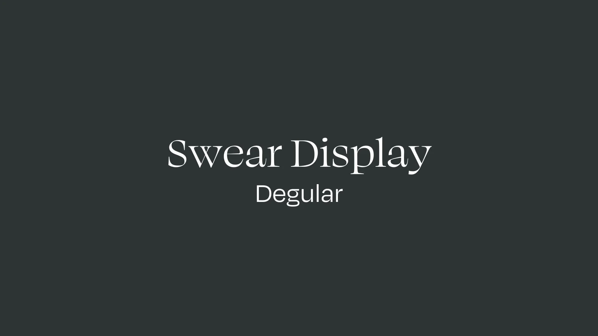
Swear Display
Overview:
Swear Display is a bold, distinctive serif typeface that stands out with its high contrast and intricate details, ideal for large display uses. Known for its expressive style, Swear Display brings a unique personality to branding and editorial designs.
History:
Swear was designed by James Edmondson and released in 2020 through his foundry, OH no Type Co. Edmondson created Swear as part of a family with various optical sizes, including Text, Deck, and Banner, to cater to different design needs. Swear Display, with its exaggerated details, was specifically crafted for impactful headline and large-format use.
Characteristics:
Design: Swear Display features sharp, exaggerated serifs and a high contrast between thick and thin strokes, making it visually striking and elegant. It’s crafted to retain clarity and character at larger sizes, making it ideal for titles, posters, and branding that demands attention.
Usage: Swear Display is best suited for headlines, logos, and editorial designs where visual impact is key. It pairs well with minimalist sans-serif fonts, creating a balance between classic and modern elements.
Attributes: Known for its dramatic flair and strong presence, Swear Display is both stylish and versatile, with a design that’s suitable for a variety of creative applications from fashion to luxury branding.

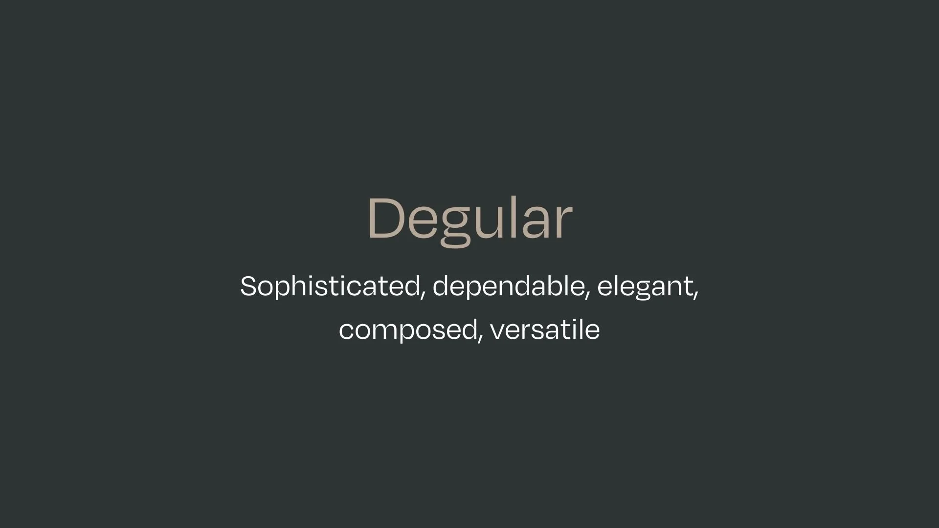
Degular
Overview:
Degular is a modern sans-serif typeface that balances geometric precision with a warm, approachable style. Known for its high readability and adaptability, it has been increasingly popular in both digital and print media, often used in branding and editorial designs.
History:
Degular was created by James Edmondson of Ohno Type Co., an independent type foundry known for its expressive and functional fonts. Initially released in 2020, Degular was designed to provide a versatile sans-serif with a distinct character, aiming to bridge the gap between clean minimalism and the warmth of humanist fonts. Edmondson developed Degular to offer designers a flexible typeface suitable for a range of applications, from headlines to body text.
Characteristics:
Design: Degular features rounded corners, balanced letterforms, and subtly unique details, giving it a friendly yet professional look. Its shapes are both geometric and slightly organic, making it feel approachable without sacrificing clarity.
Usage: Degular is suitable for large text applications, such as headlines, banners, and logos, where its bold clarity can shine. It is also readable at smaller sizes, making it effective for body text in print and digital.
Attributes: This typeface is distinguished by its blend of legibility and personality, making it versatile across different media. Designers often pair Degular with fonts like Beastly for contrast, and its flexibility allows it to fit both playful and formal design contexts.


FONT PERSONALITY
-
FONT PERSONALITY -
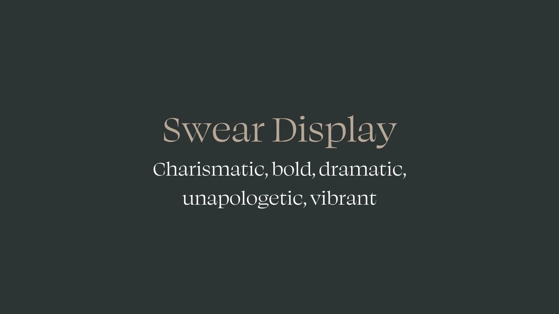
Why Swear Display and Degular are a Match Made in Heaven:
The combination of Swear Display and Degular results in a harmonious blend of boldness and elegance, offering a dynamic yet refined pairing. Swear Display, with its charismatic and unapologetic flair, brings an element of dramatic energy and confidence to the design, perfect for making a statement. On the other hand, Degular balances this energy with its sophisticated, dependable, and composed nature. It provides a calming contrast, ensuring that the overall design is both striking and readable. This pairing works seamlessly across a variety of contexts, with Swear Display commanding attention in headlines and Degular providing the smooth, refined foundation for body text.
Together, these fonts would appeal to a person who is both bold and composed—someone who embraces their individuality and isn't afraid to stand out, but also values professionalism and sophistication. This person is likely a creative professional with a strong personal brand, such as a high-end designer or an entrepreneur in the fashion, luxury, or entertainment industries. They might be someone who wants their brand to make a dramatic impact, while still maintaining an air of refinement and dependability.

CELEBRITY MATCH
-
CELEBRITY MATCH -

The font pairing of Swear Display and Degular aligns perfectly with the character of Ally, as portrayed by Lady Gaga in the movie "A Star is Born (2018)".
Summary: Lady Gaga’s portrayal of Ally in A Star is Born is an embodiment of boldness, charisma, and dramatic transformation—traits perfectly aligned with the Swear Display font. From her vulnerable beginnings as a waitress and singer to her final, triumphant moments on stage, Ally’s journey is infused with the same confidence and unapologetic energy that Swear Display exudes. The font’s vibrant, magnetic presence echoes Ally’s evolution from shy artist to a bold, unshakable force in the music world. In this sense, Ally and Swear Display are kindred spirits, both unapologetically making their mark in a world that demands attention.

HIERARCHY
-
HIERARCHY -
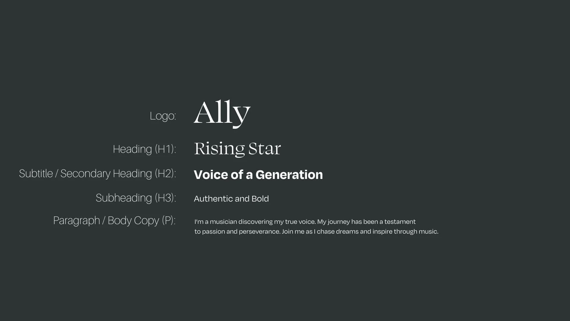
Font Hierarchy for Swear Display and Degular :
Logo
Usage: Primary logo text, initials, brand name
Swear Display, Regular, 48-60 px (Canva), 4.5-6 rem (Squarespace)
Heading (H1)
Usage: Main headings on pages, prominent titles
Swear Display, Regular, 48px (Canva), 36px (Squarespace)
Subtitle / Secondary Heading (H2)
Usage: Section titles, important subtitles
Degular, Bold, 36px (Canva), 24px (Squarespace)
Subheading (H3)
Usage: Subsection headings, less prominent titles
Degular, Regular, 24 px (Canva), 18px (Squarespace)
Paragraph / Body Copy (P)
Usage: Main body text, paragraphs, descriptions
Swear Display Degular, Regular, 18px (Canva), 16px (Squarespace)