MEET YOUR FONT PAIRING MATCH
This page is your custom breakdown of the font pairing you were matched with from the Find Your Font Quiz. You’ll discover the history, personality, and style of each font—and see how they can come to life in your personal brand.
If you're a Personal Branding Studio member:
Bookmark this page. We’ll return to it in Part 2 when it’s time to use your font pairing to design your logo and create branded Canva graphics.
Not loving this particular combo? No problem. Explore all 100+ font pairings inside PBS - Part 1, Module 4: Design - to find one that feels just right. Click the button below to go there now.
Not yet a Personal Branding Studio member?
(And wondering what Personal Branding Studio even is?)
Start by scrolling through your results below. At the bottom of this page, you’ll find out how to go deeper with your personal brand through my full Personal Branding Studio program.
And your aligned font pairing match is…


HISTORY
-
HISTORY -
Poppins
Overview:
Poppins is a geometric sans-serif typeface known for its clean, modern design and excellent legibility. With its rounded, wide letterforms, it exudes a friendly and approachable feel, making it versatile for a wide range of applications. Poppins is widely used in both digital and print media, offering a balanced aesthetic that performs well at various sizes.
History:
Poppins was created by Indian Type Foundry (ITF), with the design led by Cosimo Lorenzo Pancini and Eduardo Manso. The font was released in 2014 as part of the Google Fonts collection. The designers aimed to create a modern, geometric sans-serif typeface with rounded forms that would perform well across different languages, including both Latin and Devanagari scripts. The goal was to develop a versatile typeface that would be effective in both large and small sizes, suitable for digital interfaces as well as print applications.
Characteristics:
Design: Poppins is characterized by its geometric shapes, with clean, circular forms and wide proportions. It features rounded terminals and a uniform stroke width, giving it a contemporary, friendly look. The typeface offers a good balance between modern aesthetics and traditional sans-serif simplicity.
Usage: Poppins is highly versatile and can be used for a variety of design projects, including branding, web design, app interfaces, editorial design, and signage. Its clear and open letterforms make it ideal for headlines, body text, and UI/UX applications.
Attributes: The font is highly legible, neutral, and modern, with a slight warmth due to its rounded forms. It’s versatile enough to be used in both display and text-heavy settings, making it a popular choice for digital content, advertising, and corporate branding. Its range of weights, from thin to extra-bold, allows it to work well in both large display settings and small body text applications.

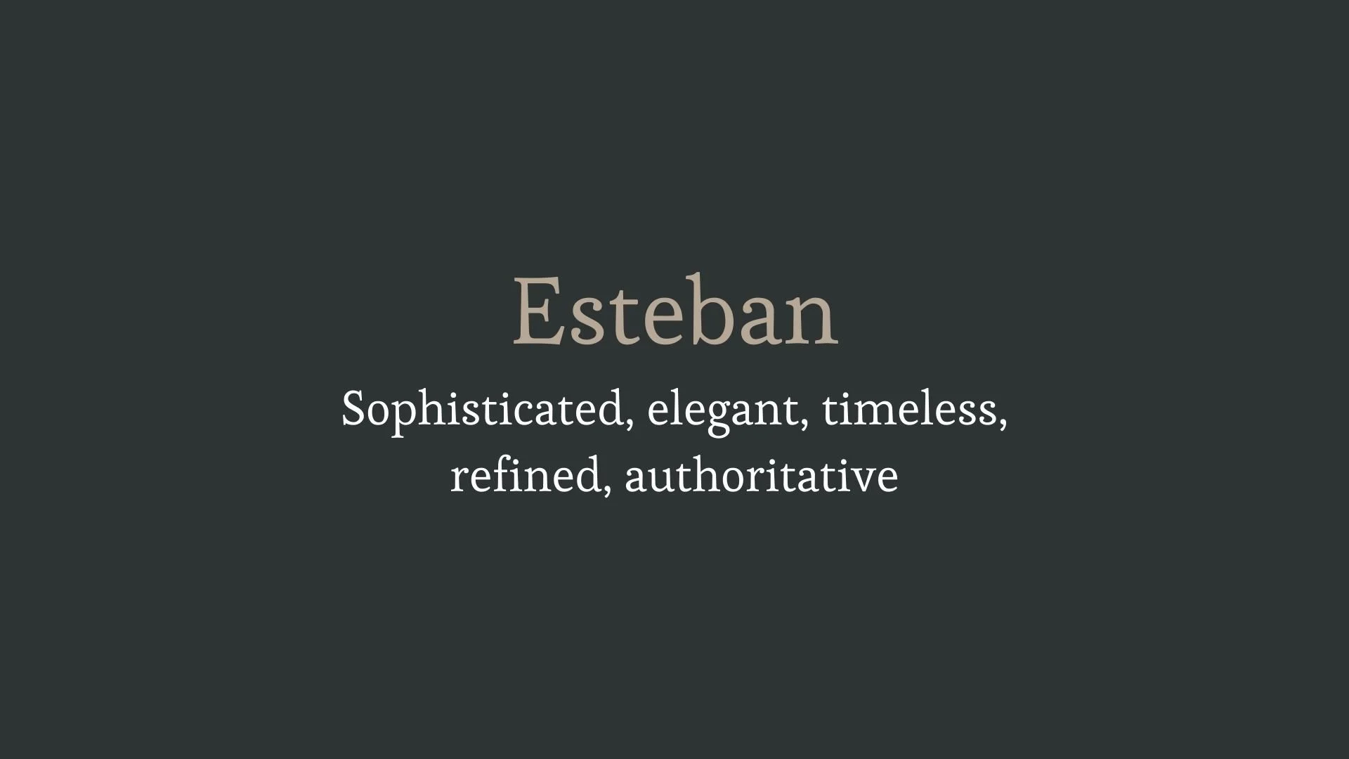
Esteban
Overview:
Esteban is a humanist serif typeface that blends traditional and modern design elements. Known for its warm and approachable appearance, Esteban is highly legible and versatile, making it suitable for a variety of applications, from print to digital. Its distinctive letterforms, featuring soft curves and sharp contrasts, lend it a sophisticated yet contemporary feel.
History:
Esteban was created by José Scaglione and Veronika Burian of TypeTogether, a well-respected type foundry. Released in 2013, the typeface was designed to fill a gap in the market for a modern serif with a humanist influence, aimed at providing both readability and personality. It was specifically crafted to perform well in editorial contexts while maintaining warmth and elegance, making it a perfect choice for books, magazines, and other long-form text.
Characteristics:
Design: Esteban features classic humanist characteristics with its organic shapes and high contrast between thick and thin strokes. The typeface has a slight calligraphic feel, which adds personality while keeping its forms clear and functional. Its letterforms are slightly condensed, offering efficiency without compromising legibility.
Usage: Ideal for both print and digital media, Esteban works particularly well for long text applications such as books, editorial designs, and magazines. Its versatility also makes it suitable for branding, headlines, and other display uses, where a touch of sophistication is needed.
Attributes: Esteban is elegant, warm, and highly readable, with subtle hints of calligraphy that give it a timeless charm. The typeface offers excellent legibility even in small sizes, making it ideal for body text, while its refined design ensures it stands out in larger sizes as well. Its rounded serifs and fluid curves provide a balance of classic and contemporary appeal.


FONT PERSONALITY
-
FONT PERSONALITY -

Why Poppins and Esteban are a Match Made in Heaven:
The combination of Poppins and Esteban creates a perfect balance between energy and elegance, making it a pairing that stands out for its versatility and sophistication. Poppins brings a modern, approachable, and friendly vibe, making it ideal for creating engaging headlines and body copy that immediately draws attention without feeling overpowering. Esteban, with its timeless, refined, and authoritative presence, provides the ideal contrast by adding an air of elegance and grace, grounding the playful nature of Poppins with its sophisticated touch. Together, they balance warmth and professionalism, inviting viewers in while maintaining an air of prestige and trustworthiness.
This pairing would be perfect for someone who is stylish yet approachable—a dynamic individual who wants to convey both their creative energy and a sense of authority. This person is likely someone in a leadership role in a creative industry, such as a branding consultant, interior designer, or a creative director who blends contemporary design with a classic, polished aesthetic. They understand the importance of appealing to both emotion and intellect and wish to project an image of innovation that is also rooted in refined taste.

CELEBRITY MATCH
-
CELEBRITY MATCH -
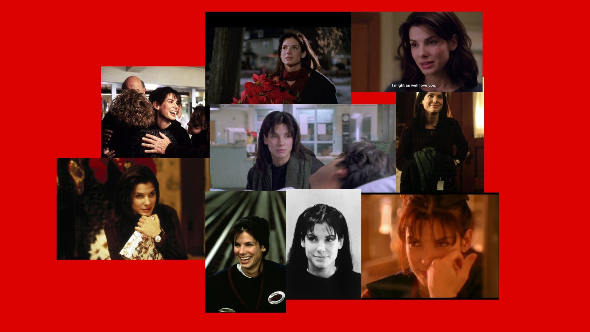
The font pairing of Poppins and Esteban aligns perfectly with the character of Grace Ballard, as portrayed by Sandra Bullock in the movie "While You Were Sleeping (1995)".
Summary: Poppins aligns with Grace’s vibrant, friendly, and approachable nature, representing her openness, adaptability, and warmth as she becomes more involved with the Callaghan family and ultimately falls in love with Peter. Esteban mirrors her sophisticated, elegant, and refined demeanor, especially in how she interacts with Peter's family and handles the situation with dignity, despite the emotional challenges. Together, Poppins and Esteban reflect Grace’s personality: modern and approachable, yet capable of exuding quiet sophistication. She is vibrant and warm in her personal connections but also poised and thoughtful in how she navigates more serious moments in the film. This pairing creates a visual balance between energy and elegance, much like Grace’s ability to balance her own personal growth with the complex love story unfolding around her. In sum, the Poppins-Esteban combination embodies the essence of Grace Ballard from While You Were Sleeping —a woman who is both modern and welcoming, yet grounded in timeless values of love and respect.

HIERARCHY
-
HIERARCHY -
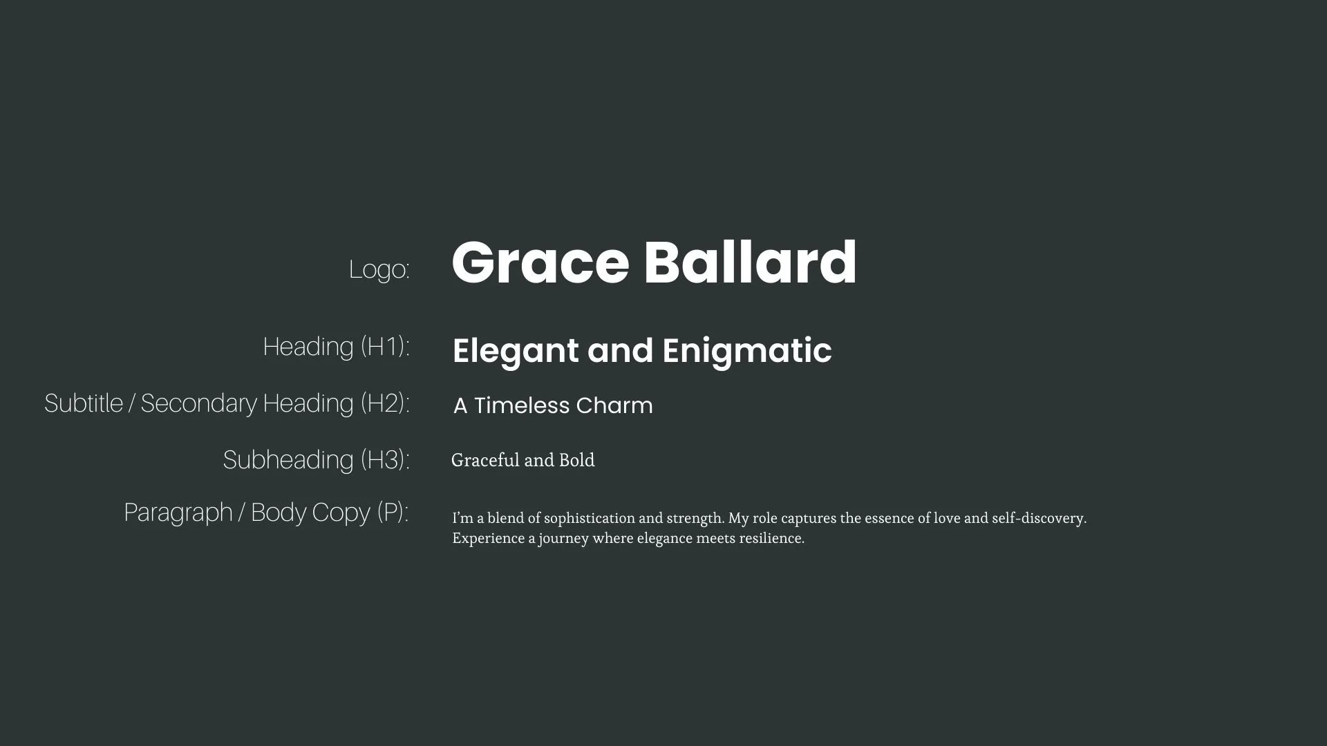
Font Hierarchy for Poppins and Esteban:
Logo
Usage: Primary logo text, initials, brand name
Poppins, Bold, 48pt (Canva), 36px (Squarespace)
Heading (H1)
Usage: Main headings on pages, prominent titles
Poppins, Semi-Bold, 36pt (Canva), 28px (Squarespace)
Subtitle / Secondary Heading (H2)
Usage: Section titles, important subtitles
Poppins, Regular, 24pt (Canva), 20px (Squarespace)
Subheading (H3)
Usage: Subsection headings, less prominent titles
Esteban, Regular, 20pt (Canva), 18px (Squarespace)
Paragraph / Body Copy (P)
Usage: Main body text, paragraphs, descriptions
Esteban, Regular, 16pt (Canva), 16px (Squarespace)