MEET YOUR FONT PAIRING MATCH
This page is your custom breakdown of the font pairing you were matched with from the Find Your Font Quiz. You’ll discover the history, personality, and style of each font—and see how they can come to life in your personal brand.
If you're a Personal Branding Studio member:
Bookmark this page. We’ll return to it in Part 2 when it’s time to use your font pairing to design your logo and create branded Canva graphics.
Not loving this particular combo? No problem. Explore all 100+ font pairings inside PBS - Part 1, Module 4: Design - to find one that feels just right. Click the button below to go there now.
Not yet a Personal Branding Studio member?
(And wondering what Personal Branding Studio even is?)
Start by scrolling through your results below. At the bottom of this page, you’ll find out how to go deeper with your personal brand through my full Personal Branding Studio program.
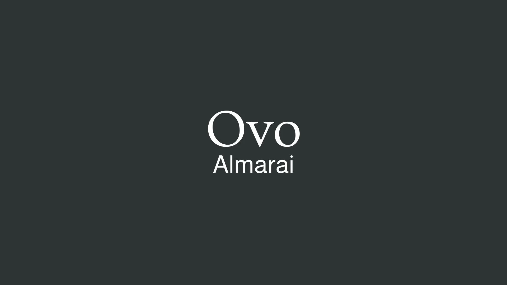
And your aligned font pairing match is…

HISTORY
-
HISTORY -
Ovo
Overview:
Ovo is a serif typeface that combines traditional elegance with contemporary readability. Its design is distinctive for its well-rounded, sturdy letterforms, making it a versatile choice for both print and digital media. Its classic yet modern appeal allows it to be used in a variety of applications, from editorial content to branding and packaging.
History:
Ovo was created by the Brazilian type designer, Rafael Costa. Released in 2010 through the type foundry TypeTogether, Ovo was designed with the goal of creating a typeface that bridges the gap between modern and classic serif designs. Costa sought to craft a typeface that could be both legible and warm, with an emphasis on clear, distinct characters that would perform well in both print and on-screen uses. The font was inspired by early 20th-century fonts but with more modern proportions and refinements.
Characteristics:
Design: The typeface features rounded serifs with soft curves, creating a friendly and approachable aesthetic. Its proportions are balanced and open, contributing to excellent legibility at both small and large sizes. The characters possess a slightly condensed feel, making it efficient in terms of space without sacrificing readability.
Usage: Ovo is perfect for long text settings such as books, editorial design, and web content. Its readability and timeless appeal also make it suitable for branding, logos, and advertising. Ovo is an excellent choice for both body text and display applications.
Attributes: The font has a harmonious and timeless quality, offering high readability and legibility, thanks to its open apertures and generous spacing. It balances the warmth of traditional serifs with modern design sensibilities, making it an ideal choice for versatile and sophisticated design projects.

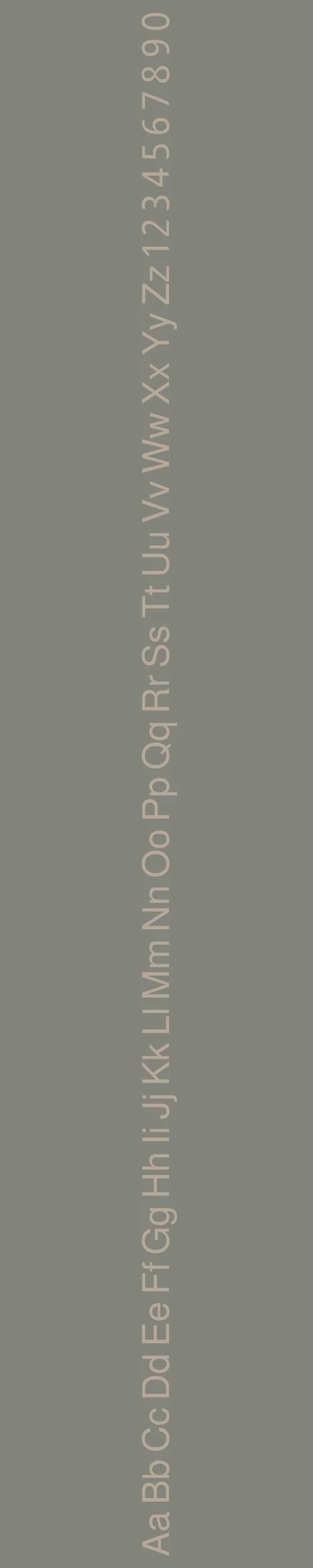
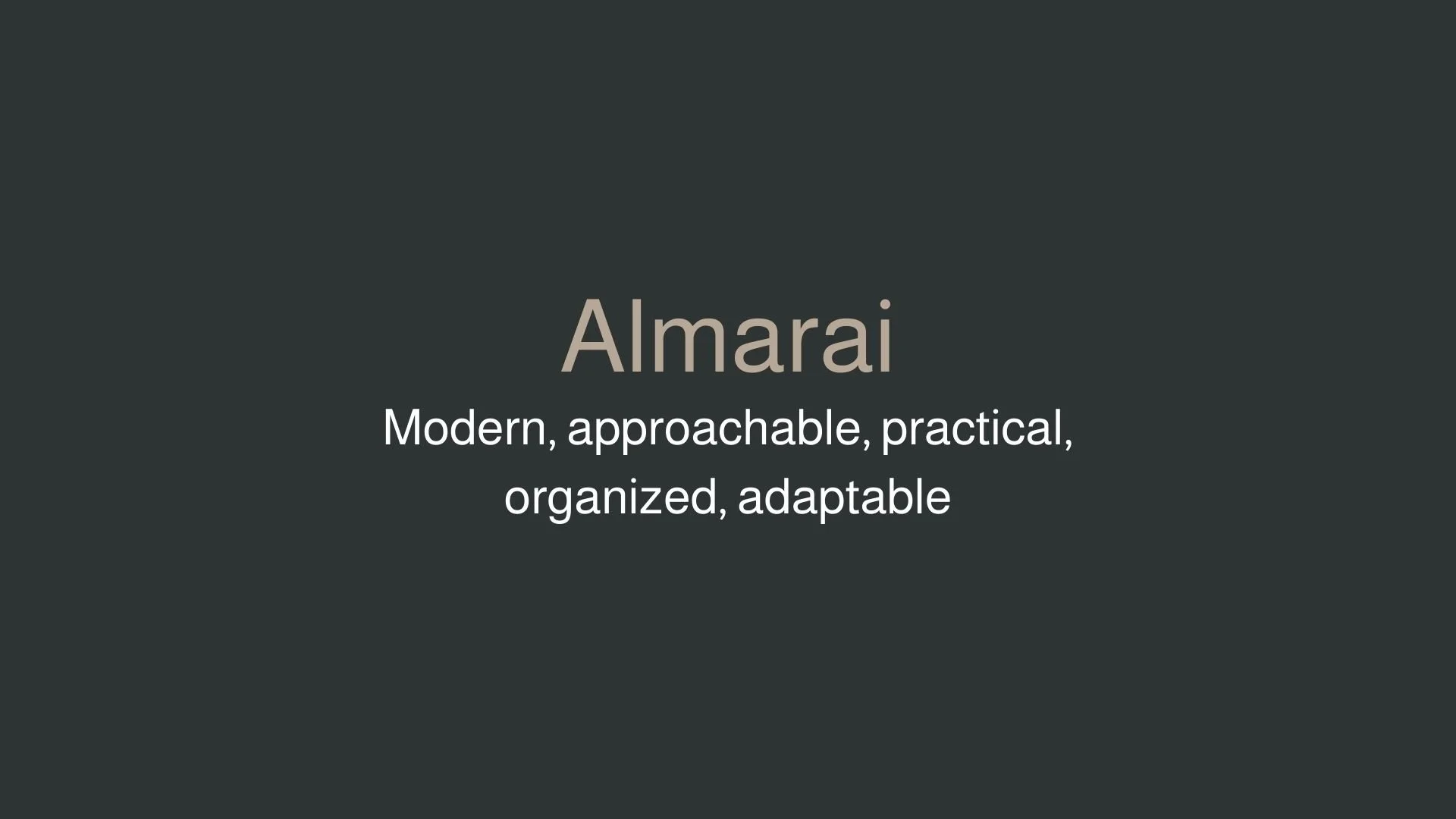
Almarai
Overview:
Almarai is a modern, versatile Arabic typeface designed with a contemporary, geometric style. Its clean and open letterforms make it highly legible, with an emphasis on functionality across both print and digital platforms. Almarai brings together traditional Arabic calligraphy with a modern typographic approach, making it a perfect choice for diverse applications that require a blend of legibility and elegance.
History:
Almarai was designed by Tarek Atrissi, a renowned Lebanese type designer, and released by the type foundry Tarek Atrissi Design in 2014. The typeface was created with the goal of providing a modern and highly legible Arabic font that could be used across various media, especially digital platforms. The project was aimed at enhancing the typographic options available for Arabic text, offering a contemporary yet traditional look for corporate branding, advertising, and editorial design.
Characteristics:
Design: Almarai features clean, geometric forms with a slight humanistic touch. Its open letterforms, high x-height, and well-balanced proportions make it highly legible in both large and small sizes. The typeface combines traditional Arabic calligraphic elements with modern typographic precision, ensuring clarity and readability.
Usage: Almarai is ideal for both display and body text, making it suitable for a variety of uses such as websites, mobile apps, editorial design, branding, and advertising. Its clean and neutral appearance ensures versatility across multiple contexts, from corporate materials to digital content.
Attributes: Almarai is a highly legible, neutral, and modern Arabic typeface with a subtle calligraphic influence. It provides a contemporary look while maintaining the essence of Arabic script, making it a reliable choice for various design applications, from headlines to text-heavy layouts. Its clear design and legibility make it a versatile typeface for diverse design projects in Arabic.

FONT PERSONALITY
-
FONT PERSONALITY -

Why Ovo and Almarai are a Match Made in Heaven:
The pairing of Ovo and Almarai creates a harmonious blend of timeless sophistication and modern accessibility. Ovo’s refined elegance and formal, graceful presence provide a classic foundation, perfect for high-end branding or projects that require an air of authority and tradition. Almarai, with its clean, modern design and approachable character, adds a layer of warmth and practicality, ensuring that the design remains relatable and functional without losing its stylish appeal. The combination results in a balanced and polished look, where sophistication meets approachability in a way that feels both current and enduring.
This font pairing would appeal to someone who values both tradition and innovation in their personal brand—someone who is sophisticated yet approachable. A person using Ovo and Almarai might be in a profession that blends the old and the new, such as a luxury consultant, a creative director, or a founder of a boutique design firm. They would be someone who exudes confidence, is seen as an expert in their field, and seeks to communicate professionalism with a touch of modern flair, making them relatable and trustworthy in a variety of settings.

CELEBRITY MATCH
-
CELEBRITY MATCH -

The font pairing of Ovo and Almarai aligns perfectly with the character of Daisy Buchanan, as portrayed by Carey Mulligan in the movie "The Great Gatsby (2013)".
Summary: The pairing of Ovo and Almarai is a perfect reflection of the characters from The Great Gatsby. Carey Mulligan’s portrayal of Daisy Buchanan embodies the elegance, sophistication, and timeless grace of Ovo , while Elizabeth Debicki’s Jordan Baker captures the modern, approachable, and practical traits of Almarai . The blend of these two fonts mirrors the balance of classic elegance and modern practicality, making the design visually striking yet highly functional—just like the dynamic between Daisy and Jordan in the film.

HIERARCHY
-
HIERARCHY -

Font Hierarchy for Ovo and Almarai:
Logo
Usage: Primary logo text, initials, brand name
Ovo, Regular, 60 pt (Canva), 60 px (Squarespace)
Heading (H1)
Usage: Main headings on pages, prominent titles
Ovo, Regular, 48 pt (Canva), 48 px (Squarespace)
Subtitle / Secondary Heading (H2)
Usage: Section titles, important subtitles
Almarai, Bold, 36 pt (Canva), 36 px (Squarespace)
Subheading (H3)
Usage: Subsection headings, less prominent titles
Almarai, Regular, 28 pt (Canva), 28 px (Squarespace)
Paragraph / Body Copy (P)
Usage: Main body text, paragraphs, descriptions
Almarai, Regular, 16 pt (Canva), 16 px (Squarespace)