MEET YOUR FONT PAIRING MATCH
This page is your custom breakdown of the font pairing you were matched with from the Find Your Font Quiz. You’ll discover the history, personality, and style of each font—and see how they can come to life in your personal brand.
If you're a Personal Branding Studio member:
Bookmark this page. We’ll return to it in Part 2 when it’s time to use your font pairing to design your logo and create branded Canva graphics.
Not loving this particular combo? No problem. Explore all 100+ font pairings inside PBS - Part 1, Module 4: Design - to find one that feels just right. Click the button below to go there now.
Not yet a Personal Branding Studio member?
(And wondering what Personal Branding Studio even is?)
Start by scrolling through your results below. At the bottom of this page, you’ll find out how to go deeper with your personal brand through my full Personal Branding Studio program.
And your aligned font pairing match is…

HISTORY
-
HISTORY -
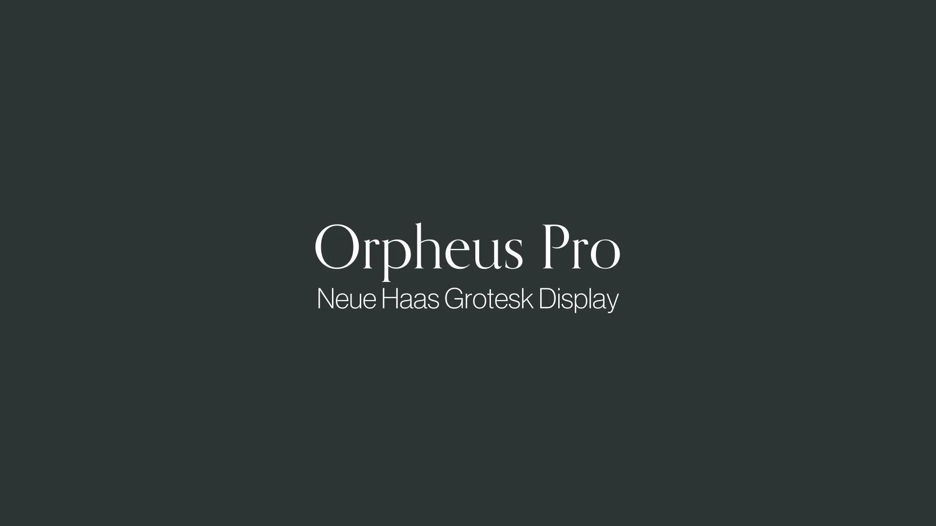
Orpheus Pro
Overview:
Orpheus Pro is a sophisticated serif typeface that combines classical elegance with contemporary design principles. It is known for its refined, balanced proportions and high legibility, making it a versatile choice for both display and body text across print and digital media.
History:
Orpheus Pro was designed by Svetoslav Simov and released in 2010 by the type foundry Fontfabric. The typeface was created as an updated version of the original Orpheus, designed in the 1950s by the renowned Bulgarian type designer, Dobrev. Orpheus Pro was developed with the aim of modernizing the classic serif design, providing a more extensive range of weights and styles while preserving the graceful and timeless qualities of its predecessor.
Characteristics:
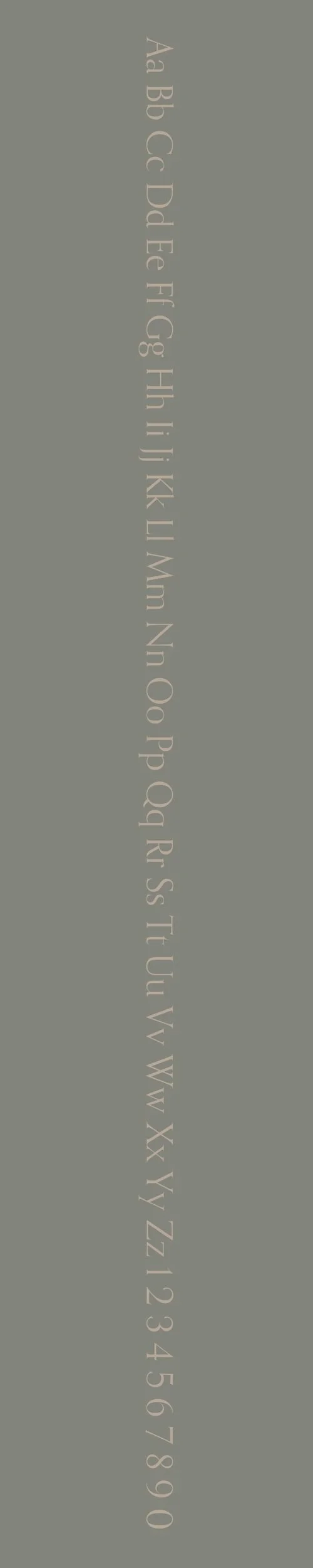
Design: Orpheus Pro features sharp, distinct serifs and subtle contrast between thick and thin strokes. The letterforms are inspired by classical typefaces but are adapted for modern use with slightly more open apertures and a broader x-height. Its high contrast and elegant curves give it a sophisticated, yet approachable appearance.
Usage: Orpheus Pro is particularly well-suited for editorial work, branding, and high-end advertising. Its refined look makes it ideal for print books, magazines, luxury product packaging, and websites that aim for a traditional yet modern feel.
Attributes: Orpheus Pro is characterized by its elegant serifs, strong verticality, and versatility across various weights. It balances traditional serif qualities with a contemporary edge, offering legibility and visual appeal in both large and small sizes.
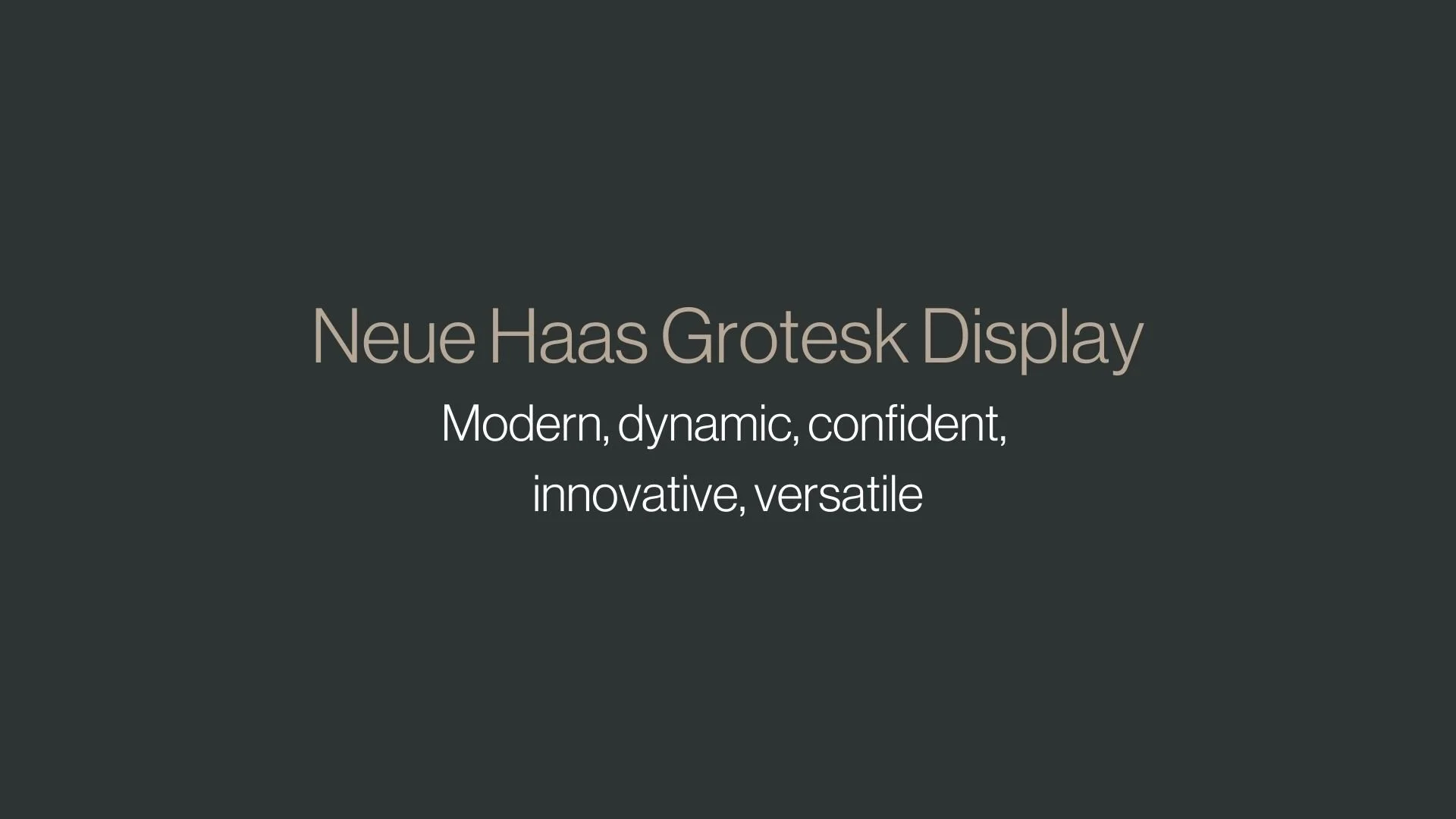
Neue Haas Grotesk Display
Overview:
Neue Haas Grotesk Display is a refined version of the classic sans-serif typeface Helvetica, designed for high-impact display use. It maintains the clean and neutral aesthetic of Helvetica but is optimized for larger sizes, making it ideal for bold, attention-grabbing applications.
History:
Neue Haas Grotesk Display was developed by the renowned Swiss type foundry Haas, with its origins tracing back to 1957 when it was first released as Haas Grotesk. The design was later adapted by Max Miedinger, and it became globally famous as Helvetica in 1957. Neue Haas Grotesk Display was introduced as part of a broader re-release of the original Haas Grotesk in the 2000s by the font foundry Linotype, under the stewardship of designer Christian Schwartz. The primary aim of the Display variant was to offer a version of the classic design that performed better at larger sizes, such as in headlines and signage, without losing its iconic neutrality.
Characteristics:
Design: Neue Haas Grotesk Display features a clean, geometric design with a high level of contrast in stroke weights. The font has a strong, uniform structure that makes it highly legible at large sizes while retaining the classic features of Helvetica, such as its tight spacing and straight terminals. Its design has been adjusted for display purposes, with slightly bolder letterforms and more defined curves to ensure better readability at larger sizes.
Usage: This typeface is particularly suited for large-scale design work, including headlines, posters, advertisements, and branding. It is perfect for any application where visual impact is key, such as in magazines, billboards, and digital interfaces that require clear and commanding typography at large sizes.
Attributes: Neue Haas Grotesk Display is clean, neutral, and versatile. It offers excellent legibility, making it ideal for both digital and print contexts. Its high contrast and geometric forms make it bold and impactful, while its refined structure ensures that it remains elegant and readable even in large formats.


FONT PERSONALITY
-
FONT PERSONALITY -

Why Orpheus Pro and Neue Haas Grotesk Display are a Match Made in Heaven:
The pairing of Orpheus Pro and Neue Haas Grotesk Display creates a perfect harmony of classic sophistication and modern dynamism. Orpheus Pro, with its elegant, cultured, and timeless characteristics, brings a sense of grace and refinement, ideal for setting a distinguished tone in any design. Meanwhile, Neue Haas Grotesk Display complements this with its modern, dynamic, and confident presence. This contrast between the classical charm of Orpheus Pro and the cutting-edge energy of Neue Haas Grotesk creates a pairing that feels both rooted in tradition and yet completely forward-thinking. The two fonts together create a visually striking balance, where Orpheus Pro’s delicate elegance is grounded by Neue Haas Grotesk’s bold, versatile nature, resulting in a design that feels both refined and fresh.
This font pairing would be perfect for someone with a personal brand that blends tradition with innovation—a creative professional or entrepreneur who values both timeless elegance and modern boldness. Such a person might be in the fields of high-end design, luxury branding, or forward-thinking technology, where sophistication and cutting-edge innovation meet. They are likely someone who is confident in their refined taste but also passionate about staying ahead of trends, someone who wants their brand to convey both heritage and progressive vision.

CELEBRITY MATCH
-
CELEBRITY MATCH -
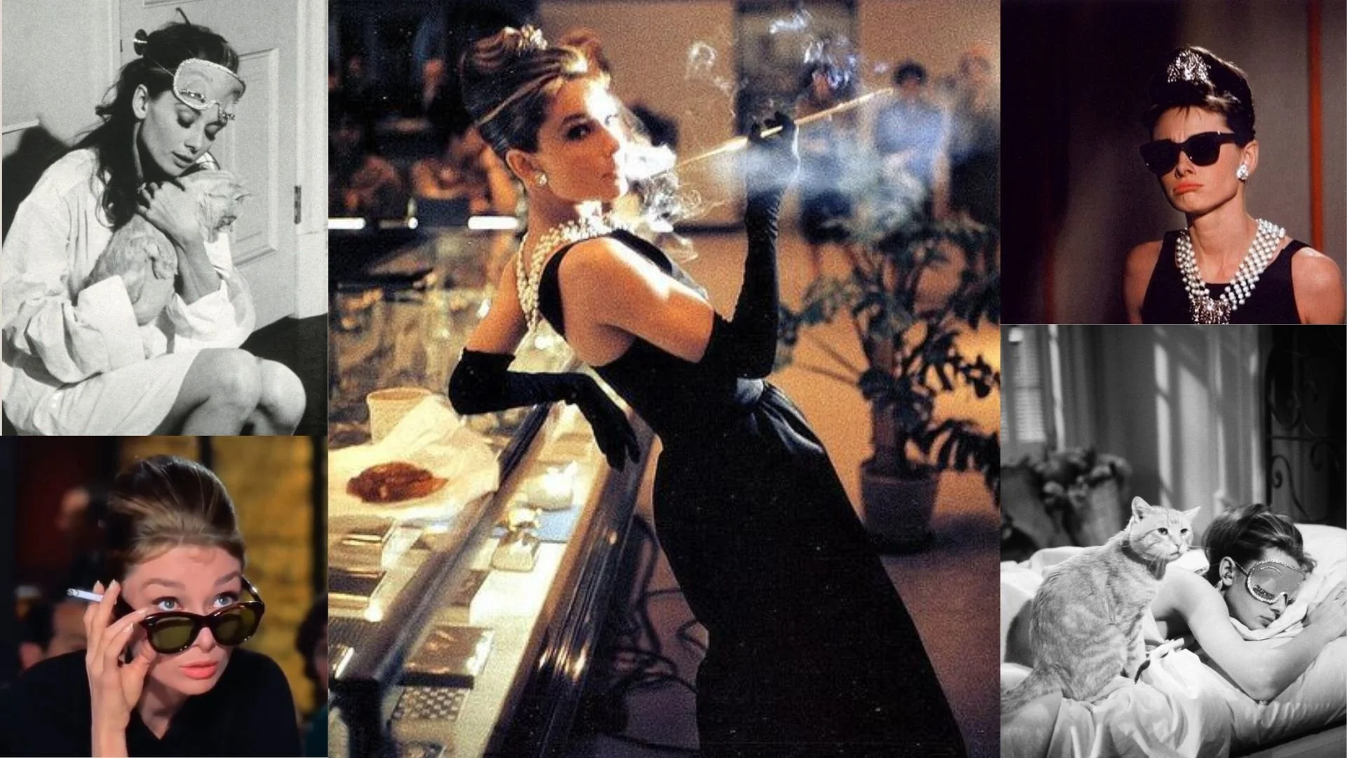
The font pairing of Orpheus Pro and Neue Haas Grotesk Display aligns perfectly with the character of Holly Golightly, as portrayed by Audrey Hepburn in the movie "Breakfast at Tiffany's" .
Summary: Audrey Hepburn as Holly Golightly in "Breakfast at Tiffany's" embodies the classical elegance and sophistication akin to Orpheus Pro. Her character's appreciation for the arts and refined taste aligns beautifully with the font's graceful and timeless charm. Angelina Jolie as Lara Croft in "Lara Croft: Tomb Raider" captures the dynamic and contemporary spirit of Neue Haas Grotesk Display. Lara's bold and adventurous persona mirrors the font's modernity and versatility, making it a fitting choice for impactful and innovative design applications. Each font persona, Orpheus Pro and Neue Haas Grotesk Display, brings its own distinct style and appeal to typographic expression, catering to different preferences and applications in design and storytelling.

HIERARCHY
-
HIERARCHY -
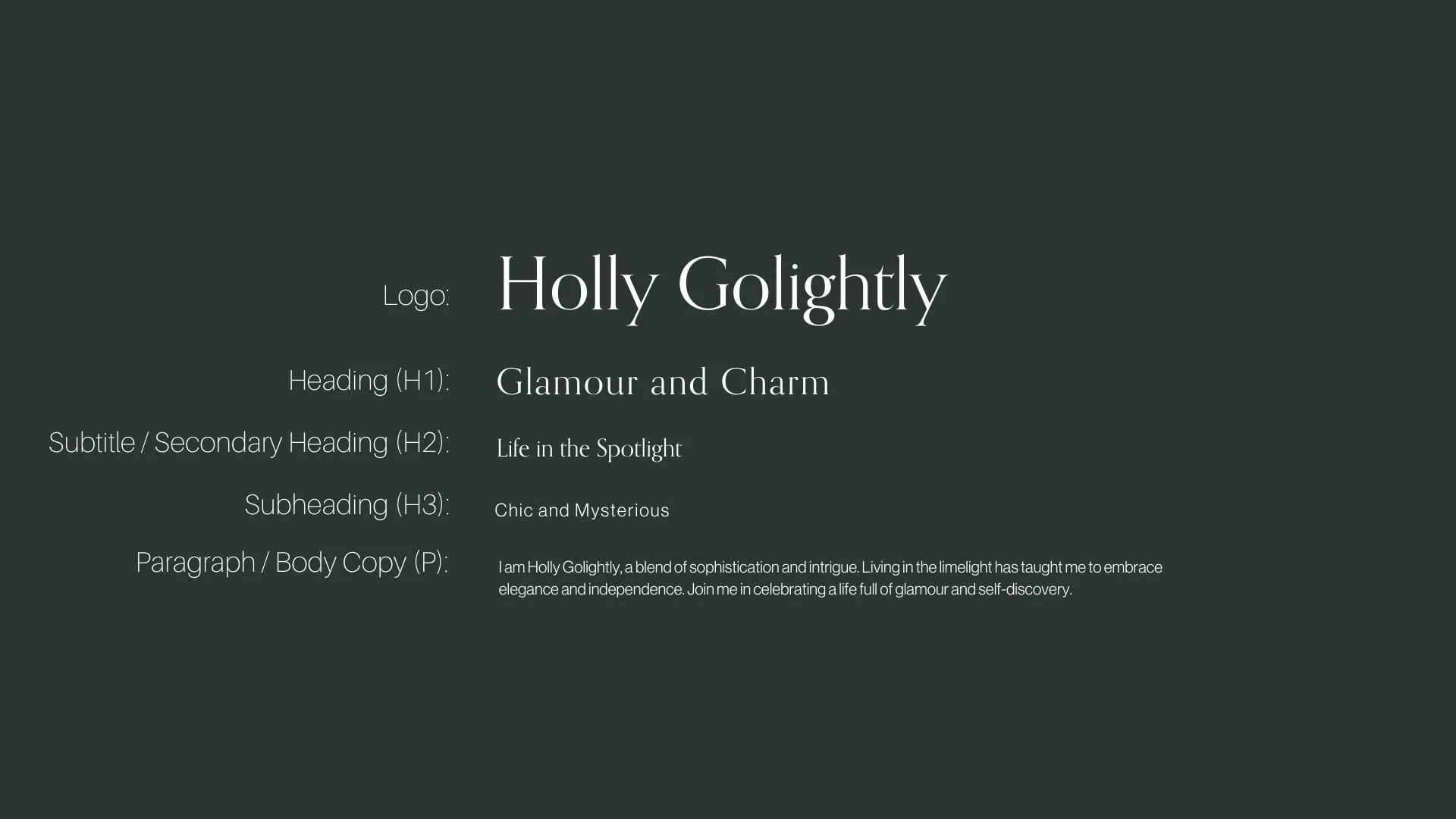
Font Hierarchy for Orpheus Pro and Neue Haas Grotesk Display:
Logo
Usage: Primary logo text, initials, brand name
Orpheus Pro, Regular, 48-60 px (Canva), 4.5-6 rem (Squarespace)
Heading (H1)
Usage: Main headings on pages, prominent titles
Orpheus Pro, Regular, 36 px (Canva), 36px (Squarespace)
Subtitle / Secondary Heading (H2)
Usage: Section titles, important subtitles
Orpheus Pro, Regular, 24px (Canva), 24px (Squarespace)
Subheading (H3)
Usage: Subsection headings, less prominent titles
Neue Haas Grotesk Display, Regular, 18px (Canva), 18px (Squarespace)
Paragraph / Body Copy (P)
Usage: Main body text, paragraphs, descriptions
Neue Haas Grotesk Display, Regular, 16 px (Canva), 16px (Squarespace)