MEET YOUR FONT PAIRING MATCH
This page is your custom breakdown of the font pairing you were matched with from the Find Your Font Quiz. You’ll discover the history, personality, and style of each font—and see how they can come to life in your personal brand.
If you're a Personal Branding Studio member:
Bookmark this page. We’ll return to it in Part 2 when it’s time to use your font pairing to design your logo and create branded Canva graphics.
Not loving this particular combo? No problem. Explore all 100+ font pairings inside PBS - Part 1, Module 4: Design - to find one that feels just right. Click the button below to go there now.
Not yet a Personal Branding Studio member?
(And wondering what Personal Branding Studio even is?)
Start by scrolling through your results below. At the bottom of this page, you’ll find out how to go deeper with your personal brand through my full Personal Branding Studio program.
And your aligned font pairing match is…


HISTORY
-
HISTORY -
Ojuju
Overview:
Ojuju is a striking sans-serif typeface with a strong Afro-grotesque influence, designed to blend modern typography with African cultural heritage. Its distinctive geometric shapes, sharp and rounded corners, and cultural references give it a bold yet approachable aesthetic, ideal for a wide range of design applications, from branding to editorial and digital content.
History:
Ojuju was created by Nigerian designer Seyi Peter-Thomas and released in 2017. The design draws inspiration from African traditional dance costumes and masks, particularly the eye cuttings of the Dogon dancers from Mali, and 1970s African movie poster lettering. The font was developed to reflect African heritage while offering practicality for contemporary design needs. Notably, Ojuju supports over 500 African indigenous languages, making it a culturally significant and accessible typeface for global and African-focused projects.
Characteristics:
Design: Ojuju features a reverse contrast weight axis, which allows the font to maintain a visually striking presence while keeping legibility at different sizes. Its characters combine sharp, geometric shapes with softer rounded edges, creating a balanced and dynamic look. The letterforms are slightly condensed, giving it an efficient space-saving design that works well in both display and text applications.
Usage: This font excels in cultural and heritage-based projects, as well as in editorial and branding design. Its unique style, while bold and distinct, remains highly legible, making it suitable for both headings and body text.
Attributes: Ojuju's well-balanced spacing and high x-height ensure clear readability across various applications, from small text to large headlines. It also incorporates ligatures for better text flow and includes alternate characters for added stylistic versatility. The font’s cultural depth combined with its modern usability makes it a strong choice for projects that seek to convey both authenticity and contemporary appeal.

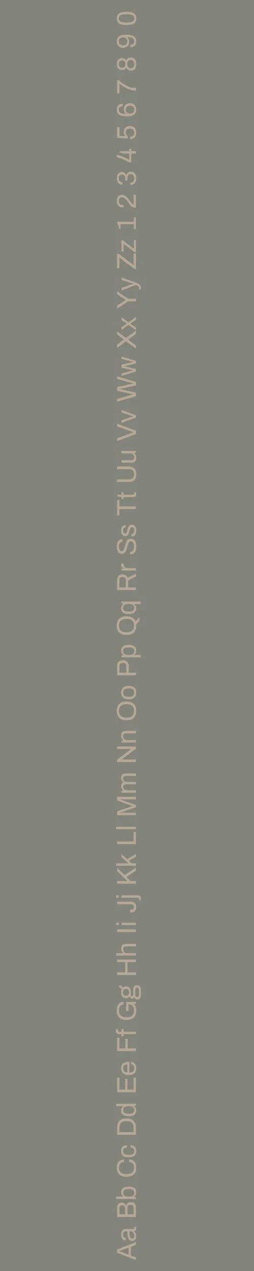
Archivo
Overview:
Archivo is a modern grotesque sans-serif font designed to provide high legibility both in print and on digital platforms. It has a clean, versatile design with a focus on readability at various sizes. Its balanced structure and contemporary feel make it an excellent choice for headlines, web content, and user interfaces.
History:
Archivo was created by Héctor Gatti and released by Omnibus-Type. It was designed to be a highly functional typeface that could be used across both print and digital media. The font draws inspiration from late 19th-century American grotesque typefaces and was developed with a specific emphasis on clarity and impact, supporting over 200 world languages. Archivo has since become widely used due to its versatility and readability.
Characteristics:
Design: Archivo features clean lines and slightly rounded corners, giving it a modern, approachable feel. Its proportions and letterforms make it ideal for both display and body text.
Usage: The typeface is perfect for headlines, signage, web design, and branding. Its strong, neutral appearance ensures it stands out without overpowering other elements.
Attributes: Archivo is highly legible with a straightforward, no-frills design. It includes several weights and styles, including narrow and black, allowing for diverse typographic expression. It works well in both large and small sizes and is optimized for readability across different platforms.

FONT PERSONALITY
-
FONT PERSONALITY -


Why Ojuju and Archivo are a Match Made in Heaven:
Ojuju and Archivo make for an exceptional font pairing because they balance energy and creativity with structure and reliability. Ojuju’s bold, playful, and dynamic nature brings a vibrant and lively touch to the design, making it perfect for creating attention-grabbing headlines or logos. It infuses the design with a sense of fun and creativity. Meanwhile, Archivo’s dependable, organized, and calm qualities provide a grounding balance, offering precision and clarity. This pairing creates a perfect harmony between spontaneity and order, where Ojuju sparks energy and Archivo ensures the design remains polished and professional.
This font pairing would appeal to a person who is both creative and grounded—someone who loves to experiment and push boundaries but also values reliability and structure. They would likely be a dynamic, creative professional who thrives in industries like marketing, design, or content creation, where innovation is essential but execution needs to be smooth and dependable. This person would have a bold personal brand that captures attention while still exuding a sense of sophistication and trustworthiness.

CELEBRITY MATCH
-
CELEBRITY MATCH -

The font pairing of Ojuju and Archivo aligns perfectly with the character of Gwen Stacy, as portrayed by Emma Stone in the movie "The Amazing Spider-Man (2012)".
Summary: Emma Stone’s portrayal of Gwen Stacy in The Amazing Spider-Man embodies the dynamic pairing of Ojuju and Archivo fonts. Ojuju reflects Gwen’s playful and bold spirit, while Archivo mirrors her dependable and organized nature. Together, they represent a balanced combination of excitement and reliability, making the pairing ideal for designs that need both flair and stability, much like Gwen’s role in the film.

HIERARCHY
-
HIERARCHY -

Font Hierarchy for Ojuju and Archivo:
Logo
Usage: Primary logo text, initials, brand name
Ojuju, Regular, 60-80 px (Canva), 48-64 px (Squarespace)
Heading (H1)
Usage: Main headings on pages, prominent titles
Ojuju, Bold, 36-48 px (Canva), 32-40 px (Squarespace)
Subtitle / Secondary Heading (H2)
Usage: Section titles, important subtitles
Archivo, Bold, 24-36 px (Canva), 24-32 px (Squarespace)
Subheading (H3)
Usage: Subsection headings, less prominent titles
Archivo, Regular, 18-24 px (Canva), 18-24 px (Squarespace)
Paragraph / Body Copy (P)
Usage: Main body text, paragraphs, descriptions
Archivo, Regular, 14-18 px (Canva), 14-18 px (Squarespace)