MEET YOUR FONT PAIRING MATCH
This page is your custom breakdown of the font pairing you were matched with from the Find Your Font Quiz. You’ll discover the history, personality, and style of each font—and see how they can come to life in your personal brand.
If you're a Personal Branding Studio member:
Bookmark this page. We’ll return to it in Part 2 when it’s time to use your font pairing to design your logo and create branded Canva graphics.
Not loving this particular combo? No problem. Explore all 100+ font pairings inside PBS - Part 1, Module 4: Design - to find one that feels just right. Click the button below to go there now.
Not yet a Personal Branding Studio member?
(And wondering what Personal Branding Studio even is?)
Start by scrolling through your results below. At the bottom of this page, you’ll find out how to go deeper with your personal brand through my full Personal Branding Studio program.
And your aligned font pairing match is…


HISTORY
-
HISTORY -
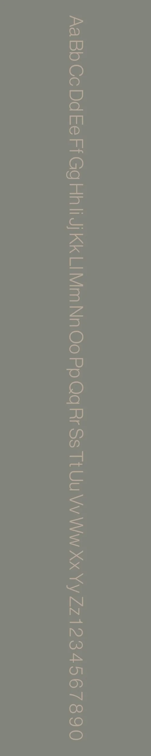
Neue Haas Grotesk Display
Overview:
Neue Haas Grotesk Display is a refined and modern sans-serif typeface, a part of the celebrated Haas Grotesk family, which serves as the precursor to the widely used Helvetica. With its clean, geometric lines and versatile design, Neue Haas Grotesk Display is optimized for use in large sizes, making it ideal for impactful headlines and display settings.
History:
Neue Haas Grotesk was originally designed by Max Miedinger with input from Eduard Hoffmann in 1957, under the name "Haas Grotesk." It was later adapted into what we know today as Helvetica. However, the "Display" version, which is a more recent interpretation, was created in 2010 by Christian Schwartz of the type foundry, Commercial Type. The goal of Neue Haas Grotesk Display was to update the classic Helvetica family for contemporary use, with adjustments that improve legibility and balance, especially in larger sizes. The display version emphasizes characteristics that are more suited to attention-grabbing settings such as posters and headlines, providing a fresh, crisp, and dynamic typographic tool.
Characteristics:
Design: Neue Haas Grotesk Display features clean, geometric forms with high contrast between thick and thin strokes. The letterforms are open and spacious, designed for clarity at large sizes. The condensed style retains some of the warmth and neutrality of the original Haas Grotesk, but with a more refined and modern finish, particularly in the proportions of the letters. Its sharpness and precision make it a sophisticated and versatile font, well-suited for striking typographic layouts.
Usage: This typeface is best used for display applications such as large-scale headlines, posters, billboards, and branding materials where strong visual impact is required. It can also work well in any situation demanding high legibility and contemporary appeal in larger text sizes.
Attributes: Neue Haas Grotesk Display is highly legible at large sizes, with balanced proportions that offer both modernity and classic appeal. The font is versatile, combining the sharp, structured aesthetic of sans-serifs with a clean, almost minimalist design. Its ability to retain readability and offer high-impact visual appeal makes it a popular choice for designers working on editorial, advertising, and branding projects.
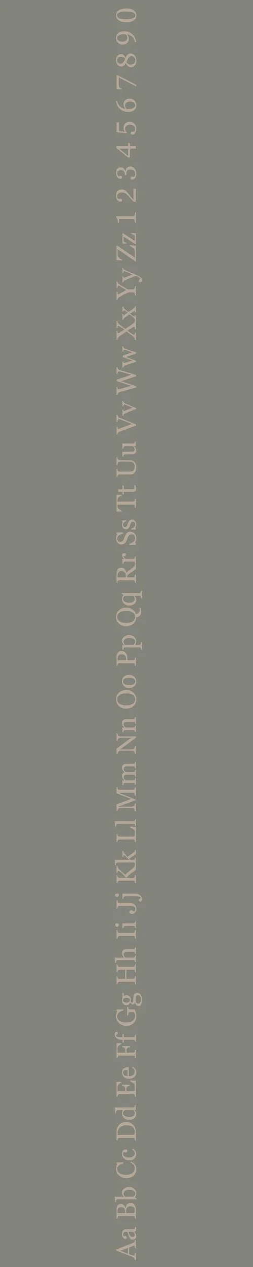
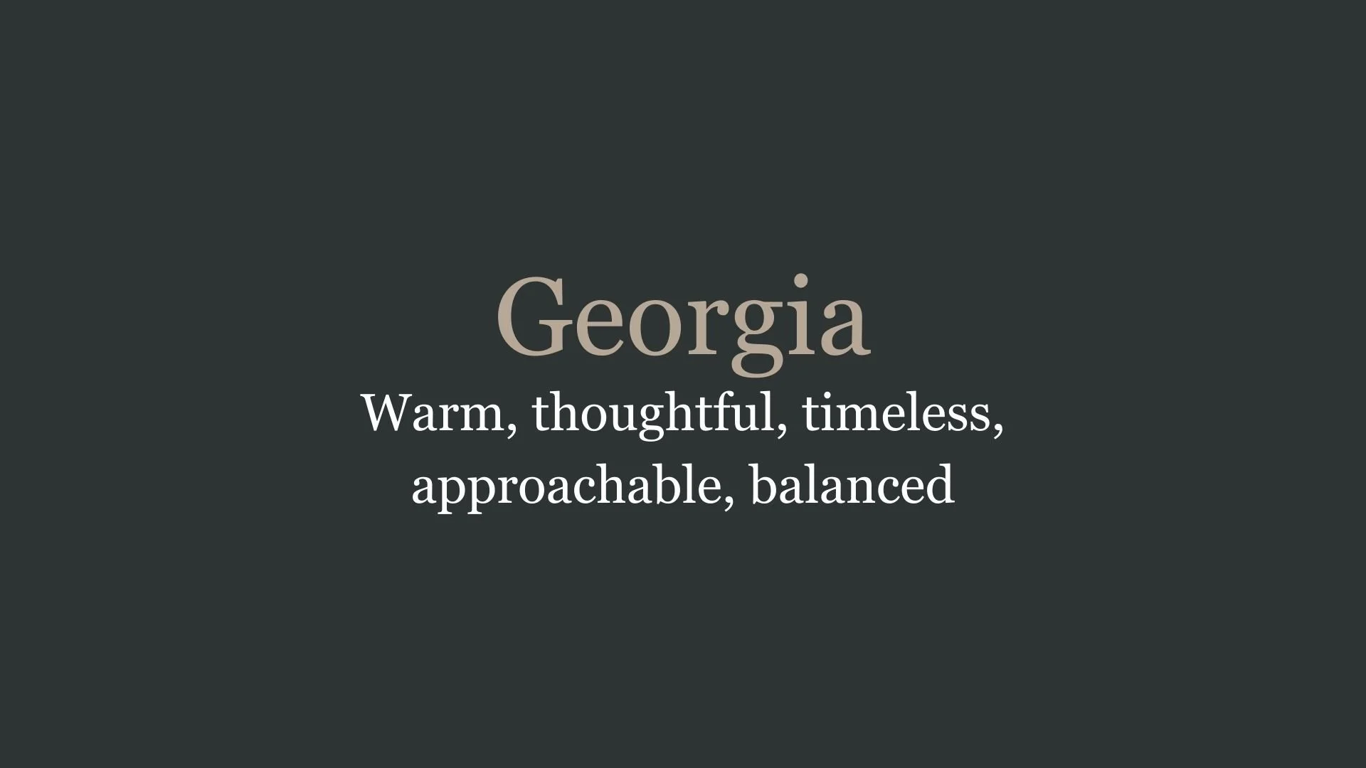
Georgia
Overview:
Georgia is a serif typeface that combines elegance with readability, designed for both screen and print usage. Its classic yet modern design makes it one of the most widely used typefaces for web content and digital media.
History:
Georgia was created by renowned type designer Matthew Carter in 1993 for Microsoft, with the intention of improving legibility on computer screens. It was developed alongside the sans-serif font Verdana, which was also designed by Carter. The aim of Georgia was to provide a typeface that could maintain clarity at small sizes, especially in digital environments where screen resolution could be a limiting factor. Its release as a core web font with Windows 95 and later versions helped cement its place as a go-to font for web design.
Characteristics:
Design: Georgia has a traditional serif structure with large, open counters and a relatively high x-height. Its serifs are more rounded than other classic serif fonts, contributing to its soft and welcoming appearance while maintaining readability. The letterforms are wide, with well-proportioned curves and distinctive, robust serifs.
Usage: Georgia is ideal for web design, body text, and editorial content. Its design allows it to scale well in both large and small sizes, making it perfect for paragraphs of text, websites, and even digital signage. It also works well for print applications such as newspapers, magazines, and books.
Attributes: Georgia is highly legible, with a timeless and professional appearance. Its generous spacing, legible serifs, and clear structure make it a versatile choice for text-heavy layouts, both online and in print.

FONT PERSONALITY
-
FONT PERSONALITY -

Why Neue Haas Grotesk Display and Georgia are a Match Made in Heaven:
The combination of Neue Haas Grotesk Display and Georgia creates a pairing that perfectly balances sleek modernity with timeless warmth. Neue Haas Grotesk Display, with its clean lines and minimalist aesthetic, provides a confident, polished foundation for the pairing, making it ideal for headlines or branding that require a strong, modern presence. Georgia, with its timeless, thoughtful characteristics, softens the visual impact and adds a touch of warmth and approachability. The contrast between these two fonts allows for a sophisticated design that is both visually striking and inviting, making it ideal for those who want their brand to appear both contemporary and grounded.
This font pairing would appeal to a person who values both sophistication and warmth—someone who wants their personal brand to convey confidence while still remaining approachable. This could be an individual who works in a professional yet creative industry, such as a consultant, designer, or strategist, who seeks a balance between modernity and trustworthiness. They would likely be someone who is polished and direct in their communication but also wants to build a brand that feels welcoming and genuine.

CELEBRITY MATCH
-
CELEBRITY MATCH -
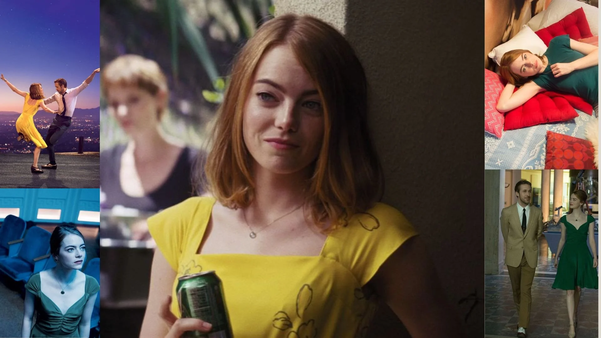
The font pairing of Neue Haas Grotesk Display and Georgia aligns perfectly with the character of Mia Dolan, as portrayed by Emma Stone in the movie "La La Land (2016)" .
Summary: The font pairing of Neue Haas Grotesk Display and Georgia captures a harmonious blend of modern impact and classic elegance. Emma Stone’s role as Mia Dolan in La La Land embodies these qualities perfectly. Mia's modern, ambitious journey aligns with the clean, impactful nature of Neue Haas Grotesk Display, while her timeless elegance resonates with the classic, readable style of Georgia. Together, these traits create a well-rounded and dynamic representation of Mia’s character, paralleling the versatility and balance of the font pairing.

HIERARCHY
-
HIERARCHY -
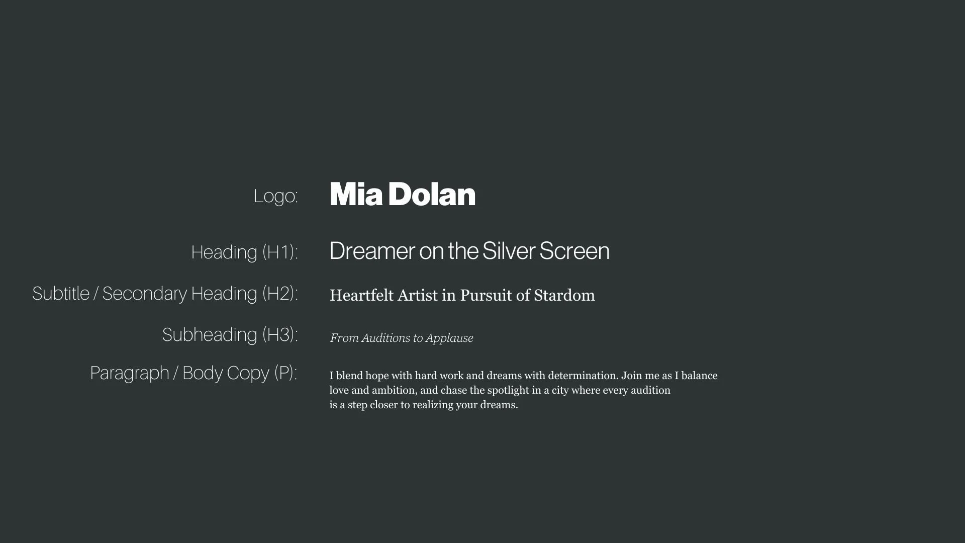
Font Hierarchy for Neue Haas Grotesk Display and Georgia:
Logo
Usage: Primary logo text, initials, brand name
Neue Haas Grotesk Display, Regular or Bold, Use at least 48pt for clarity (Canva), Use 36px for headings (Squarespace)
Heading (H1)
Usage: Main headings on pages, prominent titles
Neue Haas Grotesk Display, Regular or Bold, 36pt (Canva), 24px (Squarespace)
Subtitle / Secondary Heading (H2)
Usage: Section titles, important subtitles
Georgia, Regular, 24pt (Canva), 18px (Squarespace)
Subheading (H3)
Usage: Subsection headings, less prominent titles
Georgia, Italic, 18pt (Canva), 16px (Squarespace)
Paragraph / Body Copy (P)
Usage: Main body text, paragraphs, descriptions
Georgia, Regular, 16 pt (Canva), 14px (Squarespace)