MEET YOUR FONT PAIRING MATCH
This page is your custom breakdown of the font pairing you were matched with from the Find Your Font Quiz. You’ll discover the history, personality, and style of each font—and see how they can come to life in your personal brand.
If you're a Personal Branding Studio member:
Bookmark this page. We’ll return to it in Part 2 when it’s time to use your font pairing to design your logo and create branded Canva graphics.
Not loving this particular combo? No problem. Explore all 100+ font pairings inside PBS - Part 1, Module 4: Design - to find one that feels just right. Click the button below to go there now.
Not yet a Personal Branding Studio member?
(And wondering what Personal Branding Studio even is?)
Start by scrolling through your results below. At the bottom of this page, you’ll find out how to go deeper with your personal brand through my full Personal Branding Studio program.
And your aligned font pairing match is…

HISTORY
-
HISTORY -
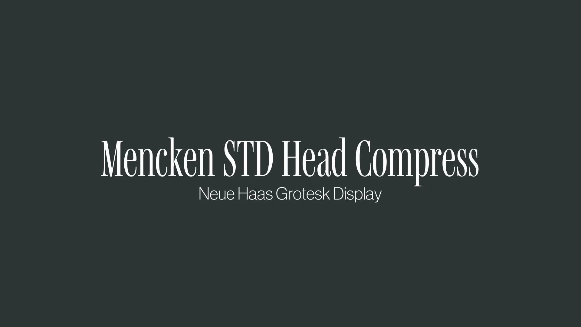
Mencken Std Head Compress
Overview:
Mencken Std Head Compress is a bold and condensed serif typeface, known for its strong presence and impactful design. Its compact letterforms make it ideal for headlines, titles, and display settings, where space is limited but clarity and style are essential.
History:
Mencken Std Head Compress was created by the renowned type designer, Robert Slimbach, for Adobe Fonts. Released in 2010 as part of the Mencken family, it was designed as a condensed version of the original Mencken typeface. The family is named after the American writer H.L. Mencken, known for his sharp wit and editorial expertise, and the font was designed to reflect a bold, no-nonsense typographic approach suitable for editorial and advertising uses. The Head Compress style was crafted specifically to deliver maximum impact in tight spaces, such as newspaper headings and magazine layouts.
Characteristics:
Design: Mencken Std Head Compress features condensed, strong letterforms with sharp serifs and high contrast between thick and thin strokes. The compact design allows for an effective use of space without sacrificing readability. The font’s geometric yet slightly old-style serifs lend it a modern yet traditional feel.
Usage: This typeface is ideal for headlines, editorial titles, and other display applications where space is limited but a bold visual impact is necessary. It is often used in print publications, such as newspapers, magazines, and posters, as well as in branding and advertising where concise and striking typography is required.
Attributes: Std Head Compress is highly legible, with a condensed design that maximizes space while maintaining clarity. It offers a strong, authoritative presence, making it perfect for impactful, attention-grabbing headlines and short-form text. The font’s sharp serifs and high contrast add to its sophistication, making it a versatile and compelling choice for a variety of design contexts.

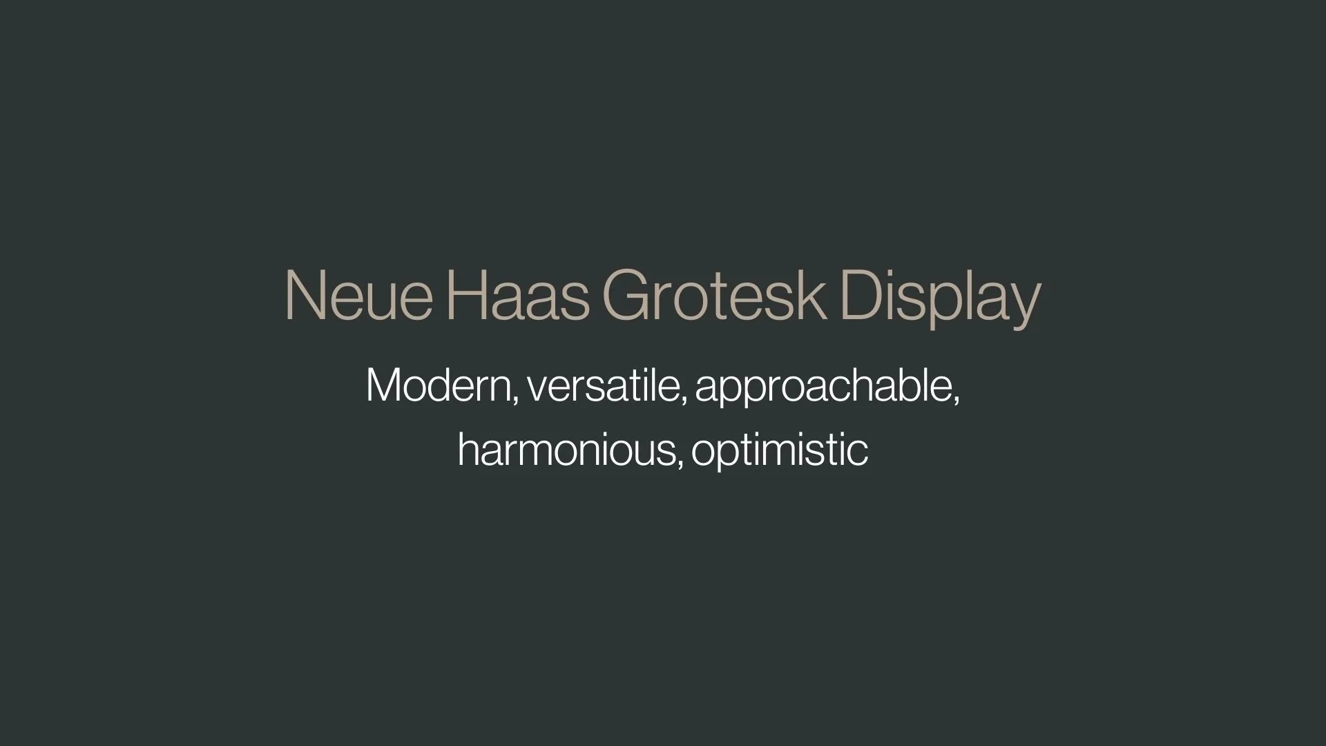
Neue Haas Grotesk Display
Overview:
Neue Haas Grotesk Display is a refined and modern sans-serif typeface, a part of the celebrated Haas Grotesk family, which serves as the precursor to the widely used Helvetica. With its clean, geometric lines and versatile design, Neue Haas Grotesk Display is optimized for use in large sizes, making it ideal for impactful headlines and display settings.
History:
Neue Haas Grotesk was originally designed by Max Miedinger with input from Eduard Hoffmann in 1957, under the name "Haas Grotesk." It was later adapted into what we know today as Helvetica. However, the "Display" version, which is a more recent interpretation, was created in 2010 by Christian Schwartz of the type foundry, Commercial Type. The goal of Neue Haas Grotesk Display was to update the classic Helvetica family for contemporary use, with adjustments that improve legibility and balance, especially in larger sizes. The display version emphasizes characteristics that are more suited to attention-grabbing settings such as posters and headlines, providing a fresh, crisp, and dynamic typographic tool.
Characteristics:
Design: Neue Haas Grotesk Display features clean, geometric forms with high contrast between thick and thin strokes. The letterforms are open and spacious, designed for clarity at large sizes. The condensed style retains some of the warmth and neutrality of the original Haas Grotesk, but with a more refined and modern finish, particularly in the proportions of the letters. Its sharpness and precision make it a sophisticated and versatile font, well-suited for striking typographic layouts.
Usage: This typeface is best used for display applications such as large-scale headlines, posters, billboards, and branding materials where strong visual impact is required. It can also work well in any situation demanding high legibility and contemporary appeal in larger text sizes.
Attributes: Neue Haas Grotesk Display is highly legible at large sizes, with balanced proportions that offer both modernity and classic appeal. The font is versatile, combining the sharp, structured aesthetic of sans-serifs with a clean, almost minimalist design. Its ability to retain readability and offer high-impact visual appeal makes it a popular choice for designers working on editorial, advertising, and branding projects.

FONT PERSONALITY
-
FONT PERSONALITY -
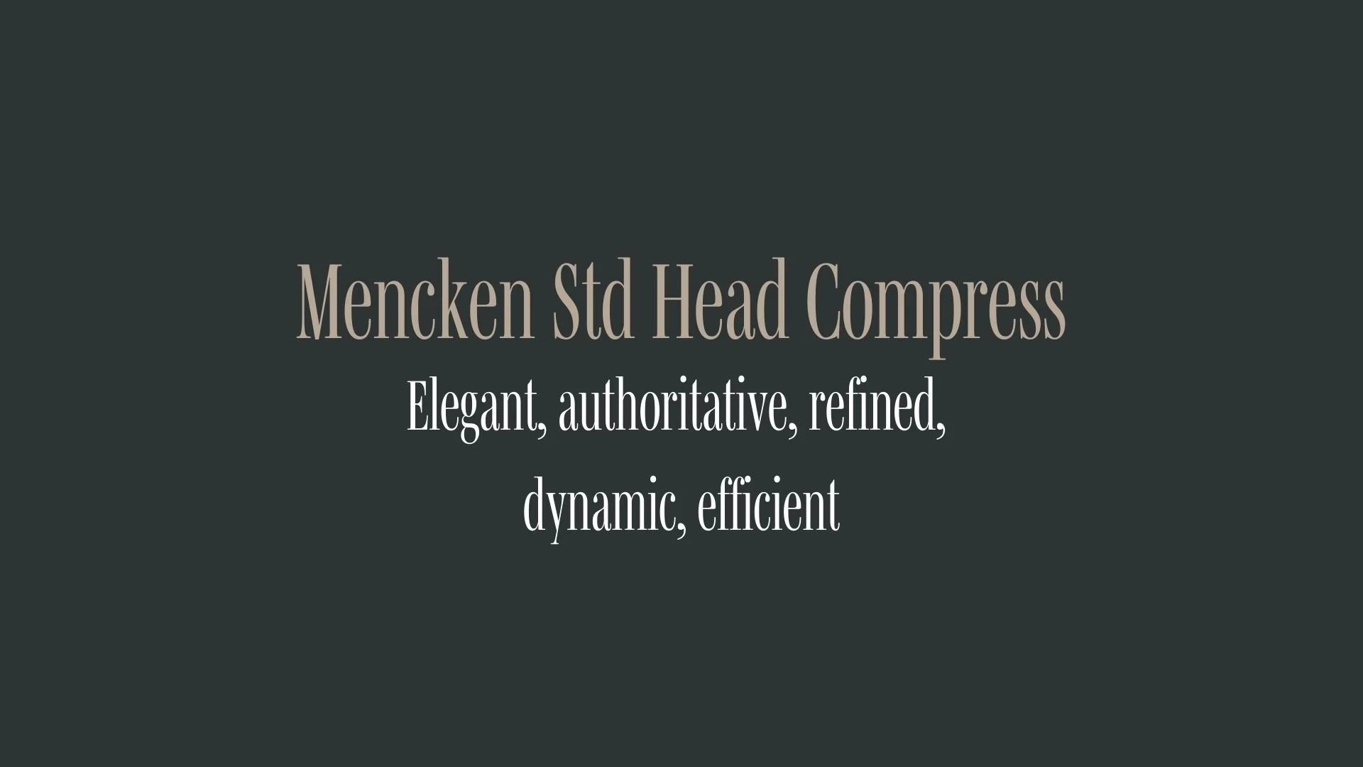
Why Mencken Std Head Compress and Neue Haas Grotesk Display are a Match Made in Heaven:
The combination of Mencken Std Head Compress and Neue Haas Grotesk Display is a harmonious blend of sophistication and approachability, creating a balanced visual experience that is both authoritative and welcoming. Mencken Std Head Compress brings an air of elegance, authority, and refinement, making it perfect for impactful headlines and branding elements that demand attention. Its dynamic yet efficient design ensures clarity while exuding timeless charm. Paired with Neue Haas Grotesk Display’s modern, friendly, and adaptable qualities, this pairing thrives in both contemporary and classic contexts. The clear and optimistic nature of Neue Haas Grotesk Display softens Mencken’s authoritative presence, creating a perfectly balanced aesthetic that is both engaging and polished.
This font pairing would be ideal for a personal brand that values both tradition and modernity. The person using these fonts is likely to be confident and refined, someone who knows the importance of maintaining a strong, professional image but also wants to come across as accessible and forward-thinking. A business consultant, a creative entrepreneur, or even a luxury brand designer might resonate with this pairing. They are individuals who seamlessly blend authority with warmth, bridging the gap between classic elegance and innovative optimism.

CELEBRITY MATCH
-
CELEBRITY MATCH -

The font pairing of Mencken Std Head Compress and Neue Haas Grotesk Display aligns perfectly with the character of Norma Desmond, as portrayed by Glenn Close in the movie "Sunset Boulevard".
Summary: Glenn Close as Norma Desmond in Sunset Boulevard is the perfect match for both fonts, but in distinct ways. Mencken Std Head Compress mirrors Norma's fading elegance, commanding presence, and precision—traits that reflect the grandeur and tragic delusions of her character. Neue Haas Grotesk Display, on the other hand, resonates with Norma's modern, versatile, and optimistic quest for a comeback, despite the harsh realities she faces. Both fonts connect with different aspects of Norma Desmond’s character—Mencken Std Head Compress speaks to her past, while Neue Haas Grotesk Display aligns with her ongoing battle to remain relevant in the present. Together, these fonts encapsulate the duality of Norma’s tragic journey, where nostalgia and modernity collide.

HIERARCHY
-
HIERARCHY -
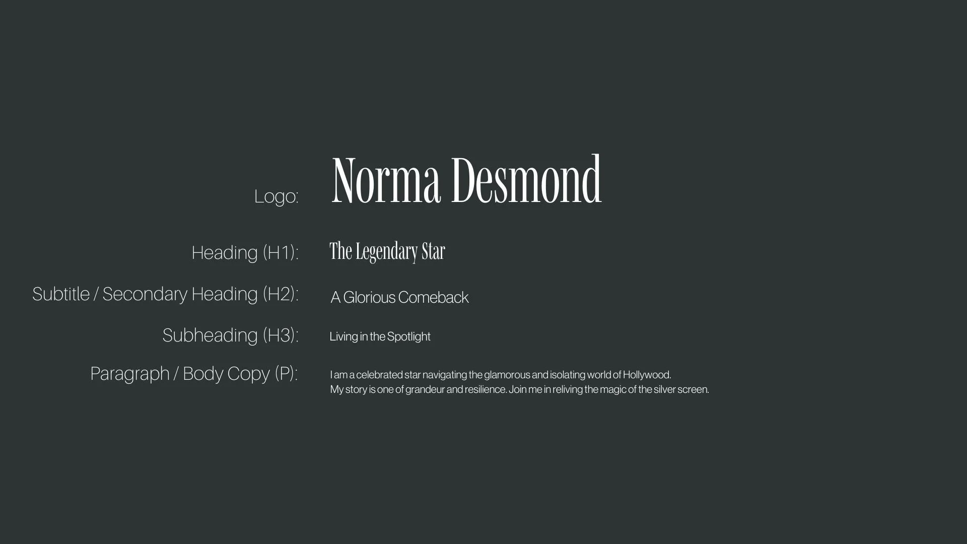
Font Hierarchy for Mencken Std Head Compress and Neue Haas Grotesk Display:
Logo
Usage: Primary logo text, initials, brand name
Mencken Std Head Compress, Regular, approximately 48-72px for Canva (Canva), 4vw (Squarespace)
Heading (H1)
Usage: Main headings on pages, prominent titles
Mencken Std Head Compress, Regular, 36px (Canva), 2.5em based on the design (Squarespace)
Subtitle / Secondary Heading (H2)
Usage: Section titles, important subtitles
Neue Haas Grotesk Display, Regular, 24px (Canva), 1.75em (Squarespace)
Subheading (H3)
Usage: Subsection headings, less prominent titles
Neue Haas Grotesk Display, Regular or Light (depending on readability), 18px (Canva), 1.25em (Squarespace)
Paragraph / Body Copy (P)
Usage: Main body text, paragraphs, descriptions
Neue Haas Grotesk Display, Regular, 16 px (Canva), 1em (Squarespace)