MEET YOUR FONT PAIRING MATCH
This page is your custom breakdown of the font pairing you were matched with from the Find Your Font Quiz. You’ll discover the history, personality, and style of each font—and see how they can come to life in your personal brand.
If you're a Personal Branding Studio member:
Bookmark this page. We’ll return to it in Part 2 when it’s time to use your font pairing to design your logo and create branded Canva graphics.
Not loving this particular combo? No problem. Explore all 100+ font pairings inside PBS - Part 1, Module 4: Design - to find one that feels just right. Click the button below to go there now.
Not yet a Personal Branding Studio member?
(And wondering what Personal Branding Studio even is?)
Start by scrolling through your results below. At the bottom of this page, you’ll find out how to go deeper with your personal brand through my full Personal Branding Studio program.
And your aligned font pairing match is…

HISTORY
-
HISTORY -
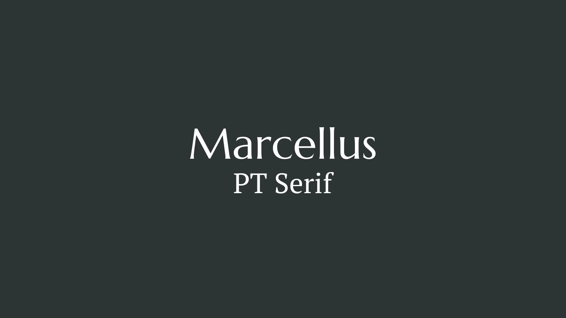
Marcellus
Overview:
Marcellus is a refined and elegant serif typeface that draws inspiration from classic Roman inscriptions. Its graceful proportions and timeless design make it a versatile choice for both contemporary and traditional typographic uses, with a focus on readability and sophistication.
History:
Marcellus was designed by the talented type designer Eduardo Tunni, an Argentine designer and typographer. The font was released in 2011 through the Google Fonts library, making it freely available for both personal and commercial use. Tunni designed Marcellus to capture the spirit of classical letterforms while incorporating subtle modern touches. The aim was to create a typeface that works well for both print and digital environments, offering a balance between tradition and functionality.
Characteristics:
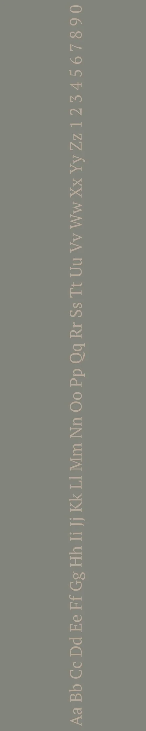
Design: Marcellus features elegant and slightly condensed letterforms with strong contrast in stroke weights, inspired by classical Roman inscriptional styles. The serifs are sharp and delicate, contributing to its stately and formal appearance. The overall design maintains a refined and readable structure, with generous spacing that enhances legibility.
Usage: Due to its classical influence and sophisticated design, Marcellus is perfect for titles, headlines, and editorial work, especially in contexts that require a more formal or historical tone. It is widely used in print media, including books, magazines, and posters, as well as for web design where a touch of elegance is desired.
Attributes: Marcellus is highly legible, with a distinct classical flair, and offers versatility in its application. It combines traditional serif design elements with a modern sensibility, making it a timeless yet contemporary typeface for a variety of design projects.

PT Serif
Overview:
PT Serif is a well-balanced serif typeface known for its clarity and legibility. Its versatile and professional design makes it suitable for both display and text usage, combining traditional serif elements with modern functionality.
History:
PT Serif was designed by Alexandra Korolkova, Dmitry Kirsanov, and the Paratype team. It was released in 2009 as part of the Public Types (PT) project initiated by the Russian government. The goal of the PT project was to create a set of typefaces for public use in Russia, and PT Serif was one of the key fonts developed to serve as a highly legible, universal typeface. It was designed to support both Cyrillic and Latin scripts, reflecting the needs of a diverse linguistic landscape.
Characteristics:
Design: PT Serif features strong, clear letterforms with moderate contrast between thick and thin strokes. The serifs are slightly rounded, giving the font a softer, more contemporary appearance compared to more traditional serif fonts. The open counters and wide apertures contribute to its excellent readability at small sizes.
Usage: Due to its clean, professional design, PT Serif works well for a range of applications, including editorial design, websites, and print materials. It is especially effective for body text and long-form content, as well as for use in corporate branding and informational signage.
Attributes: PT Serif is highly legible, with a modern yet classic feel. It offers versatility across a wide range of mediums and sizes, making it suitable for both print and digital applications. The typeface strikes a balance between tradition and modernity, making it a reliable choice for text-heavy designs.

FONT PERSONALITY
-
FONT PERSONALITY -


Why Marcellus and PT Serif are a Match Made in Heaven:
The combination of Marcellus and PT Serif creates a harmonious balance between elegance and practicality, making it a truly refined pairing. Marcellus, with its sophisticated, graceful, and timeless character, adds a touch of luxury and culture to any design, making it perfect for impactful headlines or branding that requires a sense of class and prestige. PT Serif, on the other hand, offers a grounded, clear, and adaptable nature, ensuring that the text remains legible and accessible, even in longer passages or smaller sizes. This pairing works beautifully because Marcellus elevates the overall tone with its refined presence, while PT Serif ensures the design remains practical, organized, and approachable.
This font pairing would be ideal for a person who values both elegance and functionality in their personal brand—someone who is sophisticated, but also grounded and clear in their communication. This person might be a professional in a high-end industry, such as law, finance, or luxury goods, who seeks to project a timeless, cultured image while maintaining a sense of clarity and approachability in their messaging. They would likely be someone who appreciates the balance of refined aesthetics with practical, down-to-earth qualities.

CELEBRITY MATCH
-
CELEBRITY MATCH -
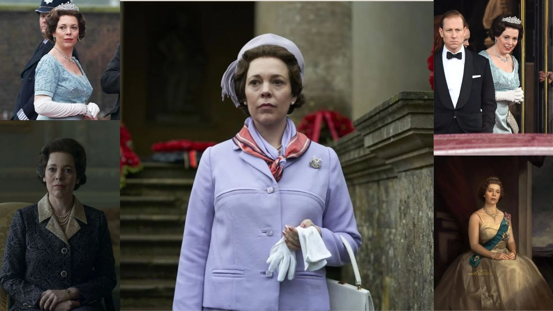
The font pairing of Marcellus and PT Serif aligns perfectly with the character of Queen Elizabeth II, as portrayed by Olivia Colman in the movie "The Crown (Season 3 and 4)" .
Summary: The font pairing of Marcellus and PT Serif beautifully encapsulates the dual nature of Queen Elizabeth II as portrayed by Olivia Colman in The Crown . Marcellus , with its timeless elegance, reflects the Queen’s aristocratic, dignified persona, while PT Serif , with its adaptability and clarity, mirrors her practical, clear-headed approach to leadership. Together, they form a harmonious blend of tradition and modernity, perfectly capturing the essence of Colman's portrayal of the monarch.

HIERARCHY
-
HIERARCHY -

Font Hierarchy for Marcellus and PT Serif:
Logo
Usage: Primary logo text, initials, brand name
Marcellus, Regular, 80-100 pt (Canva), 50-70 px (Squarespace)
Heading (H1)
Usage: Main headings on pages, prominent titles
Marcellus, Regular, 50-70 pt (Canva), 40-50 px (Squarespace)
Subtitle / Secondary Heading (H2)
Usage: Section titles, important subtitles
PT Serif, Bold, 35-45 pt (Canva), 30-40 px (Squarespace)
Subheading (H3)
Usage: Subsection headings, less prominent titles
PT Serif, Regular, 25-35 pt (Canva), 24-28 px (Squarespace)
Paragraph / Body Copy (P)
Usage: Main body text, paragraphs, descriptions
PT Serif, Regular, 16-18 pt (Canva), 16-18 px (Squarespace)