MEET YOUR FONT PAIRING MATCH
This page is your custom breakdown of the font pairing you were matched with from the Find Your Font Quiz. You’ll discover the history, personality, and style of each font—and see how they can come to life in your personal brand.
If you're a Personal Branding Studio member:
Bookmark this page. We’ll return to it in Part 2 when it’s time to use your font pairing to design your logo and create branded Canva graphics.
Not loving this particular combo? No problem. Explore all 100+ font pairings inside PBS - Part 1, Module 4: Design - to find one that feels just right. Click the button below to go there now.
Not yet a Personal Branding Studio member?
(And wondering what Personal Branding Studio even is?)
Start by scrolling through your results below. At the bottom of this page, you’ll find out how to go deeper with your personal brand through my full Personal Branding Studio program.
And your aligned font pairing match is…


HISTORY
-
HISTORY -
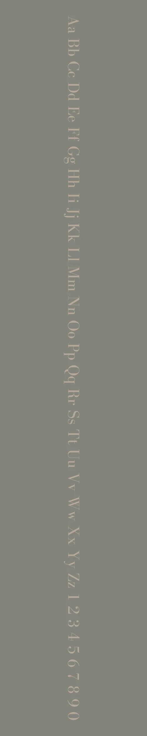
LTC Bodoni 175
Overview:
LTC Bodoni 175 is a refined serif typeface that embodies the elegance and high contrast of classic Bodoni designs. Known for its strong vertical emphasis and sharp contrasts between thick and thin strokes, it is a timeless typeface suitable for luxurious and sophisticated typographic applications, especially in print.
History:
LTC Bodoni 175 is part of the Linotype collection and is based on the work of the renowned Italian typographer Giambattista Bodoni, who created his original Bodoni typeface in the late 18th century. Released by Linotype in 1990 as part of a revival of the Bodoni family, this version of the typeface is an adaptation that brings Bodoni's distinct style into the digital era. The "175" in its name refers to the year 175, commemorating the original creation date of the Bodoni type family.
Characteristics:
Design: The typeface features strong vertical strokes with minimal bracketing, high contrast between thick and thin parts of each character, and sharp serifs. The letterforms are highly geometric, with a slightly condensed and elegant appearance. The font’s design emphasizes clarity and boldness, making it ideal for display use.
Usage: LTC Bodoni 175 is most commonly used for high-end editorial design, luxury branding, book covers, and fashion publications, where its bold, elegant style commands attention. It is also effective for large headlines and logos, where its refined contrasts stand out.
Attributes: Classic, elegant, and high-contrast. The sharp strokes and modern adaptation of Bodoni’s original design give it a luxurious, timeless feel while offering the precision needed for sophisticated typographic design. Ideal for print materials, it adds a sense of formality and elegance to any design.
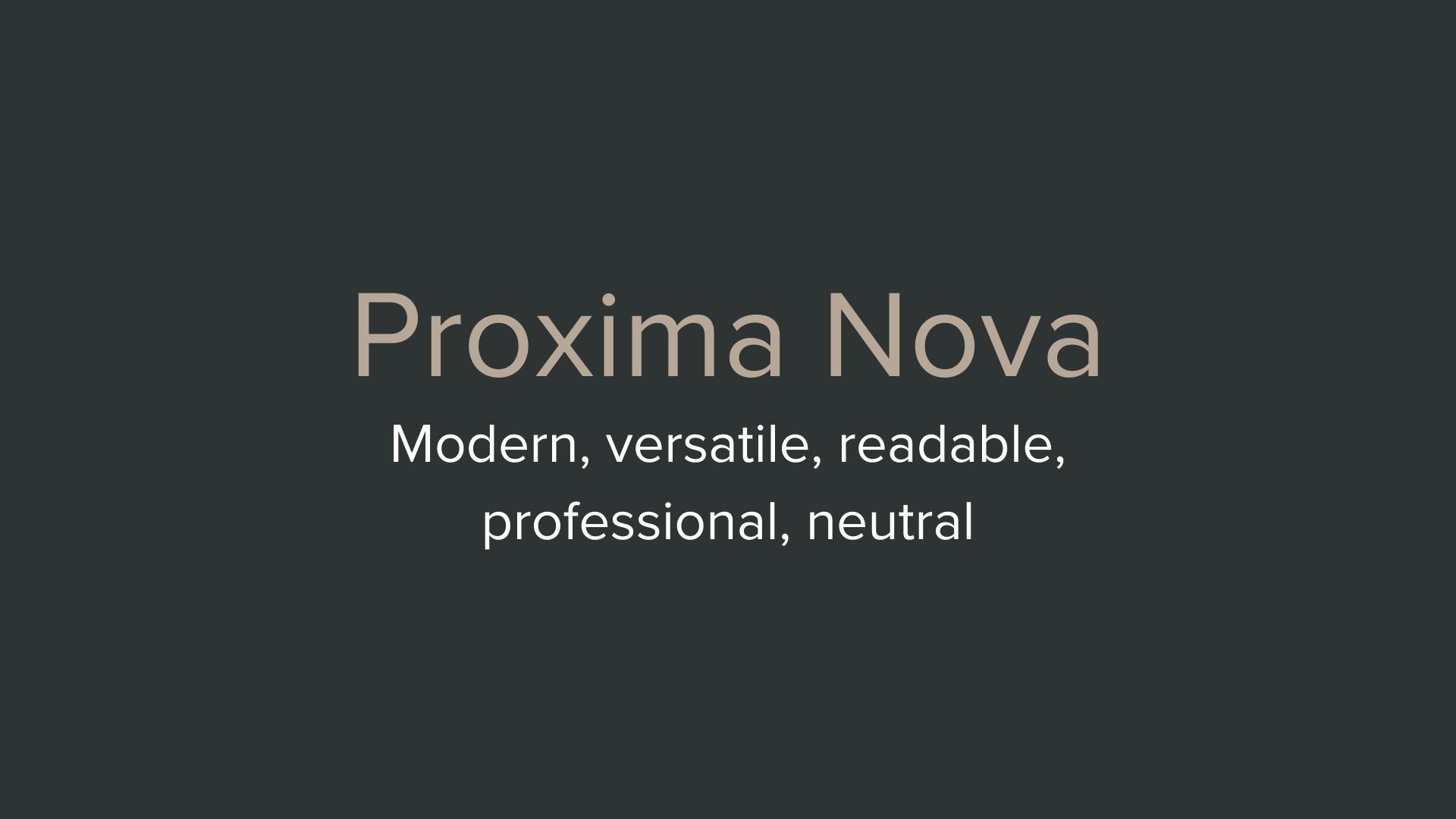
Proxima Nova
Overview:
Proxima Nova is a highly versatile sans-serif typeface that blends modern geometric shapes with a humanist touch. Known for its clean lines and wide range of weights and styles, it has become one of the most popular typefaces for web and digital design due to its readability and contemporary aesthetic.
History:
Proxima Nova was designed by Mark Simonson and released in 2005. Simonson sought to create a modern sans-serif typeface that could bridge the gap between the geometric styles of the 20th century and the more humanistic, readable fonts of the 21st century. Proxima Nova quickly gained popularity for use in both print and digital media, becoming a staple for websites, brands, and advertising due to its legibility and wide appeal.
Characteristics:
Design: Proxima Nova combines geometric forms with subtle humanist influences, featuring clean, rounded edges and balanced proportions. It has a slightly condensed design, which gives it a modern, efficient look while maintaining legibility. The font family includes a variety of weights, from thin to extra bold, and also offers matching italics and condensed versions.
Usage: Proxima Nova is ideal for digital interfaces, including websites, apps, and branding. It is commonly used in headlines, body text, logos, and marketing materials due to its versatility and wide range of weights that suit different contexts.
Attributes: Modern, clean, and highly legible. Proxima Nova’s balanced design and neutral appearance make it suitable for a broad range of applications, from casual to professional contexts. Its combination of geometric precision and humanist readability provides a timeless appeal across digital and print media.


FONT PERSONALITY
-
FONT PERSONALITY -

Why LTC Bodoni 175 and Proxima Nova are a Match Made in Heaven:
LTC Bodoni 175 and Proxima Nova come together to create a pairing that is both luxurious and modern, bridging the gap between classic elegance and contemporary clarity. LTC Bodoni 175 exudes sophistication with its high-contrast strokes and timeless serif design, making it perfect for grabbing attention in headlines, logos, and titles. Its dramatic and classic appeal gives it a sense of grandeur and luxury. Meanwhile, Proxima Nova complements this with its modern, clean, and highly readable design. Its geometric and neutral letterforms provide balance, making the overall composition more approachable while retaining a sense of professionalism. The contrast between the refined elegance of LTC Bodoni 175 and the polished, versatile nature of Proxima Nova makes this pairing both visually striking and functional.
This font pairing would be ideal for someone who embodies both refinement and approachability in their personal brand. The person who would gravitate towards this combination is likely a high-end consultant, a creative entrepreneur, or a luxury brand strategist—someone who wants to convey a sense of timeless sophistication but also values clarity, accessibility, and modern efficiency. They are forward-thinking and polished, preferring a professional yet stylish aesthetic that speaks to both their heritage and their innovative, contemporary approach.

CELEBRITY MATCH
-
CELEBRITY MATCH -

The font pairing of LTC Bodoni 175 and Proxima Nova aligns perfectly with the character of Princess Alexandra, as portrayed by Grace Kelly in the movie "The Swan (1956)" .
Summary: In this pairing, Grace Kelly as Princess Alexandra in The Swan (1956) embodies the elegance, sophistication, and drama that match the personality of LTC Bodoni 175. The font’s luxurious and timeless qualities align perfectly with Alexandra’s regal persona, as she navigates the complex emotions tied to her royal duties and personal desires. The high-contrast strokes and refined serifs of LTC Bodoni 175 parallel Alexandra’s poised and graceful demeanor, while its dramatic nature reflects the inner tension of her character’s journey in the film.

HIERARCHY
-
HIERARCHY -

Font Hierarchy for LTC Bodoni 175 and Proxima Nova:
Logo
Usage: Primary logo text, initials, brand name
LTC Bodoni 175, Regular, Adjust as necessary, typically larger for impact (Canva), Adjust as necessary, typically larger for impact (Squarespace)
Heading (H1)
Usage: Main headings on pages, prominent titles
LTC Bodoni 175, Bold, 36px (Canva), Use Heading 1 style, typically around 36px (Squarespace)
Subtitle / Secondary Heading (H2)
Usage: Section titles, important subtitles
Proxima Nova, Regular, 24px (Canva), Use Heading 2 style, typically around 24px (Squarespace)
Subheading (H3)
Usage: Subsection headings, less prominent titles
Proxima Nova, Italic, 18px (Canva), Use Heading 3 style, typically around 18px (Squarespace)
Paragraph / Body Copy (P)
Usage: Main body text, paragraphs, descriptions
Proxima Nova, Regular, 16 px (Canva), Use Paragraph style, typically around 16px (Squarespace)