MEET YOUR FONT PAIRING MATCH
This page is your custom breakdown of the font pairing you were matched with from the Find Your Font Quiz. You’ll discover the history, personality, and style of each font—and see how they can come to life in your personal brand.
If you're a Personal Branding Studio member:
Bookmark this page. We’ll return to it in Part 2 when it’s time to use your font pairing to design your logo and create branded Canva graphics.
Not loving this particular combo? No problem. Explore all 100+ font pairings inside PBS - Part 1, Module 4: Design - to find one that feels just right. Click the button below to go there now.
Not yet a Personal Branding Studio member?
(And wondering what Personal Branding Studio even is?)
Start by scrolling through your results below. At the bottom of this page, you’ll find out how to go deeper with your personal brand through my full Personal Branding Studio program.
And your aligned font pairing match is…

HISTORY
-
HISTORY -
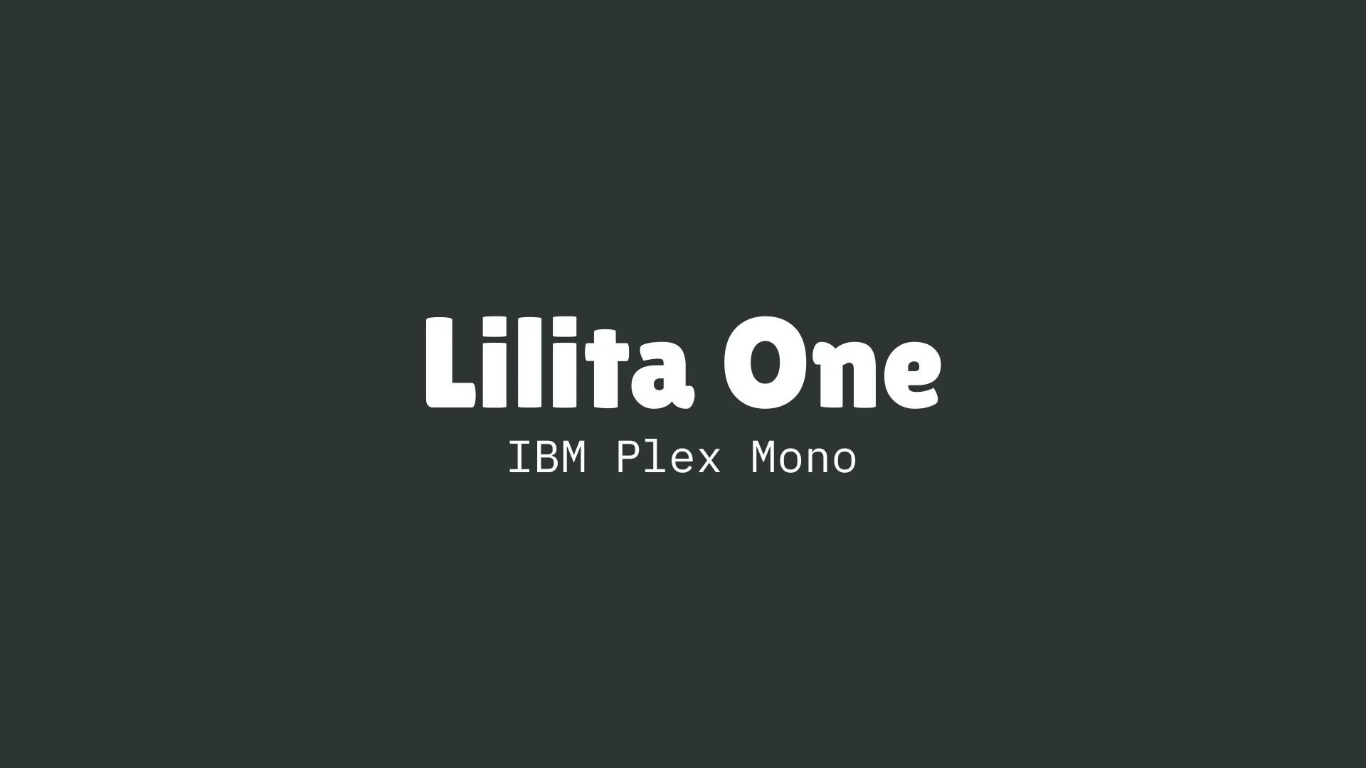
Lilita One
Overview:
Lilita One is a bold and distinctive sans-serif typeface with a playful and slightly retro vibe. It is designed to stand out in display settings, offering a unique and engaging style while maintaining excellent legibility.
History:
Lilita One was designed by Latinotype, a renowned type foundry focused on creating high-quality fonts for Latin-based scripts. Released in 2011, Lilita One was crafted to provide a quirky yet modern typeface suitable for large-format design work. Its rounded letterforms and slightly condensed proportions give it an energetic feel, making it well-suited for projects requiring attention-grabbing typography.
Characteristics:
Design: Lilita One features bold, rounded forms with a slightly condensed structure. The typeface balances a sense of friendliness and professionalism, with high contrast between strokes and a playful personality. Its clean lines and slightly exaggerated curves add a sense of fun, making it visually appealing in large sizes.
Usage: Best suited for headlines, posters, logos, and other display uses where strong visual impact is needed. Its bold nature ensures it commands attention, making it ideal for marketing materials, advertisements, and branding.
Attributes: Bold, playful, and engaging, with a modern yet slightly retro aesthetic. It stands out due to its unique character shapes and strong presence, offering a distinctive typographic voice.

IBM Plex Mono
Overview:
IBM Plex Mono is a monospaced typeface that blends the traditional aesthetic of typewriter fonts with modern design sensibilities. It is part of the IBM Plex family, which was created to reflect IBM’s design principles and heritage. With a clean, technical style, IBM Plex Mono is well-suited for coding, technical documentation, and other digital interfaces.
History:
IBM Plex Mono was designed by the type foundry, Bold Monday, and released in 2017 as part of the larger IBM Plex type family. The IBM Plex family was commissioned by IBM to refresh its brand identity, with a focus on clarity and readability across both print and digital media. IBM Plex Mono was created as a contemporary monospaced font for use in programming and technical environments, aligning with IBM's emphasis on innovation and precision.
Characteristics:
Design: The font features a clean, geometric structure typical of monospaced typefaces, with uniform letter spacing and strong vertical strokes. Its design includes slight humanist influences, providing a bit of warmth to the otherwise technical style. The rounded terminals and consistent stroke widths make it highly legible.
Usage: IBM Plex Mono excels in environments where code, technical writing, or numerical data needs to be displayed. It’s ideal for programming, terminal interfaces, and any design project that benefits from the clarity and consistency of a monospaced typeface.
Attributes: Technical, clean, and highly legible. IBM Plex Mono's monospaced nature ensures alignment across characters, making it particularly suitable for coding environments. It combines precision with a modern flair, making it not only functional but visually appealing in the right context.


FONT PERSONALITY
-
FONT PERSONALITY -


Why Lilita One and IBM Plex Mono are a Match Made in Heaven:
The pairing of Lilita One and IBM Plex Mono creates a dynamic balance between energy and precision, making it a perfect combination for both creative expression and dependable professionalism. Lilita One, with its bold and playful personality, infuses the design with excitement and charm. Its lively, eye-catching presence makes it ideal for impactful headlines and logos that need to capture attention. In contrast, IBM Plex Mono brings a calming, reliable presence to the table. Its precise, methodical nature ensures that the overall design remains organized, structured, and highly functional, making it perfect for body text or more complex, data-driven content. Together, these fonts offer the perfect blend of creativity and clarity, where imagination is met with organization.
This font pairing would appeal to someone who is both imaginative and methodical—perhaps a creative entrepreneur, a designer, or an artist who values creativity but also demands precision in their work. They are the type of person who combines a vibrant, bold approach with a solid foundation of reliability and professionalism. This could be someone in a fast-paced, innovative field like marketing, design, or tech, who knows how to captivate their audience while maintaining a high level of clarity and trustworthiness in their messaging.

CELEBRITY MATCH
-
CELEBRITY MATCH -

The font pairing of Lilita One and IBM Plex Mono aligns perfectly with the character of Anna, as portrayed by Kristen Bell in the movie "Frozen (2013)" .
Summary: The pairing of Lilita One and IBM Plex Mono matches Kristen Bell’s portrayal of Anna in Frozen in a way that highlights both her energetic, fun-loving personality and her calm, reliable side. Lilita One embodies Anna’s boldness and vivacity, while IBM Plex Mono mirrors her dependable and precise nature. Together, they create a harmonious balance between playful excitement and professional clarity, just as Anna balances her adventurous spirit with her unyielding commitment to those she loves. This font pairing is perfect for projects that aim to be both engaging and functional, much like Anna herself.

HIERARCHY
-
HIERARCHY -
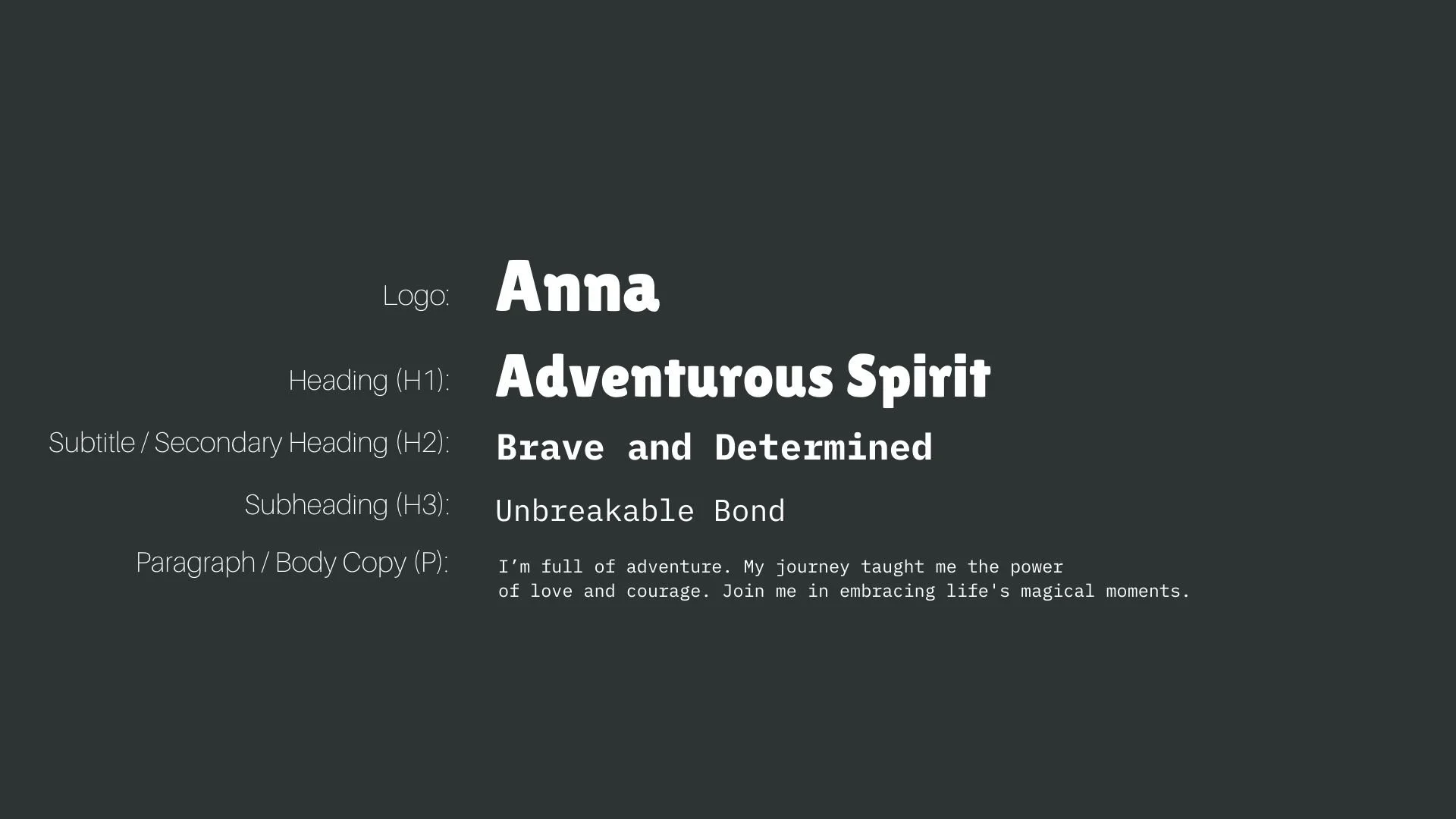
Font Hierarchy for Lilita One and IBM Plex Mono:
Logo
Usage: Primary logo text, initials, brand name
Lilita One, Regular, 72 pt (Canva), 60-70 px (Squarespace)
Heading (H1)
Usage: Main headings on pages, prominent titles
Lilita One, Regular, 60 pt (Canva), 48-56 px (Squarespace)
Subtitle / Secondary Heading (H2)
Usage: Section titles, important subtitles
IBM Plex Mono, Bold, 36 pt (Canva), 32-40 px (Squarespace)
Subheading (H3)
Usage: Subsection headings, less prominent titles
IBM Plex Mono, Regular, 30 pt (Canva), 28-32 px (Squarespace)
Paragraph / Body Copy (P)
Usage: Main body text, paragraphs, descriptions
IBM Plex Mono, Regular, 18 pt (Canva), 16-18 px (Squarespace)