MEET YOUR FONT PAIRING MATCH
This page is your custom breakdown of the font pairing you were matched with from the Find Your Font Quiz. You’ll discover the history, personality, and style of each font—and see how they can come to life in your personal brand.
If you're a Personal Branding Studio member:
Bookmark this page. We’ll return to it in Part 2 when it’s time to use your font pairing to design your logo and create branded Canva graphics.
Not loving this particular combo? No problem. Explore all 100+ font pairings inside PBS - Part 1, Module 4: Design - to find one that feels just right. Click the button below to go there now.
Not yet a Personal Branding Studio member?
(And wondering what Personal Branding Studio even is?)
Start by scrolling through your results below. At the bottom of this page, you’ll find out how to go deeper with your personal brand through my full Personal Branding Studio program.
And your aligned font pairing match is…

HISTORY
-
HISTORY -
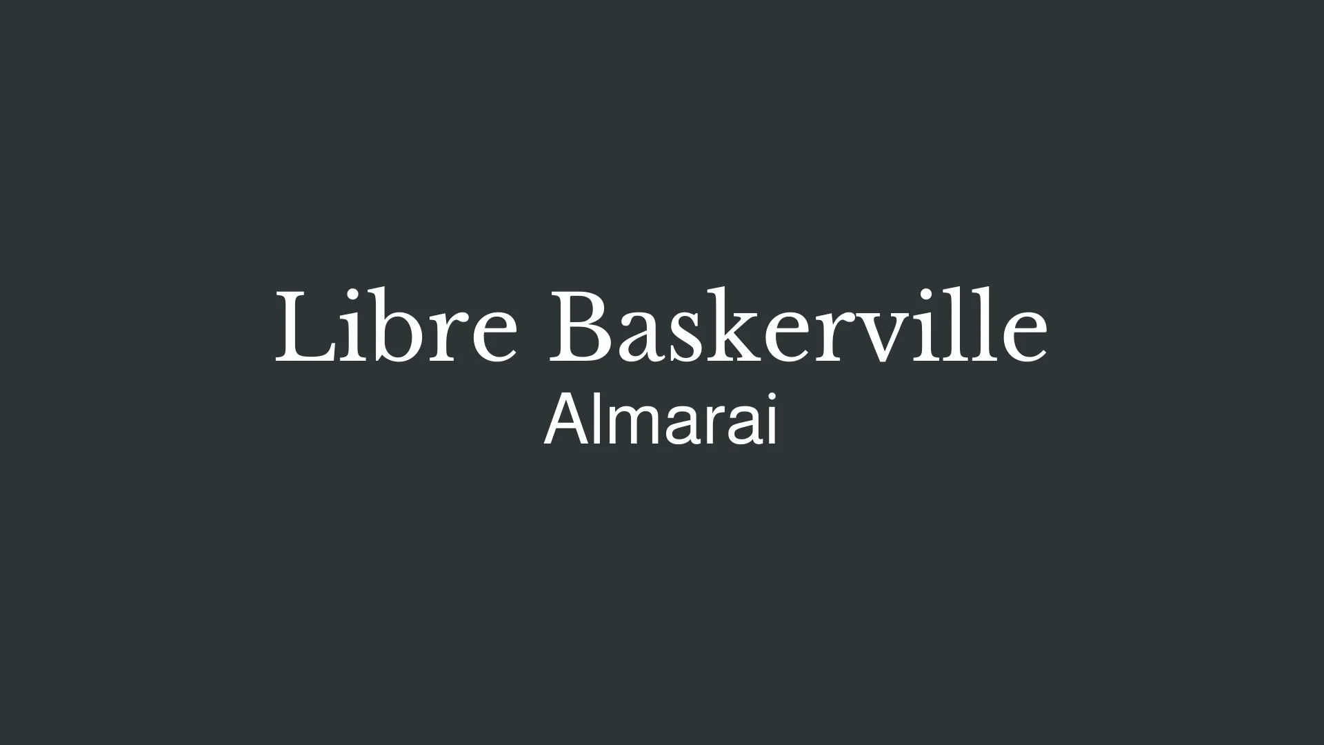
Libre Baskerville
Overview:
Libre Baskerville is a serif typeface that combines classic elegance with modern readability. It is designed to offer a sophisticated yet highly legible option for both print and digital use, making it ideal for editorial design, book typography, and websites.
History:
Libre Baskerville was created by Pablo Impallari and released in 2010 as part of the Libre Fonts project, an initiative by Impallari Type aimed at providing high-quality open-source fonts for use in both personal and commercial projects. Inspired by the Baskerville typefaces of the 18th century, Libre Baskerville was specifically designed to be a web-optimized version of the traditional Baskerville style, with proportions and spacing adjusted for better readability on screen.
Characteristics:
Design: The typeface has a high contrast between thick and thin strokes, a hallmark of the Baskerville tradition, with sharp, bracketed serifs. It features slightly wider letterforms and a more open aperture than its predecessor, improving legibility, particularly at small sizes.
Usage: Libre Baskerville is perfect for long-form reading, making it a great choice for body text in both print and digital formats. Its refined design makes it equally suited for editorial layouts, websites, and invitations.
Attributes: Highly legible with a classic, timeless feel. Its design retains the elegant detailing of traditional serifs, while its open, modern adjustments make it perfect for both print and digital media.

Almarai
Overview:
Almarai is a modern sans-serif typeface designed specifically for Arabic script, with a contemporary and clean design that combines legibility with elegance. It was designed to work well in both print and digital environments, making it versatile for a wide range of applications.
History:
Almarai was created by the renowned Arabic type foundry, "Arabic Typesetting," and released in 2015. It was designed by Tarek Atrissi and inspired by the need for a versatile and contemporary Arabic typeface that could be used across different platforms and media. The font was named after the famous Saudi Arabian dairy company, Almarai, with the intention to bring a modern Arabic typeface to the global stage, blending traditional Arabic calligraphy with modern typographic aesthetics.
Characteristics:
Design: Almarai has a geometric structure with clean, smooth curves and balanced proportions. Its letterforms are open, with an emphasis on readability and clarity. The design of Almarai takes inspiration from classical Arabic calligraphy but with simplified and contemporary touches, making it suitable for digital and print use.
Usage: Almarai is highly adaptable, and works beautifully for web typography, branding, editorial design, and UI/UX. It can be used for body text, headlines, and even in logos, providing excellent legibility in both large and small sizes.
Attributes: Highly legible, with a harmonious balance between tradition and modernity. Its geometric approach gives it a clean and modern look, while still retaining the unique qualities of Arabic script. It is a versatile and highly functional typeface suitable for various design projects.

FONT PERSONALITY
-
FONT PERSONALITY -
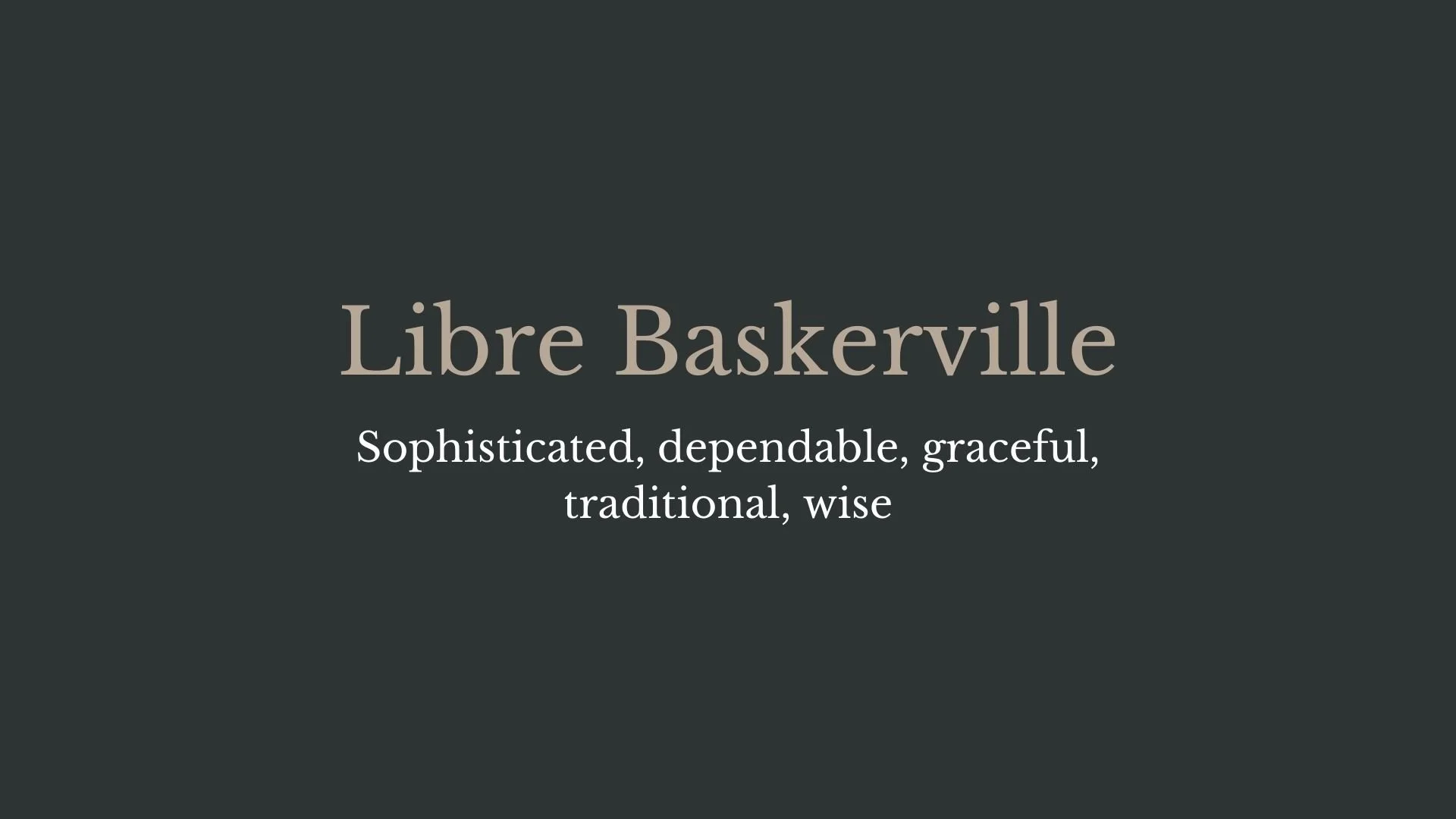

Why Libre Baskerville and Almarai are a Match Made in Heaven:
When Libre Baskerville and Almarai come together, they create a harmonious blend of tradition and modernity, sophistication and energy. Libre Baskerville, with its refined, dependable, and graceful personality, brings a sense of timeless elegance to the table, grounding the design with its rich history and intellectual depth. Almarai, in contrast, adds a burst of energy and a modern edge, offering clarity and approachability. The pairing strikes a perfect balance, with Libre Baskerville providing a strong, dependable foundation, while Almarai injects a fresh, innovative vibe that ensures the design feels contemporary and engaging.
This font pairing would appeal to a person who is both intellectually grounded and forward-thinking—someone who values tradition but is also keen on embracing new ideas and technologies. They would be the type of individual who has a sophisticated approach to their work but isn’t afraid to add an energetic, innovative twist to their personal brand. Perhaps this person is a thought leader or a creative entrepreneur, someone in a field like consulting, education, or design, who brings a polished, professional presence to their endeavors while staying attuned to modern trends and advancements.

CELEBRITY MATCH
-
CELEBRITY MATCH -
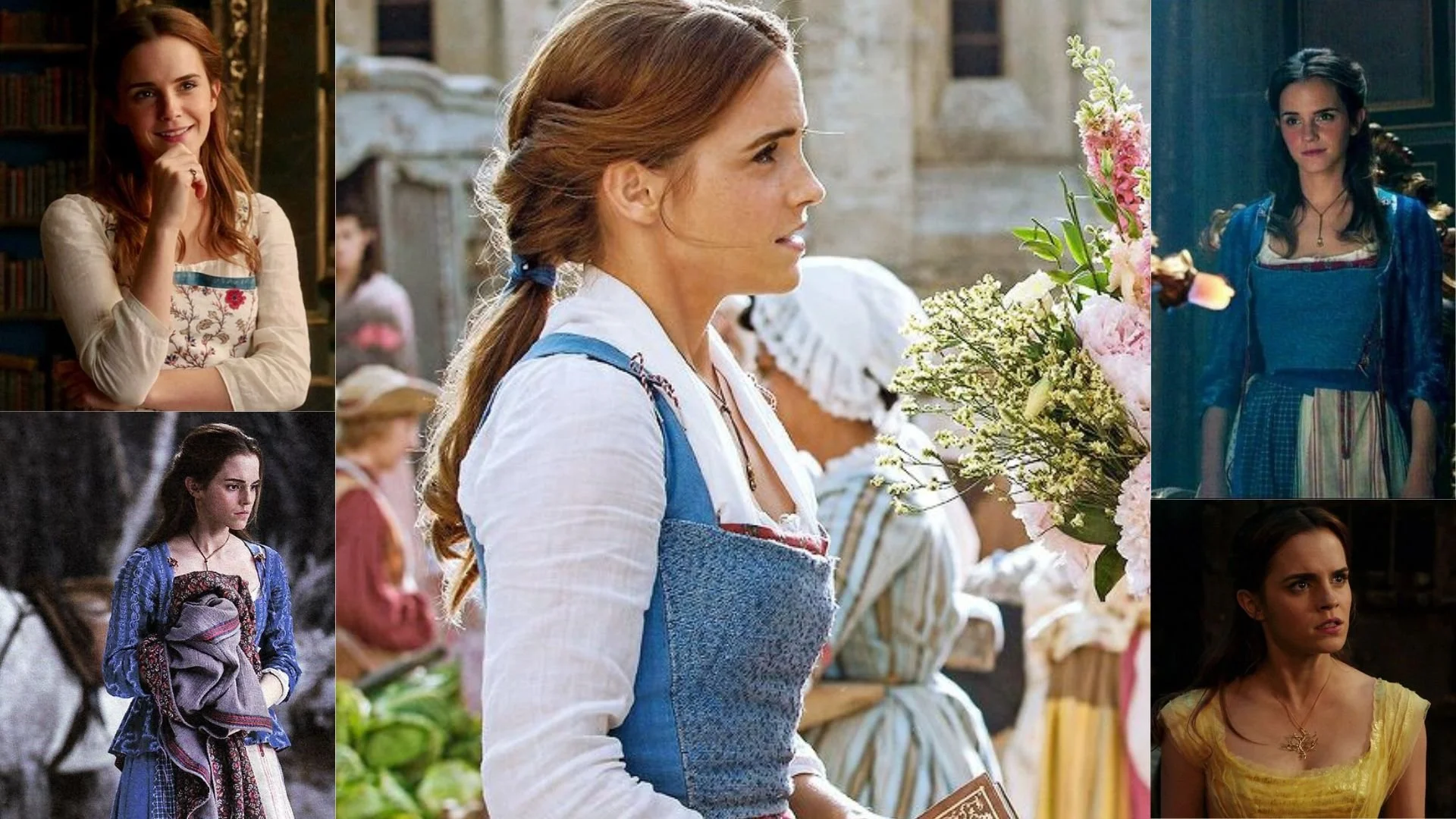
The font pairing of Libre Baskerville and Almarai aligns perfectly with the character of Belle, as portrayed by Emma Watson in the movie "Beauty and the Beast (2017)".
Summary: Emma Watson’s portrayal of Belle embodies both the timeless grace of Libre Baskerville and the energetic, modern clarity of Almarai. Belle’s classic elegance, wisdom, and love for literature are perfectly captured by Libre Baskerville, while her dynamic, forward-thinking nature is represented by Almarai. Together, these fonts encapsulate Belle’s unique blend of tradition and modernity, much like how Watson’s performance brings together Belle's sophisticated charm and courageous spirit.

HIERARCHY
-
HIERARCHY -
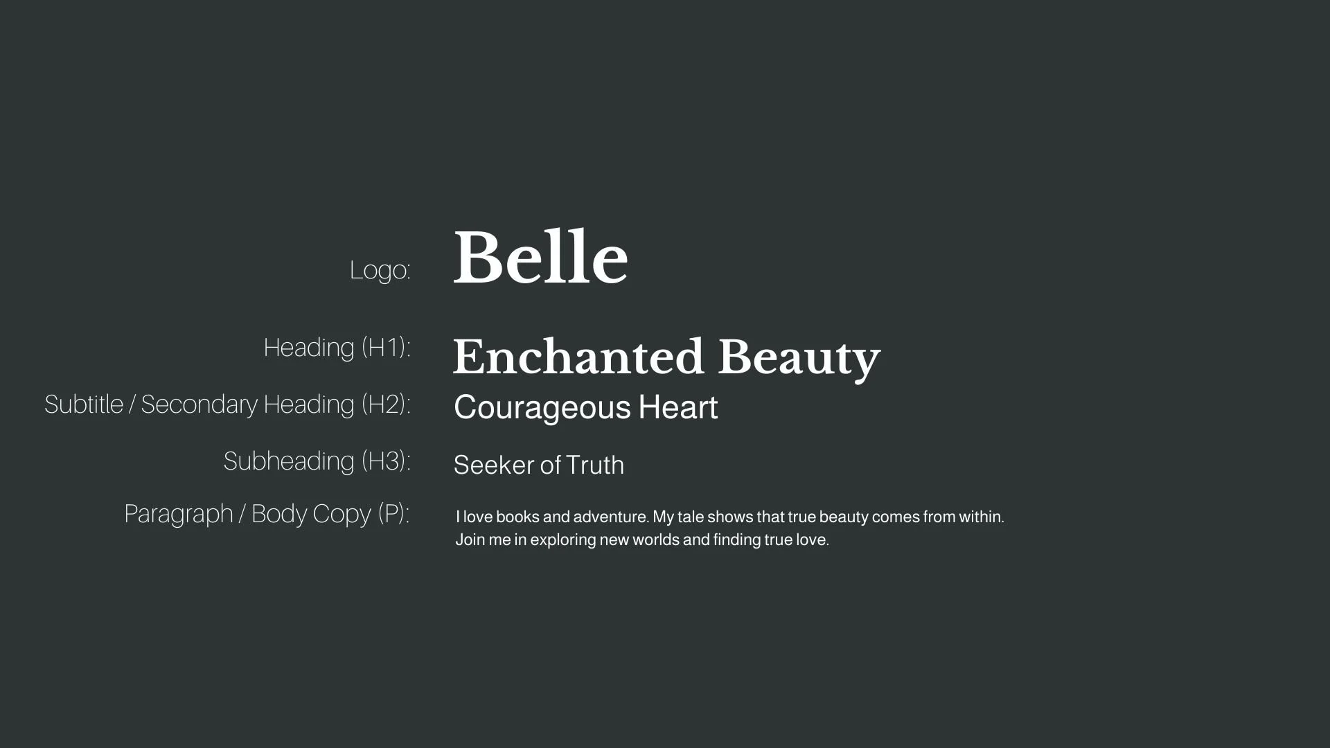
Font Hierarchy for Libre Baskerville and Almarai:
Logo
Usage: Primary logo text, initials, brand name
Libre Baskerville, Bold, 72 pt (Canva), 50-60 px (Squarespace)
Heading (H1)
Usage: Main headings on pages, prominent titles
Libre Baskerville, Bold, 48 pt (Canva), 40-48 px (Squarespace)
Subtitle / Secondary Heading (H2)
Usage: Section titles, important subtitles
Almarai, Regular, 36 pt (Canva), 32-36 px (Squarespace)
Subheading (H3)
Usage: Subsection headings, less prominent titles
Almarai, Light, 28 pt (Canva), 24-28 px (Squarespace)
Paragraph / Body Copy (P)
Usage: Main body text, paragraphs, descriptions
Almarai, Regular, 18 pt (Canva), 16-18 px (Squarespace)