MEET YOUR FONT PAIRING MATCH
This page is your custom breakdown of the font pairing you were matched with from the Find Your Font Quiz. You’ll discover the history, personality, and style of each font—and see how they can come to life in your personal brand.
If you're a Personal Branding Studio member:
Bookmark this page. We’ll return to it in Part 2 when it’s time to use your font pairing to design your logo and create branded Canva graphics.
Not loving this particular combo? No problem. Explore all 100+ font pairings inside PBS - Part 1, Module 4: Design - to find one that feels just right. Click the button below to go there now.
Not yet a Personal Branding Studio member?
(And wondering what Personal Branding Studio even is?)
Start by scrolling through your results below. At the bottom of this page, you’ll find out how to go deeper with your personal brand through my full Personal Branding Studio program.
And your aligned font pairing match is…


HISTORY
-
HISTORY -
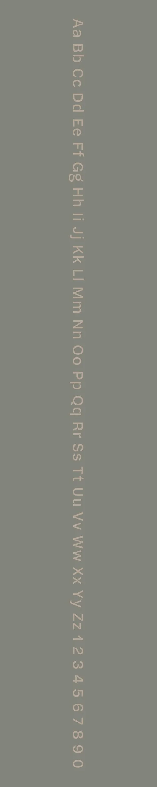
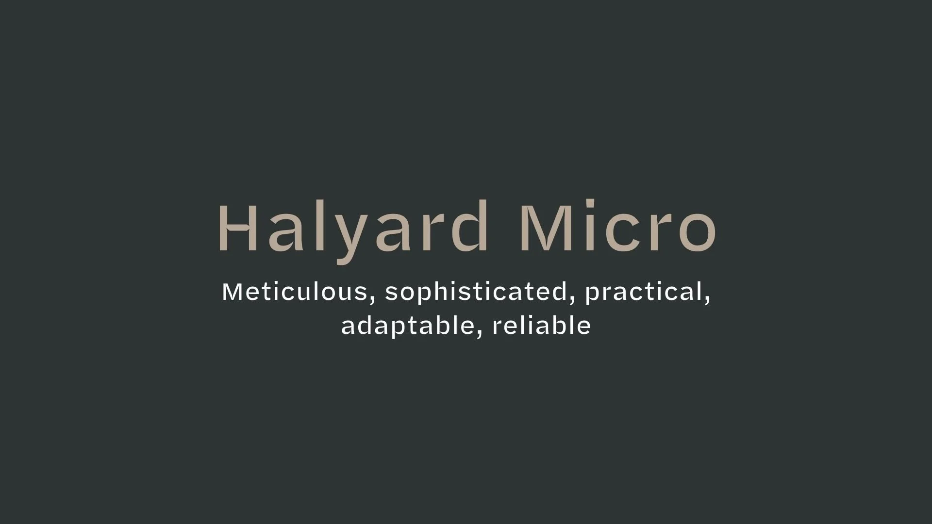
Halyard Micro
Overview:
Halyard Micro is a modern sans-serif typeface designed for high legibility in small sizes, making it ideal for both digital and print applications where space is limited. Its design is functional yet elegant, optimized for a clean and professional appearance across a wide range of media.
History:
Halyard Micro was created by Tobias Frere-Jones and released by the foundry Frere-Jones Type in 2013. It was designed as part of the larger Halyard family, with the goal of offering an optimized version for use in small sizes, particularly on screens. The typeface was conceived to provide excellent readability while retaining a distinct and refined aesthetic, making it suitable for everything from mobile apps to corporate branding.
Characteristics:
Design: Halyard Micro features a slightly condensed, geometric structure with well-balanced letterforms and open counters. The design emphasizes clarity and legibility at small sizes, with subtle curvature on the terminals to soften its otherwise clean appearance.
Usage: Halyard Micro excels in text-heavy designs such as mobile interfaces, websites, apps, and fine print. It is ideal for small-scale settings where legibility is paramount, such as body text, captions, and interface elements. It can also be used effectively for branding and corporate communications that require a modern yet approachable feel.
Attributes: Clean, highly legible, and functional with a contemporary touch. Halyard Micro offers versatility and clarity in small text, combining modern design with practical usability for digital and print media.
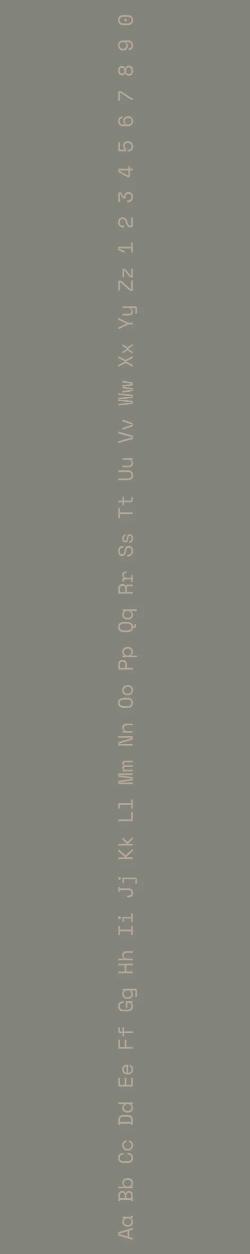
Space Mono
Overview:
Space Mono is a contemporary monospace typeface designed to bring a retro-futuristic aesthetic to modern design. With its geometric and mechanical form, it combines the precision of typewriter-style fonts with a fresh, tech-inspired vibe. It is particularly suited for coding, digital interfaces, and projects that require a monospaced font with personality.
History:
Space Mono was created by the design studio Colophon Foundry and released in 2016. Its design was inspired by classic typewriter fonts, with a focus on creating a distinctive monospace typeface that could be used across both digital and print applications. The font was developed as part of Google Fonts' growing collection of open-source web fonts, aiming to provide a versatile yet stylish typeface for developers and designers.
Characteristics:
Design: Space Mono features a geometric, mechanical design with wide letterforms and squared-off curves. The monospace style offers even spacing between characters, while the rounded terminals and high contrast between strokes provide a modern and slightly playful touch to its otherwise rigid structure.
Usage: Space Mono is primarily used in coding, user interfaces, and tech-focused branding. It works particularly well in environments where uniform character spacing is required, such as programming or data displays. Its unique style also makes it suitable for use in logos, posters, and headings where a retro-tech or vintage space theme is desired.
Attributes: Functional, geometric, and clean with a hint of retro-futurism. Space Mono is versatile for both technical and creative uses, offering high readability while maintaining a distinct, futuristic character.

FONT PERSONALITY
-
FONT PERSONALITY -

Why Halyard Micro and Space Mono are a Match Made in Heaven:
When combined, Halyard Micro and Space Mono create a pairing that strikes a perfect balance between sophistication and playfulness. Halyard Micro, with its meticulous and sophisticated nature, brings a refined, reliable foundation to the design, ensuring that any content looks polished and trustworthy. Space Mono, with its quirky and creative personality, infuses the pairing with a sense of fun and innovation, making it feel fresh and approachable. The adaptability of Halyard Micro allows it to seamlessly support the whimsical, nostalgic qualities of Space Mono, making the duo both functional and visually engaging across various contexts.
This pairing would appeal to an individual who embodies both reliability and creativity—someone who values practicality but also enjoys adding a touch of playful innovation to their work. This could be a personal brand for a creative professional, such as a graphic designer or a tech entrepreneur, who has a strong foundation in their field but isn’t afraid to push boundaries and inject personality into their projects. They appreciate elegance but love to experiment with unconventional ideas, balancing a professional demeanor with a unique, imaginative twist.

CELEBRITY MATCH
-
CELEBRITY MATCH -

The font pairing of Halyard Micro and Space Mono aligns perfectly with the character of Louise Banks, as portrayed by Amy Adams in the movie "Arrival" .
Summary: Amy Adams' portrayal of Louise Banks in Arrival mirrors the traits of Halyard Micro and Space Mono perfectly. Halyard Micro embodies Louise’s meticulous, modern, and clear communication, while Space Mono captures her creative problem-solving, consistent efforts, and the blend of retro-modern thinking required in her role. This font pairing exemplifies Louise's unique approach to deciphering an alien language, blending clarity, creativity, and dependability in a high-stakes, intellectually demanding scenario.

HIERARCHY
-
HIERARCHY -
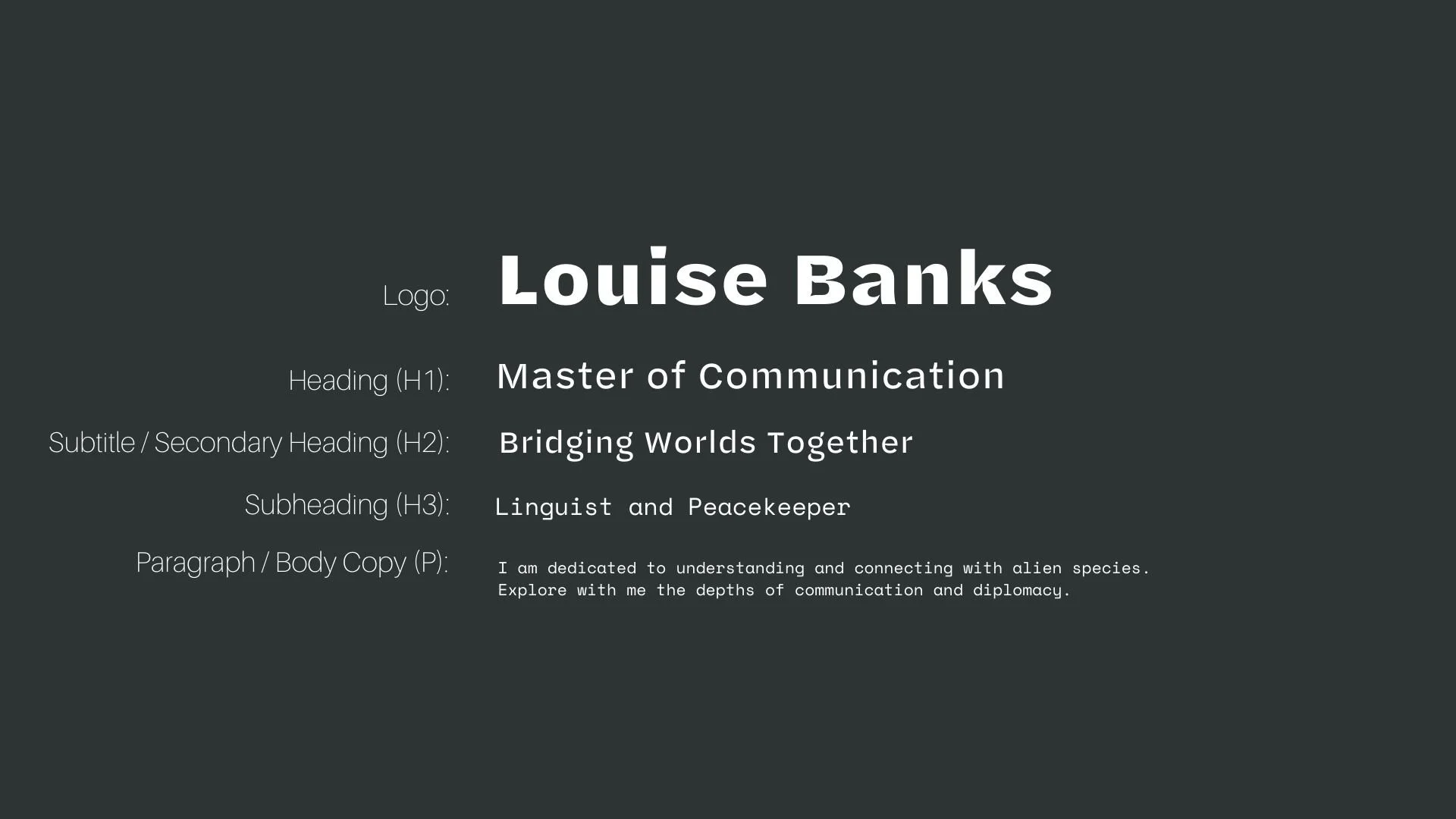
Font Hierarchy for Halyard Micro and Space Mono:
Logo
Usage: Primary logo text, initials, brand name
Halyard Micro, Bold, 48 pt (Canva), 48 px (Squarespace)
Heading (H1)
Usage: Main headings on pages, prominent titles
Halyard Micro, Regular, 36 pt (Canva), 36 px (Squarespace)
Subtitle / Secondary Heading (H2)
Usage: Section titles, important subtitles
Halyard Micro, Regular, 30 pt (Canva), 30 px (Squarespace)
Subheading (H3)
Usage: Subsection headings, less prominent titles
Space Mono, Regular, 24 pt (Canva), 24 px (Squarespace)
Paragraph / Body Copy (P)
Usage: Main body text, paragraphs, descriptions
Space Mono, Regular, 16 pt (Canva), 16 px (Squarespace)