MEET YOUR FONT PAIRING MATCH
This page is your custom breakdown of the font pairing you were matched with from the Find Your Font Quiz. You’ll discover the history, personality, and style of each font—and see how they can come to life in your personal brand.
If you're a Personal Branding Studio member:
Bookmark this page. We’ll return to it in Part 2 when it’s time to use your font pairing to design your logo and create branded Canva graphics.
Not loving this particular combo? No problem. Explore all 100+ font pairings inside PBS - Part 1, Module 4: Design - to find one that feels just right. Click the button below to go there now.
Not yet a Personal Branding Studio member?
(And wondering what Personal Branding Studio even is?)
Start by scrolling through your results below. At the bottom of this page, you’ll find out how to go deeper with your personal brand through my full Personal Branding Studio program.
And your aligned font pairing match is…

HISTORY
-
HISTORY -
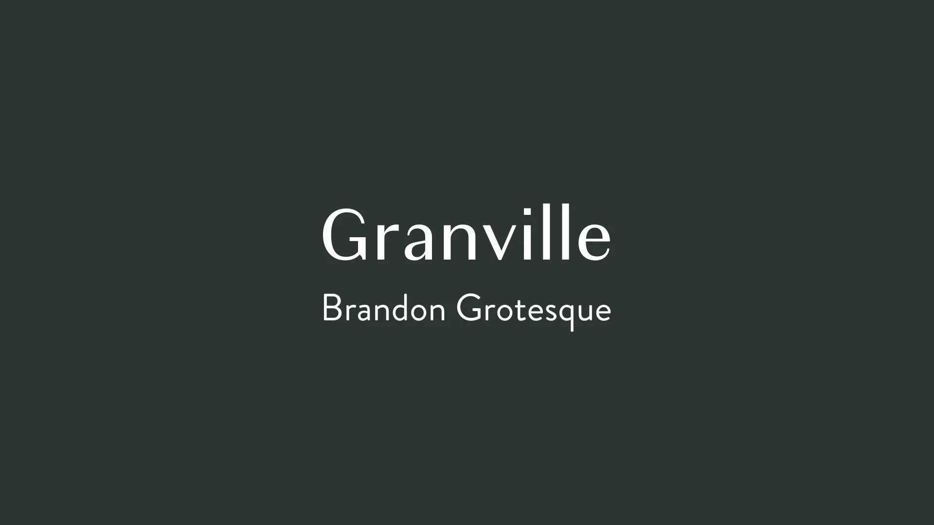
Granville
Overview:
Granville is a contemporary serif typeface known for its clean lines and professional appearance. It offers a versatile design with a touch of sophistication, making it ideal for both print and digital applications, from editorial content to branding.
History:
Granville was designed by Jeremy Dooley, a prominent type designer and founder of the design studio insigne. Released in 2016, Granville was conceived as a transitional serif font that combines classic elements of traditional serifs with modern sensibilities. Dooley aimed to create a typeface that could provide both readability and elegance in a variety of professional contexts, especially for publications and corporate design.
Characteristics:
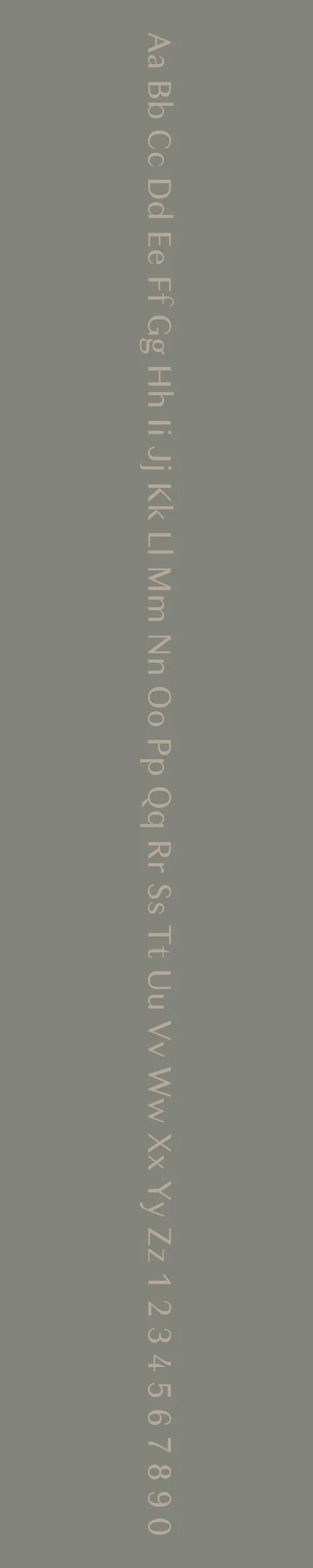
Design: Granville features high contrast between thick and thin strokes, with sharp, elegant serifs and distinctive, geometric curves. It has a refined, structured appearance that balances modern sensibilities with the timeless traits of a classic serif typeface.
Usage: Granville is best used for print and digital media where sophistication and legibility are key. It works well in editorial layouts, books, corporate branding, and advertising. Its versatility makes it suitable for both large headlines and smaller body text, providing clarity and style.
Attributes: Elegant, professional, and highly readable. Granville’s sophisticated design is ideal for creating a refined, authoritative presence in both digital and print contexts. It offers high contrast, balanced proportions, and an overall clean aesthetic that works well across a wide range of applications.
Brandon Grotesque
Overview:
Brandon Grotesque is a modern sans-serif typeface with a distinctive, geometric design that blends contemporary minimalism with vintage charm. Its clean lines and subtle curves make it highly versatile for a variety of design applications, from branding to editorial work.
History:
Brandon Grotesque was designed by Hannes von Döhren, a German type designer, and released in 2010 by the type foundry HVD Fonts. The typeface was inspired by early 20th-century sans-serif designs, particularly the geometric and grotesque styles, with a touch of warmth added through rounded letterforms. Von Döhren aimed to create a modern typeface that would balance functionality with personality, suitable for both corporate and creative projects.
Characteristics:
Design: Brandon Grotesque features a geometric structure with soft, rounded edges and a slightly condensed width. Its clean, modern appearance is softened by the rounded terminals and generous x-height, creating a friendly and approachable feel without sacrificing sophistication.
Usage: Brandon Grotesque is ideal for a wide range of uses, from logo design and branding to editorial layouts, websites, and advertising. It works particularly well in headlines and short blocks of text, offering clarity and impact in both large and small sizes.
Attributes: Clean, geometric, and contemporary with a touch of warmth. Brandon Grotesque is versatile, offering excellent legibility and a balanced, refined aesthetic. It is particularly suited to projects that require both professionalism and personality.


FONT PERSONALITY
-
FONT PERSONALITY -


Why Granville and Brandon Grotesque are a Match Made in Heaven:
Granville and Brandon Grotesque form a font pairing that beautifully balances elegance and modernity. Granville’s classic, refined, and professional qualities bring a sense of sophistication and authority, making it ideal for high-impact headings, logos, or other key brand elements that need to exude timeless appeal. Meanwhile, Brandon Grotesque adds a touch of friendliness and modernity with its clean, geometric design and approachable roundness. The two fonts complement each other perfectly: Granville provides the structure and elegance, while Brandon Grotesque offers a more relaxed, contemporary feel that ensures clarity and accessibility.
This pairing would be ideal for someone who embodies both tradition and innovation. A person using Granville and Brandon Grotesque for their personal brand is likely sophisticated yet approachable—someone who values timeless professionalism but also understands the importance of modern, clear communication. This individual might be an entrepreneur, consultant, or creative professional who works in industries like fashion, consulting, or design, where a polished, yet contemporary image is essential to resonate with both established and modern audiences.

CELEBRITY MATCH
-
CELEBRITY MATCH -
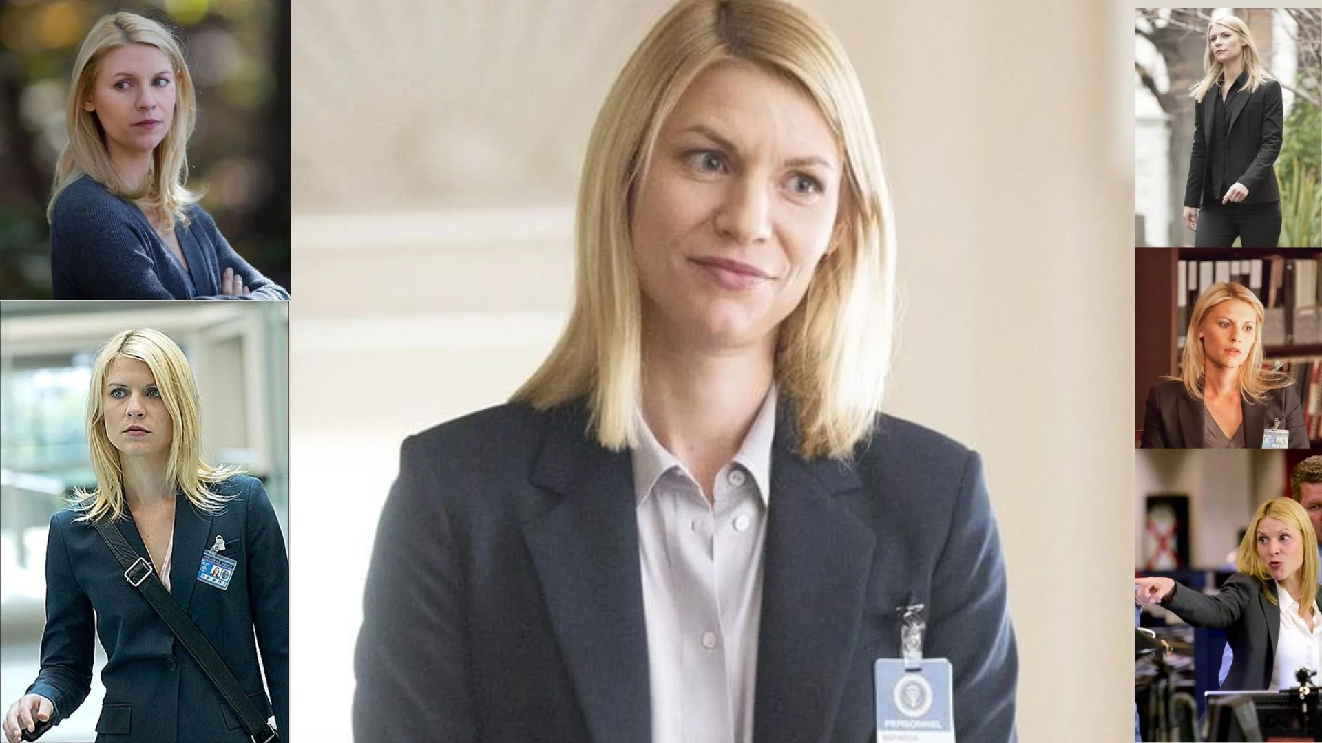
The font pairing of Granville and Brandon Grotesque aligns perfectly with the character of Carrie Mathison, as portrayed by Claire Danes in the movie "Homeland" .
Summary: Claire Danes, through her portrayal of Carrie Mathison in Homeland, aligns perfectly with the Granville and Brandon Grotesque font pairing. The sophisticated, poised, and refined nature of Granville reflects Carrie's intellectual and composed traits, while Brandon Grotesque’s modern and approachable characteristics match Carrie’s versatility and personal touch. This pairing highlights the balance between classic refinement and contemporary approachability, embodying the elegance and adaptability of both the font pairing and the character.

HIERARCHY
-
HIERARCHY -

Font Hierarchy for Granville and Brandon Grotesque:
Logo
Usage: Primary logo text, initials, brand name
Granville, Regular or Bold (depending on preference and readability), 72 pt or larger (Canva), Equivalent to 72 pt or larger, typically 72px or more for headers (Squarespace)
Heading (H1)
Usage: Main headings on pages, prominent titles
Granville, Bold, 48-60 pt (Canva), 48-60px (Squarespace)
Subtitle / Secondary Heading (H2)
Usage: Section titles, important subtitles
Brandon Grotesque, Bold, 36-42 pt (Canva), 36-42px (Squarespace)
Subheading (H3)
Usage: Subsection headings, less prominent titles
Brandon Grotesque, Regular or Italic (Italic for emphasis), 24-30 pt (Canva), 24-30px (Squarespace)
Paragraph / Body Copy (P)
Usage: Main body text, paragraphs, descriptions
Brandon Grotesque, Regular, 14-18 pt (Canva), 14-18px (Squarespace)