MEET YOUR FONT PAIRING MATCH
This page is your custom breakdown of the font pairing you were matched with from the Find Your Font Quiz. You’ll discover the history, personality, and style of each font—and see how they can come to life in your personal brand.
If you're a Personal Branding Studio member:
Bookmark this page. We’ll return to it in Part 2 when it’s time to use your font pairing to design your logo and create branded Canva graphics.
Not loving this particular combo? No problem. Explore all 100+ font pairings inside PBS - Part 1, Module 4: Design - to find one that feels just right. Click the button below to go there now.
Not yet a Personal Branding Studio member?
(And wondering what Personal Branding Studio even is?)
Start by scrolling through your results below. At the bottom of this page, you’ll find out how to go deeper with your personal brand through my full Personal Branding Studio program.
And your aligned font pairing match is…

HISTORY
-
HISTORY -
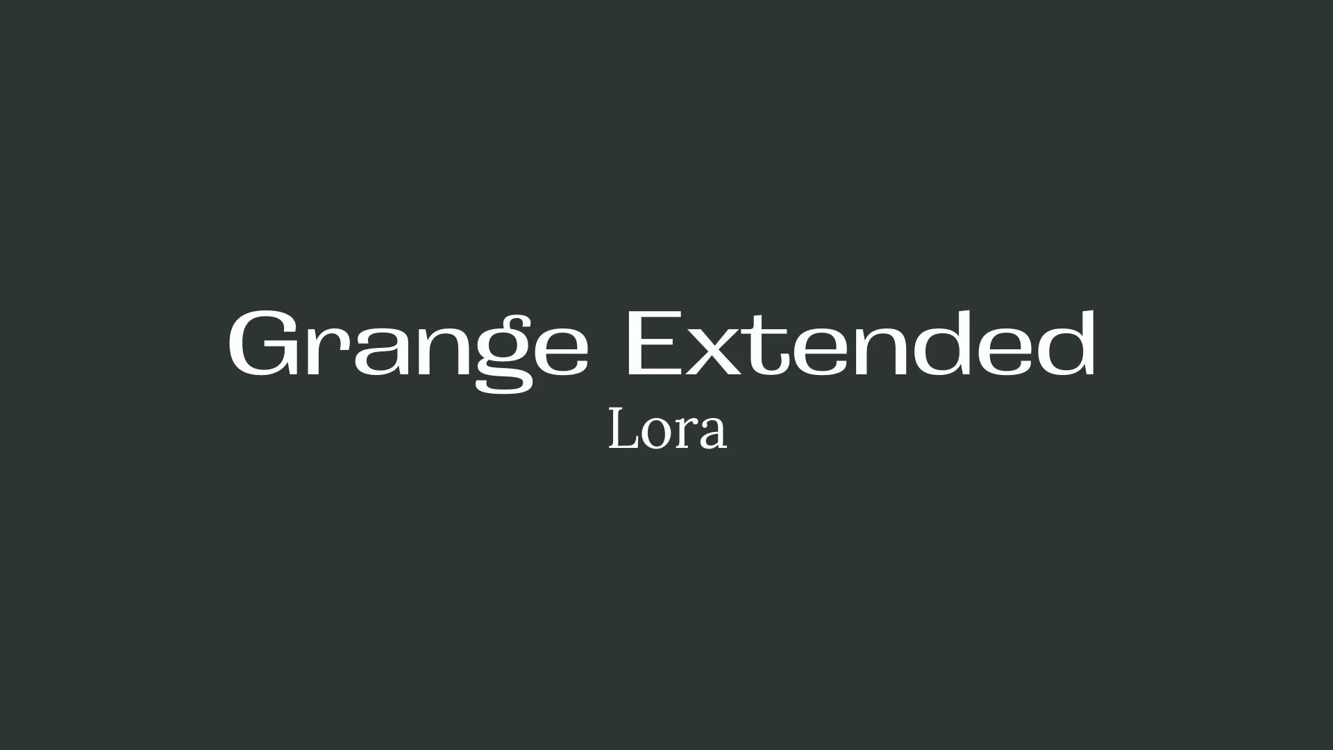
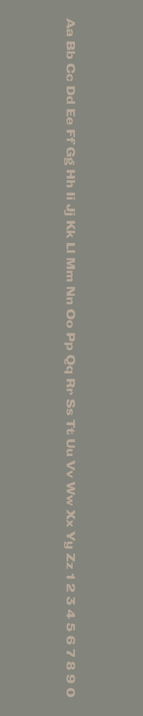
Grange Extended
Overview:
Grange Extended is a bold and distinctive serif typeface with a modern, wide stance. Known for its elegant and robust design, it stands out in large headlines and display text, making a strong statement while maintaining readability.
History:
Grange Extended was designed by David Jonathan Ross, an American type designer, and was released in 2012 through his foundry, Font of the Month Club. The font was created as an extended version of the original Grange typeface, which was inspired by classic serif letterforms with a contemporary twist. The goal was to develop a more expansive version of Grange that would perform well in larger settings, such as headlines, posters, and branding.
Characteristics:
Design: Grange Extended has a wide, slightly condensed structure with strong serifs and sharp details. Its high contrast between thick and thin strokes gives it a refined yet bold look, while the extended proportions make it well-suited for display uses.
Usage: Best used for large-scale projects such as posters, titles, branding, and other display text. Its bold presence and wide design make it perfect for catching attention in creative applications, including editorial designs, advertisements, and logos.
Attributes: Strong, bold, and elegant with a high contrast between thick and thin strokes. Grange Extended is perfect for creating striking visual statements and is highly legible even in larger sizes.
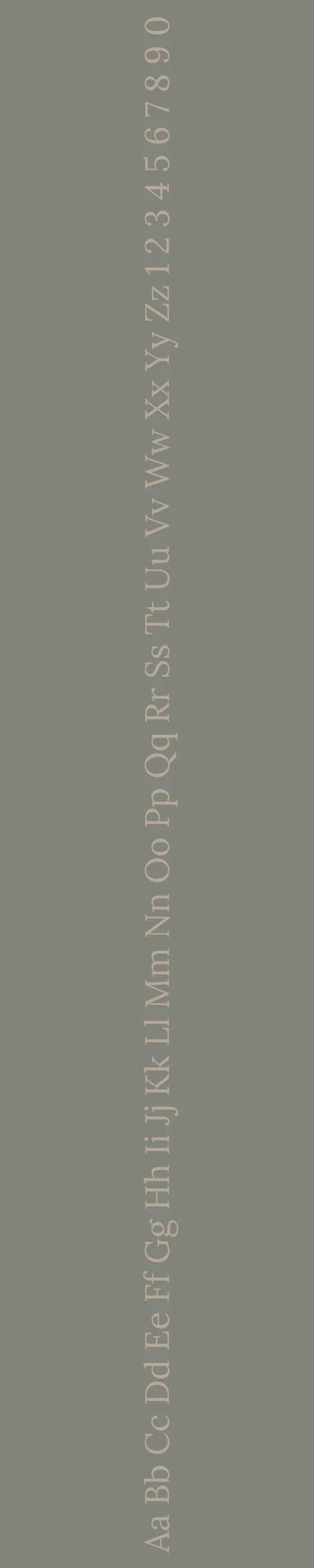
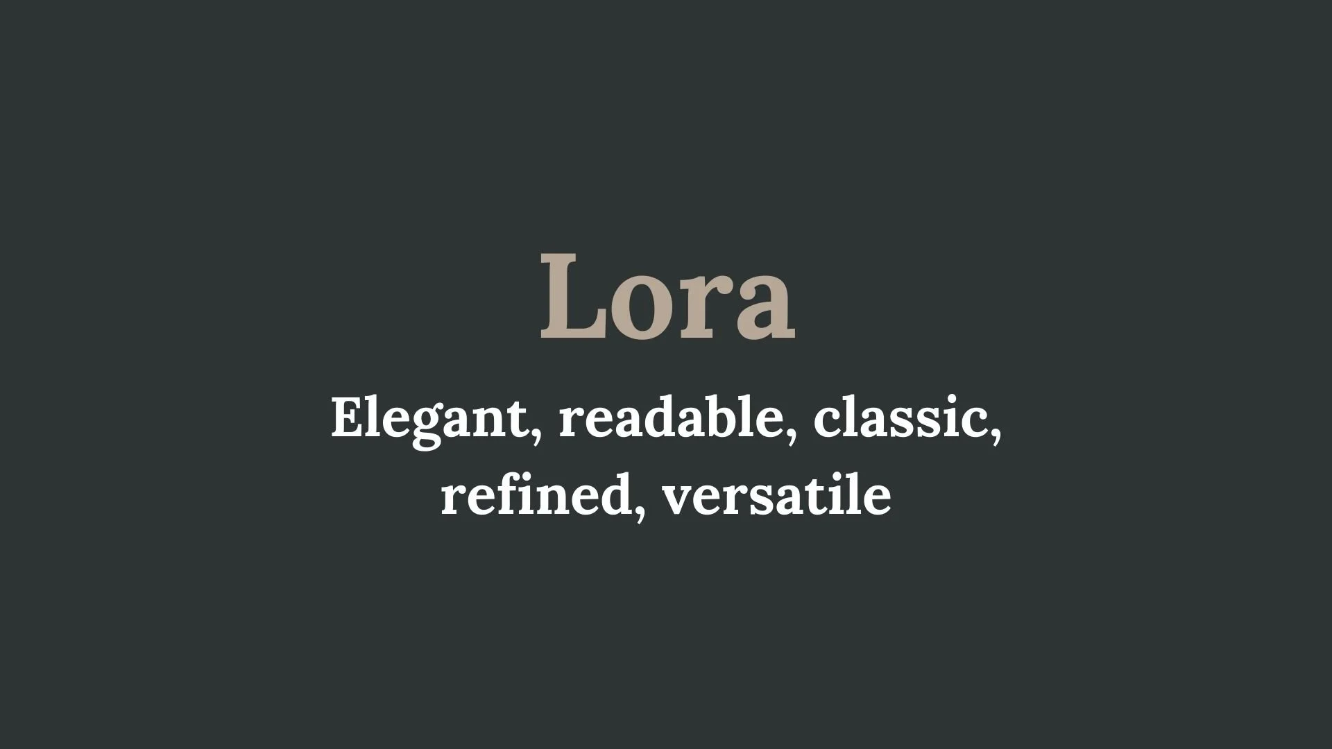
Lora
Overview:
Lora is a well-balanced serif typeface that strikes a harmonious blend of modern and classic design elements. It is known for its elegant and readable characteristics, making it highly suitable for both print and digital use, especially in long-form content like articles, blogs, and books.
History:
Lora was designed by Olga Kwiatkowska and Tomasz Piątek, members of the Typo/Graphic Designers, a Polish design studio. It was released in 2011 through the Google Fonts library. Lora was created with the aim of offering a contemporary serif typeface with roots in traditional calligraphy. The font was specifically crafted to provide high legibility in body text while maintaining a modern appearance that could work across a variety of media.
Characteristics:
Design: Lora features classic proportions, with sharp serifs and subtle curves, giving it a refined yet approachable appearance. The font's slightly calligraphic roots are evident in its smooth, rounded forms and gentle curves, while its geometric structure ensures clarity and readability.
Usage: Lora excels in long-form content, making it an ideal choice for books, websites, blogs, and articles. It can also be effectively used in editorial design, print publications, and branding where readability and a sophisticated feel are key.
Attributes: Elegant, highly legible, and versatile. Lora combines traditional serif features with modern functionality, offering a clean and refined presence perfect for both digital and print environments.

FONT PERSONALITY
-
FONT PERSONALITY -
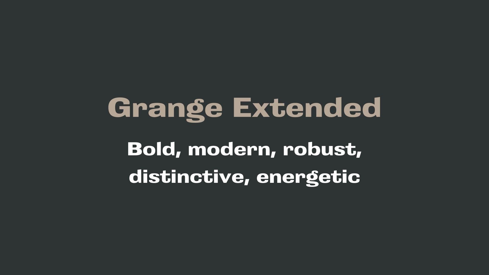
Why Grange Extended and Lora are a Match Made in Heaven:
Grange Extended and Lora create a dynamic pairing that balances boldness with sophistication, making them an ideal combination for a brand that wants to make a statement while maintaining a sense of elegance. Grange Extended’s robust, modern, and energetic qualities bring a sense of strength and authority, making it perfect for headlines or brand names that need to stand out with confidence. In contrast, Lora’s refined and elegant serifs provide a complementary, softer touch that adds warmth and timeless appeal. The contrast between the assertive, geometric forms of Grange Extended and the classic, graceful nature of Lora ensures a harmonious balance, allowing the design to be both eye-catching and approachable.
This pairing would appeal to someone who wants to project a strong yet polished personal brand. The person who would choose Grange Extended and Lora for their branding is likely someone who is forward-thinking and innovative but also values tradition and refinement. They are a professional with a commanding presence, such as a creative director, entrepreneur, or consultant, who wants their brand to exude both confidence and sophistication. Their brand would reflect a blend of cutting-edge modernity with timeless elegance—someone who thrives in industries where both strength and style are essential, such as design, luxury brands, or high-end consulting.

CELEBRITY MATCH
-
CELEBRITY MATCH -

The font pairing of Grange Extended and Lora aligns perfectly with the character of Angela Chase, as portrayed by Claire Danes in the movie "My So-Called Life".
Summary: The pairing of Grange Extended and Lora reflects the dual nature of Angela Chase in My So-Called Life. Grange Extended represents Angela’s bold, confident, and dynamic exterior, while Lora captures her elegant, thoughtful, and introspective inner world. Claire Danes’ portrayal of Angela embodies this balance—her character is both a loud and energetic force in the world and a quiet, introspective young woman discovering her place in it. This combination of fonts mirrors Angela’s multi-faceted persona, making it an ideal representation of her journey through teenage life.

HIERARCHY
-
HIERARCHY -

Font Hierarchy for Grange Extended and Lora:
Logo
Usage: Primary logo text, initials, brand name
Grange Extended, Bold, 100-150 pt depending on the space and design needs (Canva), Equivalent to 72-96 px (Squarespace)
Heading (H1)
Usage: Main headings on pages, prominent titles
Grange Extended, Regular, 60-80 pt (Canva), Equivalent to 48-64 px (Squarespace)
Subtitle / Secondary Heading (H2)
Usage: Section titles, important subtitles
Lora, Bold, 36-48 pt (Canva), Equivalent to 32-40 px (Squarespace)
Subheading (H3)
Usage: Subsection headings, less prominent titles
Lora, Italic, 24-32 pt (Canva), Equivalent to 24-28 px (Squarespace)
Paragraph / Body Copy (P)
Usage: Main body text, paragraphs, descriptions
Lora, Regular, 16-18 pt (Canva), Equivalent to 16-18 px (Squarespace)