MEET YOUR FONT PAIRING MATCH
This page is your custom breakdown of the font pairing you were matched with from the Find Your Font Quiz. You’ll discover the history, personality, and style of each font—and see how they can come to life in your personal brand.
If you're a Personal Branding Studio member:
Bookmark this page. We’ll return to it in Part 2 when it’s time to use your font pairing to design your logo and create branded Canva graphics.
Not loving this particular combo? No problem. Explore all 100+ font pairings inside PBS - Part 1, Module 4: Design - to find one that feels just right. Click the button below to go there now.
Not yet a Personal Branding Studio member?
(And wondering what Personal Branding Studio even is?)
Start by scrolling through your results below. At the bottom of this page, you’ll find out how to go deeper with your personal brand through my full Personal Branding Studio program.
And your aligned font pairing match is…


HISTORY
-
HISTORY -
Goblin One
Overview:
Goblin One is a quirky and distinctive sans-serif typeface with playful characteristics and a slightly rounded design. Its unique style combines both modern and retro elements, making it suitable for a range of creative and informal applications, particularly where personality and legibility are key.
History:
Goblin One was designed by Santiago Orozco and released through Google Fonts in 2012. Orozco, an Argentine type designer, aimed to create a typeface that combined a bold, geometric structure with soft, rounded forms, making it both approachable and versatile. The design was inspired by the need for a clean yet expressive font for digital environments, particularly for use in web design.
Characteristics:
Design: Goblin One features rounded edges and a strong geometric foundation, lending it a friendly and modern feel. Its wide letterforms and open apertures contribute to high legibility, while the quirky, almost hand-drawn aesthetic gives it a unique personality.
Usage: This font is best suited for headlines, posters, branding, and web design where a fun, bold statement is needed. Its legibility and casual tone make it great for informal settings and creative projects such as blogs, ads, and creative event materials.
Attributes: Playful and modern, with rounded terminals and a geometric structure. Goblin One offers a strong presence, making it an excellent choice for attention-grabbing titles and logos.

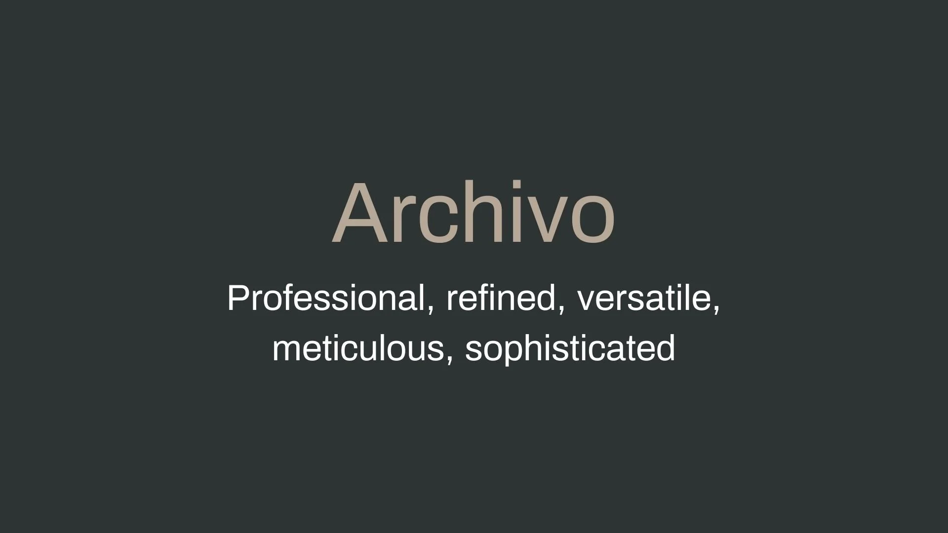
Archivo
Overview:
Archivo is a modern sans-serif font family known for its clarity, versatility, and high-performance readability across print and digital media. Designed with functional elegance, it combines simplicity with a subtle nod to classic grotesque typefaces, making it suitable for headlines, body text, and large-scale typography projects.
History:
Archivo was developed by Héctor Gatti in collaboration with Omnibus-Type, a Latin American type foundry, and was inspired by late 19th-century American typefaces. Originally designed for headline use, Archivo is now widely embraced for various digital and print applications due to its clean, bold appearance and accessibility across different formats and devices. The font family supports more than 200 languages, reflecting Omnibus-Type’s goal to create highly functional, universally accessible typefaces for a global audience.
Characteristics:
Design: Archivo features strong, consistent strokes with minimal decorative elements, designed to prioritize readability and utility. Its letterforms are inspired by the grotesque style, with balanced, uniform proportions that enhance legibility.
Usage: Ideal for large headlines, banners, and high-impact text, but also works well in body text due to its modern yet straightforward design. Archivo's various weights and narrow styles offer flexibility across branding, editorial, and web design projects.
Attributes: Archivo is known for its durability and adaptability in high-performance typography, excelling in both digital screens and print. It has a neutral, professional appearance with just enough warmth to suit a wide range of uses.


FONT PERSONALITY
-
FONT PERSONALITY -

Why Goblin One and Archivo are a Match Made in Heaven:
The pairing of Goblin One and Archivo strikes a perfect balance between playful energy and commanding confidence. Goblin One’s bold and whimsical nature makes it ideal for grabbing attention in headlines, logos, or key callouts, injecting a sense of fun and fearlessness into any design. Meanwhile, Archivo steps in with its dynamic, sharp, and forward-thinking personality, providing a grounded yet versatile counterpart that ensures the design stays polished and professional. Together, these fonts create a harmonious blend of bold creativity and crisp sophistication, making them ideal for projects that need to be both expressive and impactful.
This pairing would resonate with someone who is vibrant and unapologetically creative—a person who thrives on pushing boundaries and making a statement with their personal brand. They might be a bold entrepreneur, an innovative marketer, or an artist with a fearless vision. This individual values energy and innovation, wanting their brand to feel approachable and fun while exuding confidence and professionalism.

CELEBRITY MATCH
-
CELEBRITY MATCH -
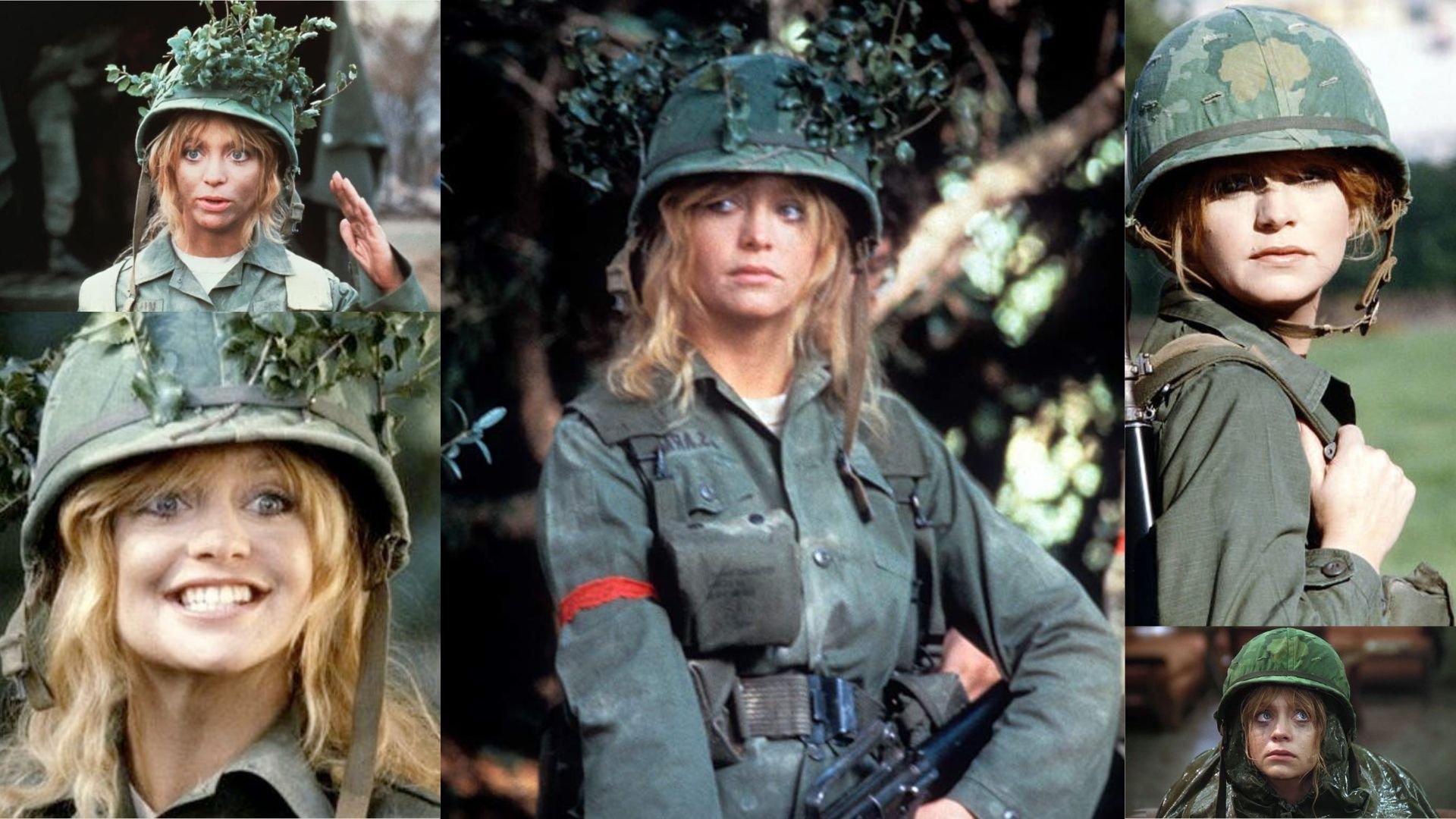
The font pairing of Goblin One and Archivo aligns perfectly with the character of Judy Benjamin, as portrayed by Goldie Hawn in the movie "Private Benjamin (1980)."
Summary: Goldie Hawn’s portrayal of Judy Benjamin in Private Benjamin embodies the traits of Goblin One and Archivo perfectly. Judy’s carefree, bold, and playful spirit aligns with Goblin One’s whimsical and fearless qualities, while her growth into a confident, dynamic, and forward-thinking individual mirrors the qualities of Archivo. This pairing of fonts captures Judy's multifaceted journey, from the fun-loving, whimsical recruit to a strong, capable leader who commands attention and respect.

HIERARCHY
-
HIERARCHY -

Font Hierarchy for Goblin One and Archivo:
Logo
Usage: Primary logo text, initials, brand name
Goblin One, Regular, 96 pt (Canva), 72 pt (Squarespace)
Heading (H1)
Usage: Main headings on pages, prominent titles
Goblin One, Regular, 60 pt (Canva), 48 pt (Squarespace)
Subtitle / Secondary Heading (H2)
Usage: Section titles, important subtitles
Archivo, Bold, 48 pt (Canva), 36 pt (Squarespace)
Subheading (H3)
Usage: Subsection headings, less prominent titles
Archivo, Regular, 36 pt (Canva), 28 pt (Squarespace)
Paragraph / Body Copy (P)
Usage: Main body text, paragraphs, descriptions
Archivo, Regular, 18 pt (Canva), 16 pt (Squarespace)

NOW WHAT?
NOW WHAT?
Let’s put your font pairing to work.
For PBS Members:
If you’re already in my Personal Branding Studio:
If this font pairing feels right, then bookmark this page. We’ll revisit it in Part 2 when we dive into designing your logo and personally branded Canva graphics.
If it’s not quite the one, head back to Part 1, Module 4: Design to explore 100+ other font pairings just like this one.
There’s no rush. Choose the one that truly reflects your most authentic future self.
Not yet a PBS Member?
If you’re not in my Personal Branding Studio program and have no clue what it is…
Then you’ve just scratched the surface.
Imagine having access to:
100+ curated font pairings - each with its own personality, vibe, and purpose
Free downloadable fonts
Step-by-step tutorials on how to use your font pairing in Canva and Squarespace
Full brand-building modules to help you design your logo, website, social media, and more
Plus my 3 part process - Align, Curate, Elevate - on how to build an unforgettable personal brand with magnetic messaging, vibrant visuals, and delicious designs
That’s what you get inside Personal Branding Studio.
Your font (and personal branding) journey doesn't have to end here.
Use discount code FONT20 at checkout to get 20% off.