MEET YOUR FONT PAIRING MATCH
This page is your custom breakdown of the font pairing you were matched with from the Find Your Font Quiz. You’ll discover the history, personality, and style of each font—and see how they can come to life in your personal brand.
If you're a Personal Branding Studio member:
Bookmark this page. We’ll return to it in Part 2 when it’s time to use your font pairing to design your logo and create branded Canva graphics.
Not loving this particular combo? No problem. Explore all 100+ font pairings inside PBS - Part 1, Module 4: Design - to find one that feels just right. Click the button below to go there now.
Not yet a Personal Branding Studio member?
(And wondering what Personal Branding Studio even is?)
Start by scrolling through your results below. At the bottom of this page, you’ll find out how to go deeper with your personal brand through my full Personal Branding Studio program.
And your aligned font pairing match is…


HISTORY
-
HISTORY -
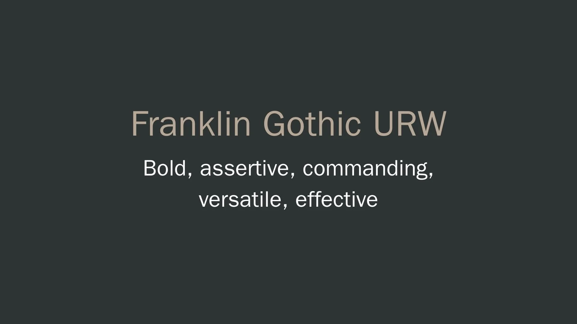
Franklin Gothic URW
Overview:
Franklin Gothic URW is a bold and expressive sans-serif font derived from the Franklin Gothic typeface, a highly recognizable style in the grotesque category. Known for its powerful presence and excellent readability, Franklin Gothic URW is popular across digital and print platforms, often featured in headlines, advertisements, and signage.
History:
Originally designed by American type designer Morris Fuller Benton in 1902 for the American Type Founders (ATF), Franklin Gothic was crafted as a modern take on 19th-century sans-serifs, aiming to provide a clear, unadorned typeface suitable for a variety of media. Over the years, it became a classic in American typography, evolving through several iterations by various foundries. The URW version was created in the digital era to adapt Benton’s original vision for contemporary use, leveraging modern technology to enhance its versatility and accessibility across platforms.
Characteristics:
Design: Franklin Gothic URW features clean lines, relatively narrow proportions, and sturdy forms that make it stand out without overwhelming. Its bold strokes and slightly condensed structure provide a grounded and assertive look.
Usage: Ideal for headlines, posters, branding, and short text blocks where impact is essential, Franklin Gothic URW's straightforward design ensures readability at a glance.
Attributes: This typeface is characterized by its clarity, authority, and subtle vintage appeal, providing a balance of strength and refinement that makes it adaptable yet distinct.
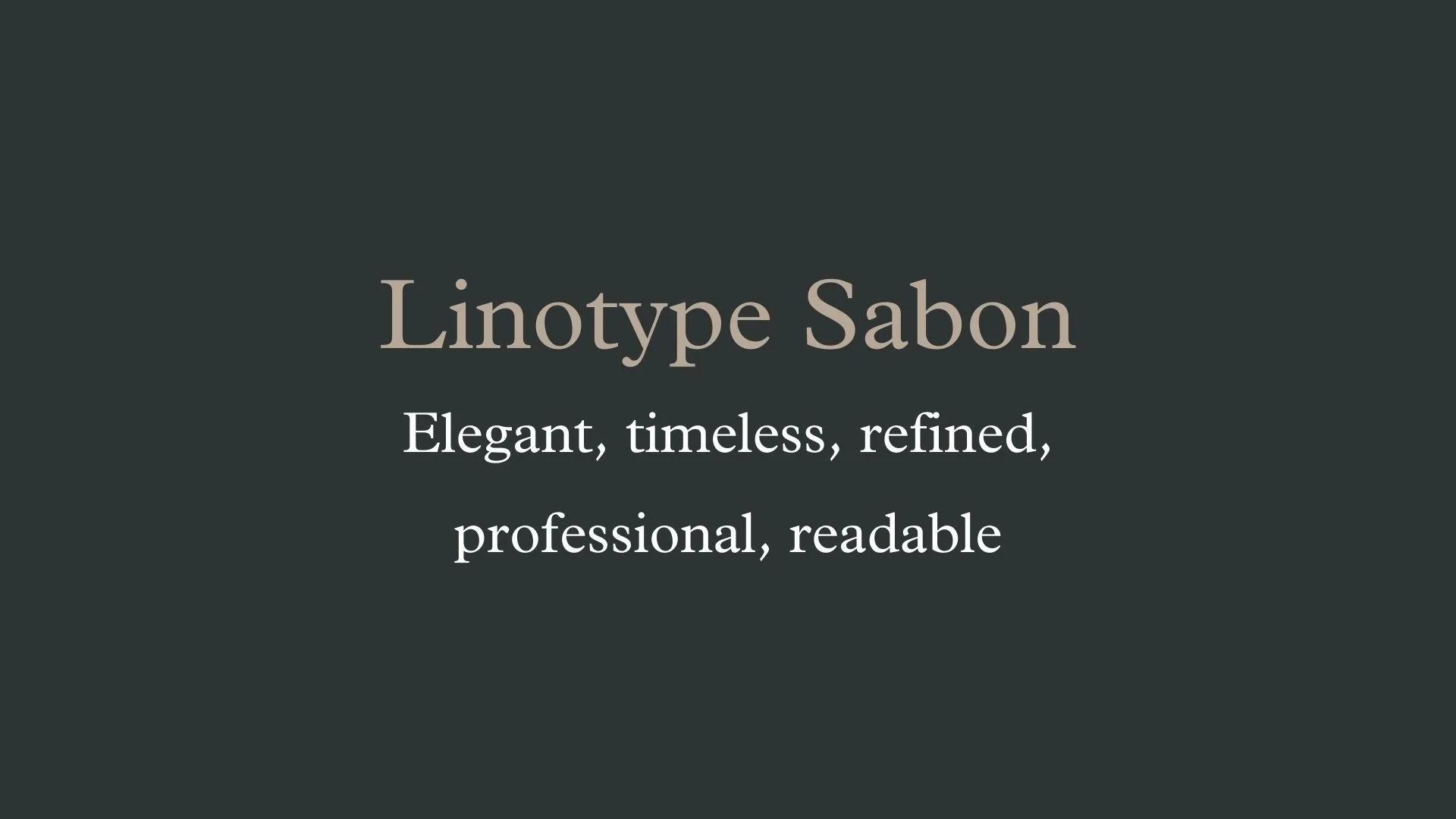
Linotype Sabon
Overview:
Linotype Sabon is a serif typeface known for its elegance and balance, making it a versatile choice for both print and digital applications. Inspired by traditional Garamond designs, Sabon is celebrated for its readability and classic style, lending itself well to book design, magazines, and corporate branding.
History:
Sabon was designed by Jan Tschichold in 1967. Commissioned by the German print industry, it aimed to create a unified typeface for both Monotype and Linotype systems, which had different technical constraints at the time. Tschichold’s goal was to preserve the character and sophistication of the Garamond style while ensuring that Sabon maintained consistent proportions across different typesetting systems, making it an ideal choice for print in an era where multiple technologies were in use.
Characteristics:
Design: Sabon is rooted in the Garamond tradition, with a few unique adaptations by Tschichold to meet mid-20th century printing needs. Its balanced proportions, open counters, and distinct italics contribute to both clarity and beauty. Sabon Next, a later adaptation by Jean-François Porchez, introduced additional weights and refined details to enhance the font's usability in modern digital contexts.
Usage: Primarily used for high-quality print, Sabon excels in long-form text, such as books, where readability and classic elegance are key. Its clarity at small sizes also makes it suitable for body text in magazines and newspapers. Sabon’s italic and bold variants are nuanced, making it a popular choice for more refined editorial design.
Attributes: Known for its readability, warmth, and timeless style, Sabon captures the traditional aesthetic of Renaissance typefaces with a modern twist. It is often described as understated yet elegant, combining classic serif characteristics with a subtle modern sensibility.


FONT PERSONALITY
-
FONT PERSONALITY -
Why Franklin Gothic URW and Linotype Sabon are a Match Made in Heaven:
Franklin Gothic URW and Linotype Sabon form an ideal combination, balancing bold authority with classic elegance. Franklin Gothic URW, with its assertive and commanding nature, grabs attention in a way that feels both contemporary and accessible, making it perfect for headlines or elements that require a strong presence. Linotype Sabon, on the other hand, introduces a sense of timeless sophistication with its refined serifs and meticulous design, providing a grounded, polished contrast to Franklin Gothic’s boldness. Together, this pairing achieves a harmony of power and elegance, giving designs a clear hierarchy and visual depth. Franklin Gothic draws the eye, while Linotype Sabon gently supports, offering a structured, authoritative feel that never loses its sense of grace.
This pairing would appeal to someone who is confident, articulate, and poised—a natural leader who values both impact and refinement. They might be a professional in a high-stakes field, such as law, publishing, or corporate strategy, where conveying both strength and sophistication is essential. This person understands the importance of first impressions but also values depth and professionalism, creating an aura of authority softened by a timeless, approachable warmth. They are decisive and purposeful, making Franklin Gothic URW and Linotype Sabon an ideal match to represent their brand’s commanding yet refined identity.

CELEBRITY MATCH
-
CELEBRITY MATCH -

The font pairing of Franklin Gothic URW and Linotype Sabon aligns perfectly with the character of Fantine, as portrayed by Anne Hathaway in the movie "Les Misérables (2012)."
Summary: The combination of Franklin Gothic URW and Linotype Sabon aptly captures the essence of Anne Hathaway’s portrayal of Fantine in Les Misérables. Franklin Gothic URW’s boldness aligns with Fantine’s strength and assertiveness, while Linotype Sabon’s elegance mirrors her grace and emotional complexity. This pairing reflects Fantine’s multifaceted character, whose commanding presence and tragic beauty make her one of the most powerful figures in the story.

HIERARCHY
-
HIERARCHY -

Font Hierarchy for Franklin Gothic URW and Linotype Sabon:
Logo
Usage: Primary logo text, initials, brand name
Franklin Gothic URW, Bold, 72 pt (Canva), 48 px (Squarespace)
Heading (H1)
Usage: Main headings on pages, prominent titles
Franklin Gothic URW, Regular, 60 pt (Canva), 36 px (Squarespace)
Subtitle / Secondary Heading (H2)
Usage: Section titles, important subtitles
Linotype Sabon, Bold, 48 pt (Canva), 30 px (Squarespace)
Subheading (H3)
Usage: Subsection headings, less prominent titles
Linotype Sabon, Regular, 36 pt (Canva), 24 px (Squarespace)
Paragraph / Body Copy (P)
Usage: Main body text, paragraphs, descriptions
Linotype Sabon, Regular, 24 pt (Canva), 16 px (Squarespace)

NOW WHAT?
NOW WHAT?
Let’s put your font pairing to work.
For PBS Members:
If you’re already in my Personal Branding Studio:
If this font pairing feels right, then bookmark this page. We’ll revisit it in Part 2 when we dive into designing your logo and personally branded Canva graphics.
If it’s not quite the one, head back to Part 1, Module 4: Design to explore 100+ other font pairings just like this one.
There’s no rush. Choose the one that truly reflects your most authentic future self.
Not yet a PBS Member?
If you’re not in my Personal Branding Studio program and have no clue what it is…
Then you’ve just scratched the surface.
Imagine having access to:
100+ curated font pairings - each with its own personality, vibe, and purpose
Free downloadable fonts
Step-by-step tutorials on how to use your font pairing in Canva and Squarespace
Full brand-building modules to help you design your logo, website, social media, and more
Plus my 3 part process - Align, Curate, Elevate - on how to build an unforgettable personal brand with magnetic messaging, vibrant visuals, and delicious designs
That’s what you get inside Personal Branding Studio.
Your font (and personal branding) journey doesn't have to end here.
Use discount code FONT20 at checkout to get 20% off.