MEET YOUR FONT PAIRING MATCH
This page is your custom breakdown of the font pairing you were matched with from the Find Your Font Quiz. You’ll discover the history, personality, and style of each font—and see how they can come to life in your personal brand.
If you're a Personal Branding Studio member:
Bookmark this page. We’ll return to it in Part 2 when it’s time to use your font pairing to design your logo and create branded Canva graphics.
Not loving this particular combo? No problem. Explore all 100+ font pairings inside PBS - Part 1, Module 4: Design - to find one that feels just right. Click the button below to go there now.
Not yet a Personal Branding Studio member?
(And wondering what Personal Branding Studio even is?)
Start by scrolling through your results below. At the bottom of this page, you’ll find out how to go deeper with your personal brand through my full Personal Branding Studio program.
And your aligned font pairing match is…


HISTORY
-
HISTORY -
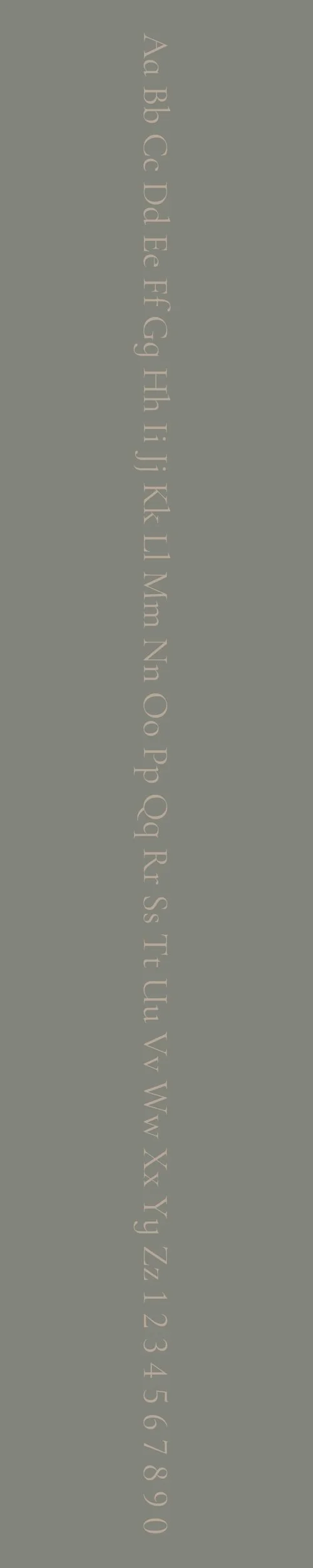
Cormorant Infant
Overview:
Cormorant Infant is a classic serif typeface inspired by the timeless elegance of Garamond, yet simplified for improved readability at small sizes. It carries a refined, traditional feel, which makes it ideal for literary and formal applications where a classic yet approachable typeface is desired.
History:
Created by type designer Christian Thalmann and released through Catharsis Fonts, Cormorant Infant is part of the larger Cormorant type family, which Thalmann crafted as a tribute to the work of the 16th-century French type designer Claude Garamond. Released through Google Fonts, the Cormorant family consists of multiple styles including Infant, Roman, Italic, and others, each developed to highlight unique aspects of Garamond's legacy while being versatile for modern usage. Thalmann's primary motivation was to create a typeface family that retained Garamond’s elegance but with design updates, like simplified letterforms and wider counters, to improve legibility and accessibility, especially in smaller sizes.
Characteristics:
Design: Cormorant Infant stands out for its gentle curves and classic proportions, with softened, rounded edges that make it highly readable even for young or novice readers. This feature distinguishes it from the sharper terminals in the traditional Garamond style, giving it a more welcoming and gentle aesthetic.
Usage: Ideal for body text, children’s literature, and any long-form text, Cormorant Infant works well in both digital and print contexts where comfort and clarity are essential. Its classic style also makes it suitable for formal invitations, editorial design, and branding that calls for a touch of sophistication.
Attributes: Cormorant Infant is distinguished by its warm, elegant character and high readability. With a well-balanced contrast and refined serif details, it adds a timeless, literary quality to text while remaining approachable and functional.
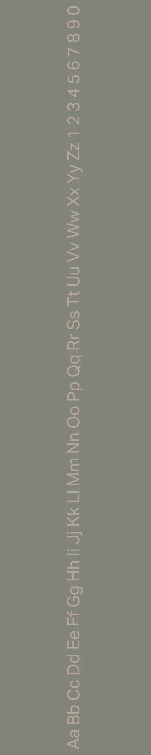
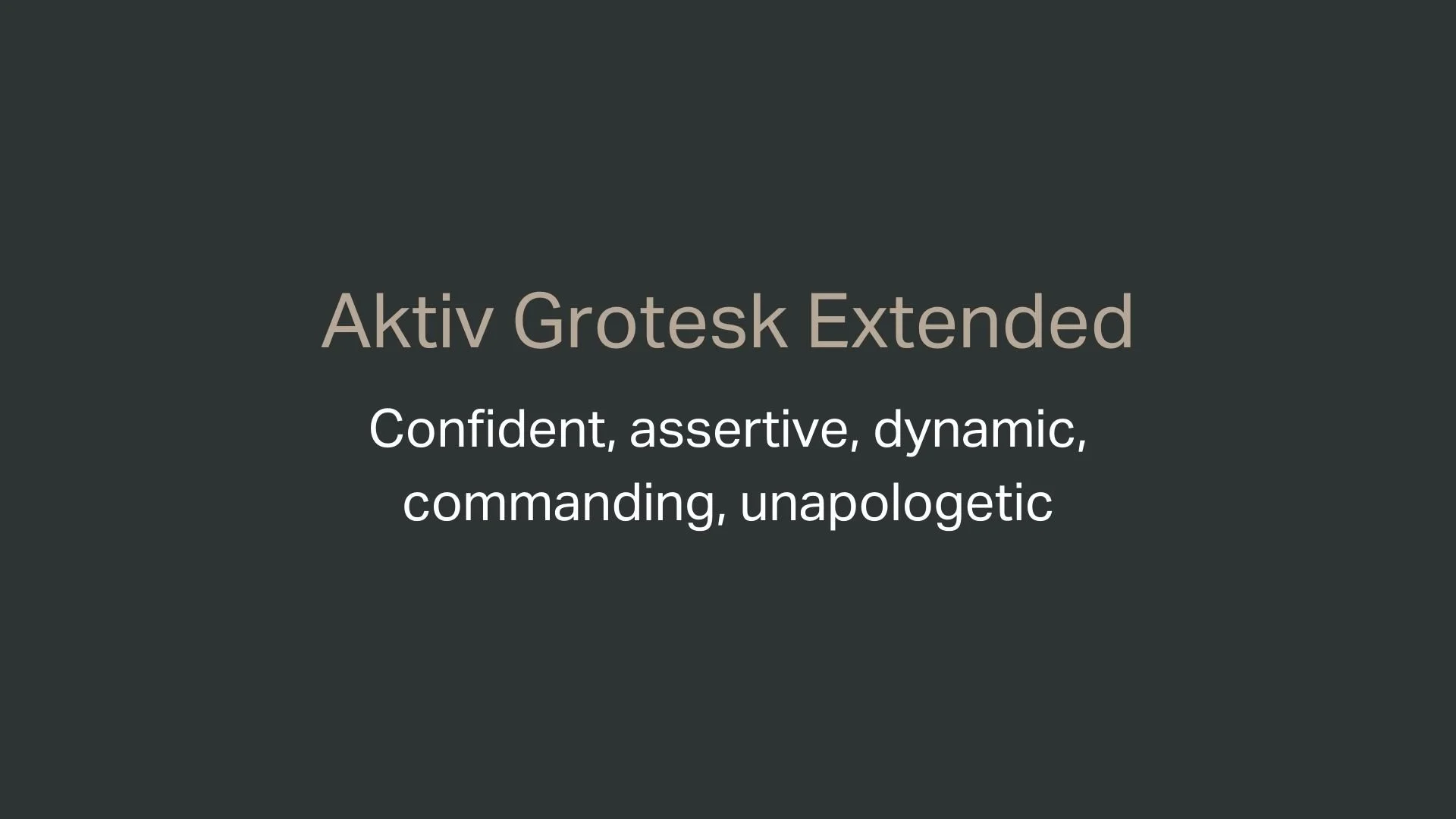
Aktiv Grotesk Extended
Overview:
Aktiv Grotesk Extended is a contemporary sans-serif typeface known for its clean, robust appearance and versatility across digital and print media. It’s recognized as a modern alternative to Helvetica, aimed at combining precise functionality with a hint of personality, which is why it’s a popular choice in corporate and branding projects that seek a professional yet approachable feel.
History:
Designed in 2010 by Dalton Maag, Aktiv Grotesk was the brainchild of Bruno Maag, Tom Foley, and Fabio Haag. It was created as a direct response to the limitations of Helvetica, offering an alternative that would sit stylistically between the crisp Univers and the more mechanical Helvetica. The design team’s goal was to eliminate Helvetica's quirks and create a typeface that had perfect structural balance and flawless craftsmanship while still being distinctive and functional. Since its release, Aktiv Grotesk has been adopted by numerous brands, including the English National Ballet, reflecting its suitability for both elegance and utility.
Characteristics:
Design: Aktiv Grotesk Extended is distinguished by its even weight distribution, balanced geometric shapes, and slightly softened edges, providing it with a modern yet grounded look. The extended width variation of Aktiv Grotesk emphasizes its readability and creates a bolder, more impactful presence.
Usage: Well-suited for headlines, branding, and corporate identities, Aktiv Grotesk Extended is ideal in spaces where readability and a contemporary aesthetic are paramount. Its clean lines and precise structure make it perfect for signage, editorial layouts, and digital interfaces, where clarity and style must coexist seamlessly.
Attributes: This typeface is highly legible, consistent, and has a neutral character, making it adaptable to various design contexts without overpowering other design elements. Its slightly rounded, open shapes ensure it remains approachable, with a professional and polished appearance.

FONT PERSONALITY
-
FONT PERSONALITY -

Why Cormorant Infant and Aktiv Grotesk Extended are a Match Made in Heaven:
Cormorant Infant and Aktiv Grotesk Extended complement each other beautifully, creating a visual dynamic that balances nurturing warmth with confident boldness. Cormorant Infant, with its soft, graceful forms, conveys a sense of care and patience—perfect for creating a welcoming and empathetic impression. Its gentle aesthetic is inviting, making it an ideal choice for headings or focal text where a touch of elegance and approachability is needed. In contrast, Aktiv Grotesk Extended brings a bold, unapologetic energy to the mix, anchoring Cormorant’s gentle qualities with assertiveness and strength. This secondary font’s extended letterforms stand out with commanding presence, offering a striking yet harmonious counterpoint to Cormorant Infant’s softness. Together, these fonts create a pairing that is sophisticated, warm, and impactful—ideal for brands that wish to be both reassuring and authoritative.
This pairing would resonate with someone who is both nurturing and confident—perhaps a mentor, life coach, or wellness professional who is deeply attuned to the needs of others but also exudes a strong, guiding presence. They likely value open communication and approachability but are unafraid to take charge and lead with conviction. This person might work in a field where both empathy and decisiveness are essential, such as counseling, holistic health, or personal development, bringing both warmth and a clear, confident voice to their personal brand.

CELEBRITY MATCH
-
CELEBRITY MATCH -

The font pairing of Cormorant Infant and Aktiv Grotesk Extended aligns perfectly with the character of Alice Kepley, as portrayed by Dakota Johnson in the movie "How to Be Single (2016)."
Summary: Dakota Johnson’s portrayal of Alice Kepley in How to Be Single perfectly aligns with the font pairing of Cormorant Infant and Aktiv Grotesk Extended . Alice begins as a nurturing, empathetic character, akin to Cormorant Infant, but evolves into a confident, assertive woman, much like the strong presence of Aktiv Grotesk Extended. This duality in her character mirrors the dynamic of the font pairing, making Dakota Johnson and her role as Alice a perfect match for these fonts.

HIERARCHY
-
HIERARCHY -

Font Hierarchy for Cormorant Infant and Aktiv Grotesk:
Logo
Usage: Primary logo text, initials, brand name
Cormorant Infant, Bold, 72 pt (Canva), 60 px (Squarespace)
Heading (H1)
Usage: Main headings on pages, prominent titles
Cormorant Infant, Regular, 48 pt (Canva), 42 px (Squarespace)
Subtitle / Secondary Heading (H2)
Usage: Section titles, important subtitles
Aktiv Grotesk Extended, Bold, 36 pt (Canva), 32 px (Squarespace)
Subheading (H3)
Usage: Subsection headings, less prominent titles
Aktiv Grotesk Extended, Regular, 30 pt (Canva), 28 px (Squarespace)
Paragraph / Body Copy (P)
Usage: Main body text, paragraphs, descriptions
Aktiv Grotesk Extended, Regular, 16 pt (Canva), 18 px (Squarespace)

NOW WHAT?
NOW WHAT?
Let’s put your font pairing to work.
For PBS Members:
If you’re already in my Personal Branding Studio:
If this font pairing feels right, then bookmark this page. We’ll revisit it in Part 2 when we dive into designing your logo and personally branded Canva graphics.
If it’s not quite the one, head back to Part 1, Module 4: Design to explore 100+ other font pairings just like this one.
There’s no rush. Choose the one that truly reflects your most authentic future self.
Not yet a PBS Member?
If you’re not in my Personal Branding Studio program and have no clue what it is…
Then you’ve just scratched the surface.
Imagine having access to:
100+ curated font pairings - each with its own personality, vibe, and purpose
Free downloadable fonts
Step-by-step tutorials on how to use your font pairing in Canva and Squarespace
Full brand-building modules to help you design your logo, website, social media, and more
Plus my 3 part process - Align, Curate, Elevate - on how to build an unforgettable personal brand with magnetic messaging, vibrant visuals, and delicious designs
That’s what you get inside Personal Branding Studio.
Your font (and personal branding) journey doesn't have to end here.
Use discount code FONT20 at checkout to get 20% off.