MEET YOUR FONT PAIRING MATCH
This page is your custom breakdown of the font pairing you were matched with from the Find Your Font Quiz. You’ll discover the history, personality, and style of each font—and see how they can come to life in your personal brand.
If you're a Personal Branding Studio member:
Bookmark this page. We’ll return to it in Part 2 when it’s time to use your font pairing to design your logo and create branded Canva graphics.
Not loving this particular combo? No problem. Explore all 100+ font pairings inside PBS - Part 1, Module 4: Design - to find one that feels just right. Click the button below to go there now.
Not yet a Personal Branding Studio member?
(And wondering what Personal Branding Studio even is?)
Start by scrolling through your results below. At the bottom of this page, you’ll find out how to go deeper with your personal brand through my full Personal Branding Studio program.
And your aligned font pairing match is…


HISTORY
-
HISTORY -
Calistoga
Overview:
Calistoga is a unique, semi-bold display serif font with a character that brings a touch of vintage charm and playfulness to text. With its chunky, bold design and organic curves, it serves well in headline settings, balancing legibility with a distinctive personality.
History:
Calistoga was created by designer Yvonne Schuttler in 2011, originally inspired by classic travel posters of the early 20th century, especially those crafted by Oscar M. Bryn for the Santa Fe Railroad. The font was published by Sorkin Type and later refined by Eben Sorkin in 2018 to enhance its usability, expand its glyph support, and ensure broader language compatibility.
Characteristics:
Design: Calistoga’s semi-bold weight, rounded edges, and open apertures give it a playful, retro feel while maintaining readability. Its thick serifs and organic shape make it memorable and suited for eye-catching, expressive typography.
Usage: Ideal for headlines, posters, logos, and other display purposes where a bit of retro flair is desirable. It’s particularly well-suited to branding that aims for an approachable, nostalgic feel.
Attributes: Calistoga has an inviting, bold presence. Its versatility is enhanced by extensive language support, including characters for over 130 languages, making it a good choice for international projects in both print and digital applications.

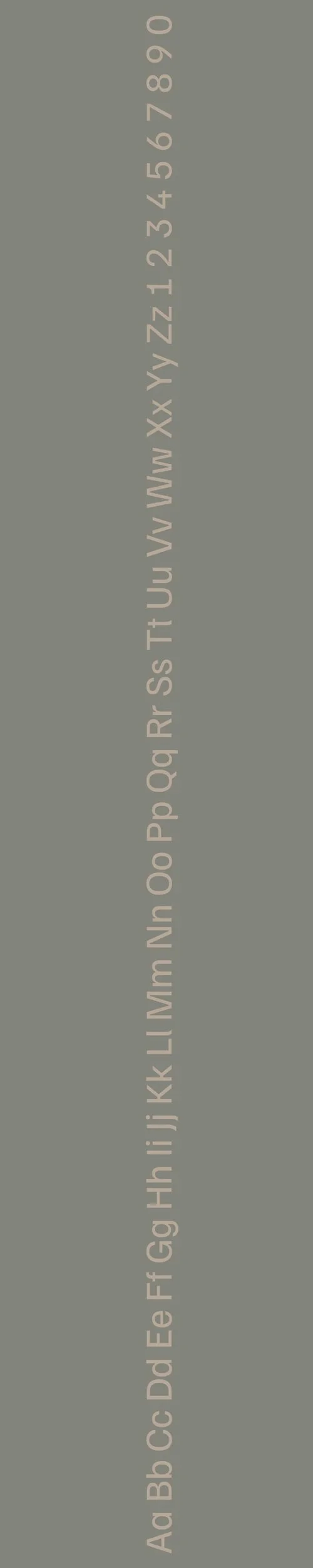
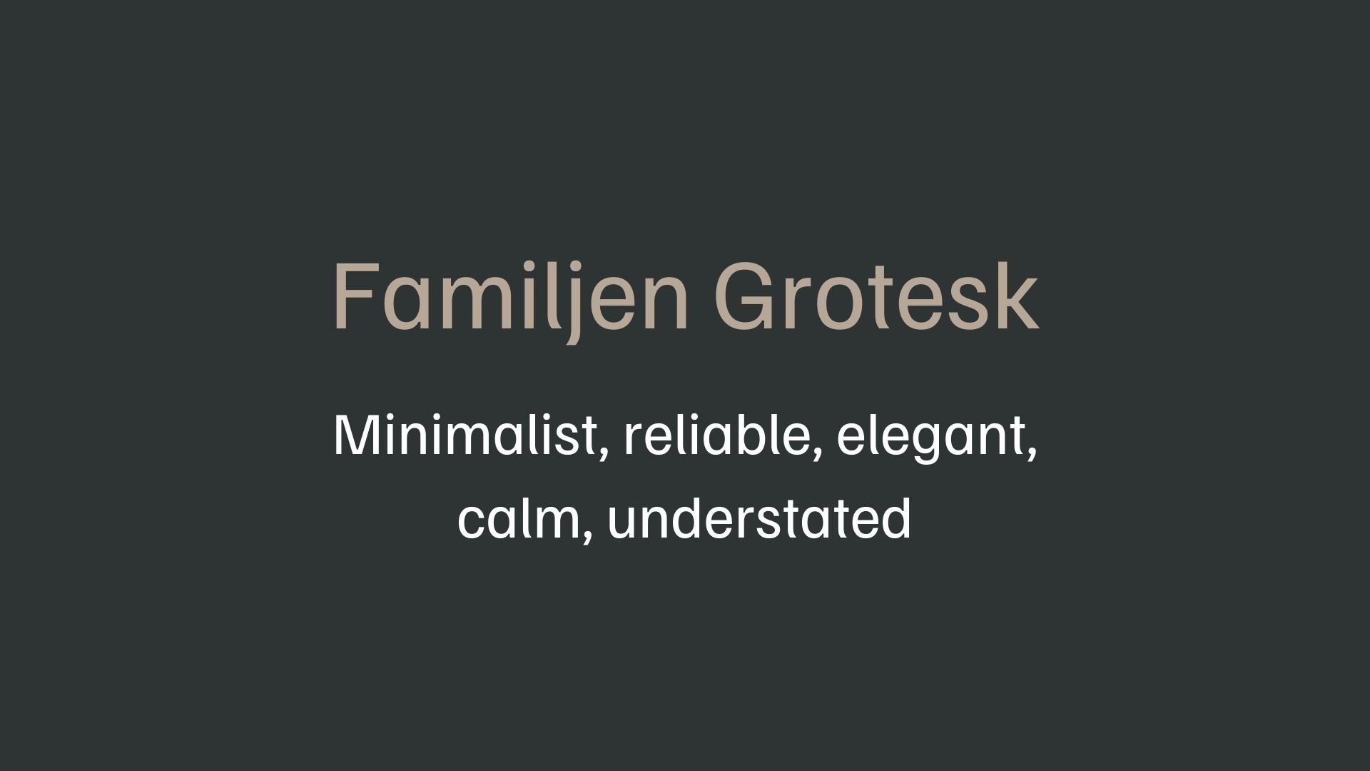
Familjen Grotesk
Overview:
Familjen Grotesk is a contemporary sans-serif typeface with roots in the traditional grotesque style but with unique, playful details that give it a friendly and modern feel. With both display and body text applications in mind, it is designed to be highly versatile and suitable for a range of digital and print uses.
History:
Familjen Grotesk was created by the Swedish design studio Familjen STHLM AB, with contributions from Anders Wikström, Jonas Baeckman, Kristian Moeller, and Matilda Gysing. This typeface was intended to bring a fresh and approachable twist to the classic grotesque style, balancing formality with lively details. Its release as a free typeface under the Open Font License also supports accessibility for a broad range of users and projects.
Characteristics:
Design: Familjen Grotesk combines geometric structure with subtle, organic touches. Key features include softly bent stems, low contrast, a large x-height, and closed apertures. These details, along with unique ink traps and single-story forms of “a” and “g,” add warmth and approachability.
Usage: Its clarity and unique details make it suitable for both large display text and smaller UI elements. The typeface works well for headlines, creative publishing, and user interfaces, adding character without overwhelming the design.
Attributes: Familjen Grotesk is distinguished by its blend of formality and friendliness, making it a good alternative to traditional grotesques like Helvetica, particularly when a more modern, accessible feel is desired.

FONT PERSONALITY
-
FONT PERSONALITY -

Why Calistoga and Familjen Grotesk are a Match Made in Heaven:
Calistoga and Familjen Grotesk make an unexpectedly delightful pairing, balancing charm with sophistication. Calistoga’s playful, whimsical, and nostalgic nature infuses a warm, vintage flair into any design, capturing attention with its quirky and expressive personality. It’s a font that brings life to headlines, creating a friendly and memorable impression. Familjen Grotesk, on the other hand, complements this with a clean, minimalist structure that lends reliability and elegance to the overall look. Familjen’s calm and understated style tempers Calistoga’s vibrant personality, allowing each font to shine without competing. Together, they create a harmonious blend of fun and functionality—perfect for brands that want to evoke creativity without sacrificing professionalism.
This pairing would appeal to someone with a love for both the whimsical and the refined—a creative professional who enjoys mixing vintage vibes with modern minimalism. This person likely has a warm and approachable personality, with an eye for detail and an appreciation for both art and order. They might be an artisan, a lifestyle blogger, or an independent boutique owner who values a personal, nostalgic touch in their brand while maintaining a sense of elegance and reliability. This individual knows how to captivate an audience with charm and authenticity, while also conveying a sense of trustworthiness and calm expertise.

CELEBRITY MATCH
-
CELEBRITY MATCH -

The font pairing of Calistoga and Familjen Grotesk aligns perfectly with the character of Serena van der Woodsen, as portrayed by Blake Lively in the movie "Gossip Girl."
Summary: The font pairing of Calistoga and Familjen Grotesk embodies a dynamic that reflects the character of Serena van der Woodsen from Gossip Girl. Calistoga’s playful, vintage-inspired personality complements Serena’s glamorous and creative side, while Familjen Grotesk’s modern, professional demeanor reflects the organized and efficient structure within Serena’s world. Together, these fonts create a balanced and engaging design, much like Serena’s captivating yet well-structured presence in the series.

HIERARCHY
-
HIERARCHY -

Font Hierarchy for Calistoga and Familjen Grotesk:
Logo
Usage: Primary logo text, initials, brand name
Calistoga, Regular, 36–48 pt depending on the design context (Canva), 48–72 px (Squarespace)
Heading (H1)
Usage: Main headings on pages, prominent titles
Calistoga, Regular, 30–36 pt (Canva), 36–48 px (Squarespace)
Subtitle / Secondary Heading (H2)
Usage: Section titles, important subtitles
Familjen Grotesk, Regular, 24–30 pt (Canva), 24–30 px (Squarespace)
Subheading (H3)
Usage: Subsection headings, less prominent titles
Familjen Grotesk, Italic, 18–24 pt (Canva), 18–24 px (Squarespace)
Paragraph / Body Copy (P)
Usage: Main body text, paragraphs, descriptions
Familjen Grotesk, Regular, 12–14 pt (Canva), 14–16 px (Squarespace)

NOW WHAT?
NOW WHAT?
Let’s put your font pairing to work.
For PBS Members:
If you’re already in my Personal Branding Studio:
If this font pairing feels right, then bookmark this page. We’ll revisit it in Part 2 when we dive into designing your logo and personally branded Canva graphics.
If it’s not quite the one, head back to Part 1, Module 4: Design to explore 100+ other font pairings just like this one.
There’s no rush. Choose the one that truly reflects your most authentic future self.
Not yet a PBS Member?
If you’re not in my Personal Branding Studio program and have no clue what it is…
Then you’ve just scratched the surface.
Imagine having access to:
100+ curated font pairings - each with its own personality, vibe, and purpose
Free downloadable fonts
Step-by-step tutorials on how to use your font pairing in Canva and Squarespace
Full brand-building modules to help you design your logo, website, social media, and more
Plus my 3 part process - Align, Curate, Elevate - on how to build an unforgettable personal brand with magnetic messaging, vibrant visuals, and delicious designs
That’s what you get inside Personal Branding Studio.
Your font (and personal branding) journey doesn't have to end here.
Use discount code FONT20 at checkout to get 20% off.