MEET YOUR FONT PAIRING MATCH
This page is your custom breakdown of the font pairing you were matched with from the Find Your Font Quiz. You’ll discover the history, personality, and style of each font—and see how they can come to life in your personal brand.
If you're a Personal Branding Studio member:
Bookmark this page. We’ll return to it in Part 2 when it’s time to use your font pairing to design your logo and create branded Canva graphics.
Not loving this particular combo? No problem. Explore all 100+ font pairings inside PBS - Part 1, Module 4: Design - to find one that feels just right. Click the button below to go there now.
Not yet a Personal Branding Studio member?
(And wondering what Personal Branding Studio even is?)
Start by scrolling through your results below. At the bottom of this page, you’ll find out how to go deeper with your personal brand through my full Personal Branding Studio program.
And your aligned font pairing match is…

HISTORY
-
HISTORY -
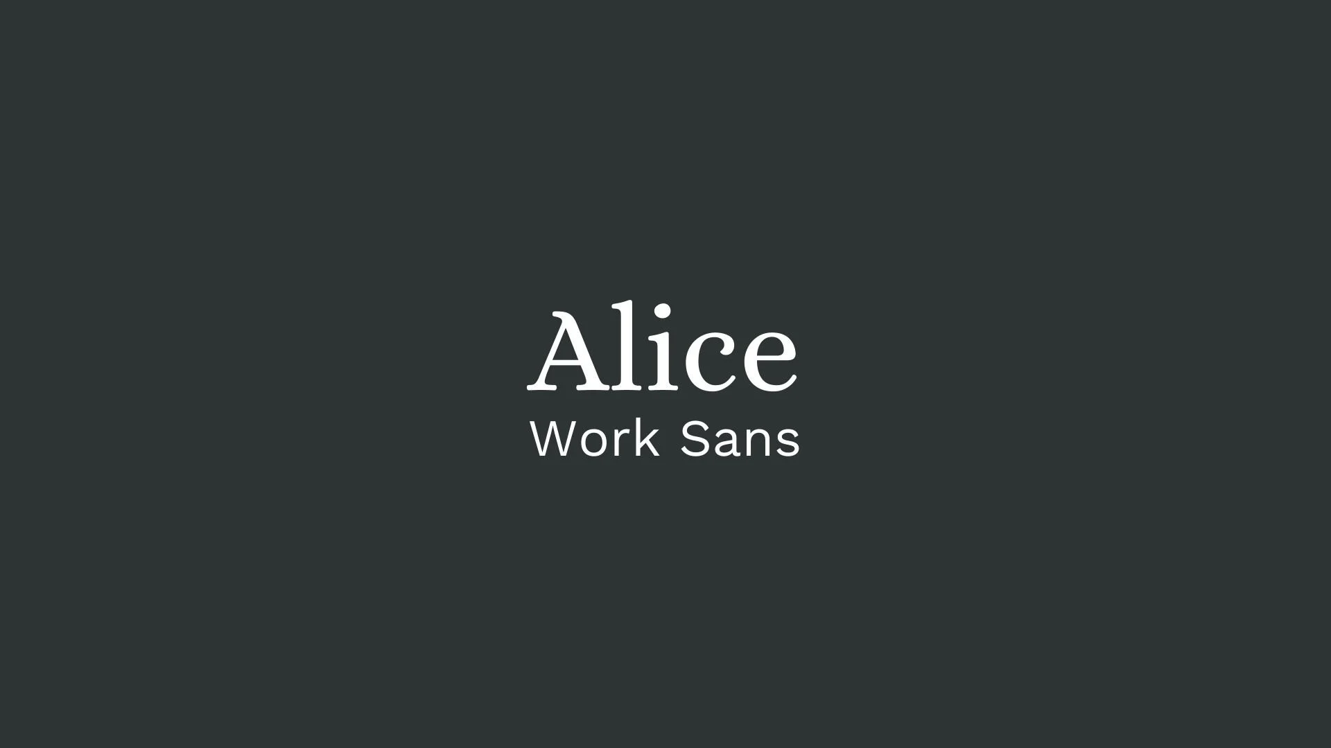
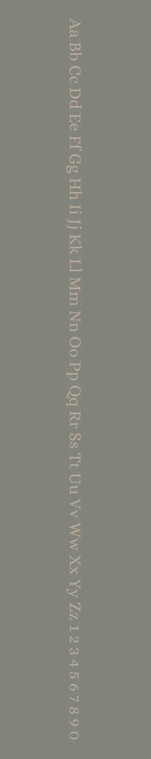
Alice
Overview:
Alice is a charming serif typeface characterized by its traditional elegance and friendly appearance. With its distinct letterforms and moderate contrast, Alice strikes a balance between readability and personality, making it suitable for both digital and print contexts.
History:
Alice was designed by the renowned type designer and typographer, José Scaglione, in collaboration with Veronika Burian. Released in 2010 through the type foundry TypeTogether, Alice was inspired by classic typefaces used in children’s literature, reflecting a blend of charm and sophistication. The design aimed to evoke a sense of warmth and approachability while maintaining excellent legibility, making it ideal for long texts, such as novels and editorial content.
Characteristics:
Design: Alice features soft, rounded serifs and a slightly condensed letterform that provides a unique yet familiar look. Its moderate x-height enhances legibility, while its subtle curves add a touch of elegance and friendliness.
Usage: Perfect for body text in books and articles, Alice is also suitable for invitations, branding, and any design where a warm and inviting typographic style is desired. Its balanced proportions work well in both large and small sizes.
Attributes: Highly legible, warm, and inviting, Alice combines classic elements with a modern touch, making it a versatile choice for various design projects.
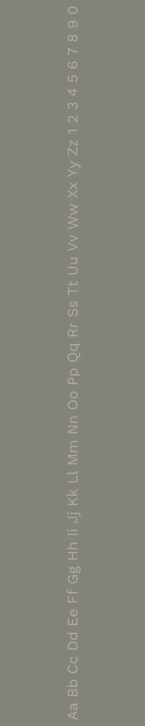
Work Sans
Overview:
Work Sans is a contemporary sans-serif typeface designed with a focus on versatility and legibility. Its modern aesthetic, combined with a slight geometric influence, makes it an excellent choice for both digital and print applications, particularly in user interfaces and branding.
History:
Work Sans was designed by Wei Huang, a type designer based in New Zealand. The typeface was released in 2015 and is part of the Google Fonts library, where it was made available for free use. Inspired by early grotesque typefaces, Work Sans aims to bridge the gap between a clean sans-serif look and the humanistic qualities of classic typefaces, making it suitable for a variety of design contexts. The font was created to meet the increasing demand for web-safe typefaces that are optimized for on-screen readability.
Characteristics:
Design: Work Sans features a geometric structure with open forms and a harmonious x-height, resulting in a highly legible and approachable typeface. Its letterforms include subtle humanistic details, making it feel friendly yet professional.
Usage: This typeface is particularly effective for body text, user interfaces, and digital applications, as well as for branding materials. Its modern appearance allows it to work well in both formal and informal contexts, making it versatile for different design needs.
Attributes: Work Sans is characterized by its high legibility, modernity, and adaptability. It comes in multiple weights, providing flexibility for designers to create hierarchy and emphasis within their typographic compositions. The font is also optimized for screen use, making it a popular choice for websites and mobile applications.

FONT PERSONALITY
-
FONT PERSONALITY -


Why Alice and Work Sans are a Match Made in Heaven:
Alice and Work Sans create a beautiful harmony that bridges elegance with approachability, resulting in a pairing that feels both refined and relevant. Alice brings a sophisticated charm with its graceful, timeless design, adding a layer of warmth and tradition that speaks to elegance and poise. Meanwhile, Work Sans keeps things grounded and practical, with its clean lines and modern versatility, making it ideal for body text that needs to be effortlessly readable and organized. Together, they strike a balance—Alice’s classic, high-culture allure is complemented by Work Sans' approachable and contemporary touch, resulting in a pairing that feels both inviting and upscale.
This font pairing would appeal to someone who embodies both sophistication and accessibility—a person who values heritage but isn’t afraid to stay current. Imagine a creative entrepreneur or lifestyle consultant who is refined and stylish, yet down-to-earth and personable. They enjoy culture and tradition but also appreciate clean, modern aesthetics. This person likely works in fields where both beauty and practicality are essential, such as interior design, luxury event planning, or boutique branding, blending an eye for detail with a welcoming demeanor.

CELEBRITY MATCH
-
CELEBRITY MATCH -
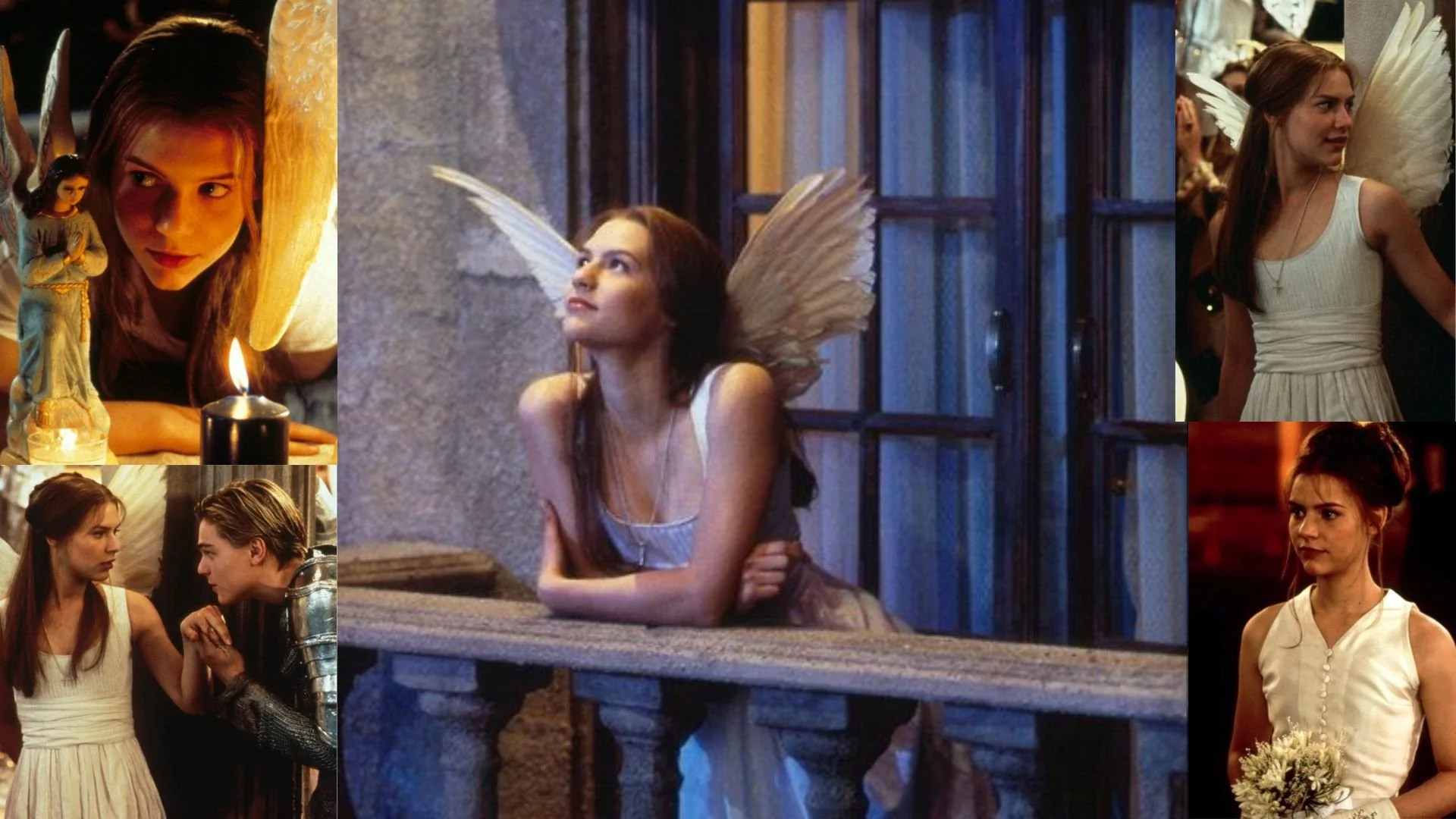
The font pairing of Alice and Work Sans aligns perfectly with the character of Juliet, as portrayed by Claire Danes in the movie "Romeo + Juliet (1996)."
Summary: The font pairing of Alice and Work Sans aligns beautifully with Claire Danes’s portrayal of Juliet in Romeo + Juliet. Alice embodies Juliet’s refined elegance and timeless beauty, while Work Sans mirrors her youthful, modern emotional depth. This pairing strikes a harmonious balance between classic sophistication and contemporary clarity, perfectly mirroring the blend of traditional romance and modern sensibilities that Juliet navigates in the film. Together, Alice and Work Sans offer a nuanced design aesthetic that is both timeless and adaptable, much like Juliet's iconic character.

HIERARCHY
-
HIERARCHY -

Font Hierarchy for Alice and Work Sans:
Logo
Usage: Primary logo text, initials, brand name
Alice, Regular, 72pt (Canva), 48px (Squarespace)
Heading (H1)
Usage: Main headings on pages, prominent titles
Alice, Regular, 48pt (Canva), 36px (Squarespace)
Subtitle / Secondary Heading (H2)
Usage: Section titles, important subtitles
Work Sans, Bold, 36pt (Canva), 30px (Squarespace)
Subheading (H3)
Usage: Subsection headings, less prominent titles
Work Sans, Regular, 28pt (Canva), 24px (Squarespace)
Paragraph / Body Copy (P)
Usage: Main body text, paragraphs, descriptions
Work Sans, Regular, 16pt (Canva), 18px (Squarespace)

NOW WHAT?
NOW WHAT?
Let’s put your font pairing to work.
For PBS Members:
If you’re already in my Personal Branding Studio:
If this font pairing feels right, then bookmark this page. We’ll revisit it in Part 2 when we dive into designing your logo and personally branded Canva graphics.
If it’s not quite the one, head back to Part 1, Module 4: Design to explore 100+ other font pairings just like this one.
There’s no rush. Choose the one that truly reflects your most authentic future self.
Not yet a PBS Member?
If you’re not in my Personal Branding Studio program and have no clue what it is…
Then you’ve just scratched the surface.
Imagine having access to:
100+ curated font pairings - each with its own personality, vibe, and purpose
Free downloadable fonts
Step-by-step tutorials on how to use your font pairing in Canva and Squarespace
Full brand-building modules to help you design your logo, website, social media, and more
Plus my 3 part process - Align, Curate, Elevate - on how to build an unforgettable personal brand with magnetic messaging, vibrant visuals, and delicious designs
That’s what you get inside Personal Branding Studio.
Your font (and personal branding) journey doesn't have to end here.
Use discount code FONT20 at checkout to get 20% off.