MEET YOUR FONT PAIRING MATCH
This page is your custom breakdown of the font pairing you were matched with from the Find Your Font Quiz. You’ll discover the history, personality, and style of each font—and see how they can come to life in your personal brand.
If you're a Personal Branding Studio member:
Bookmark this page. We’ll return to it in Part 2 when it’s time to use your font pairing to design your logo and create branded Canva graphics.
Not loving this particular combo? No problem. Explore all 100+ font pairings inside PBS - Part 1, Module 4: Design - to find one that feels just right. Click the button below to go there now.
Not yet a Personal Branding Studio member?
(And wondering what Personal Branding Studio even is?)
Start by scrolling through your results below. At the bottom of this page, you’ll find out how to go deeper with your personal brand through my full Personal Branding Studio program.
And your aligned font pairing match is…

HISTORY
-
HISTORY -
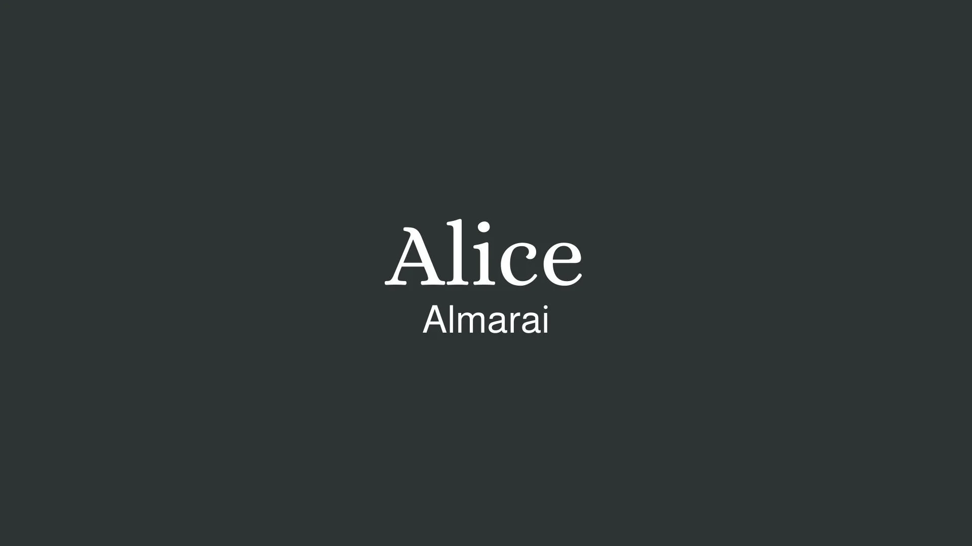
Alice
Overview:
Alice is a charming serif typeface characterized by its traditional elegance and friendly appearance. With its distinct letterforms and moderate contrast, Alice strikes a balance between readability and personality, making it suitable for both digital and print contexts.
History:
Alice was designed by the renowned type designer and typographer, José Scaglione, in collaboration with Veronika Burian. Released in 2010 through the type foundry TypeTogether, Alice was inspired by classic typefaces used in children’s literature, reflecting a blend of charm and sophistication. The design aimed to evoke a sense of warmth and approachability while maintaining excellent legibility, making it ideal for long texts, such as novels and editorial content.
Characteristics:
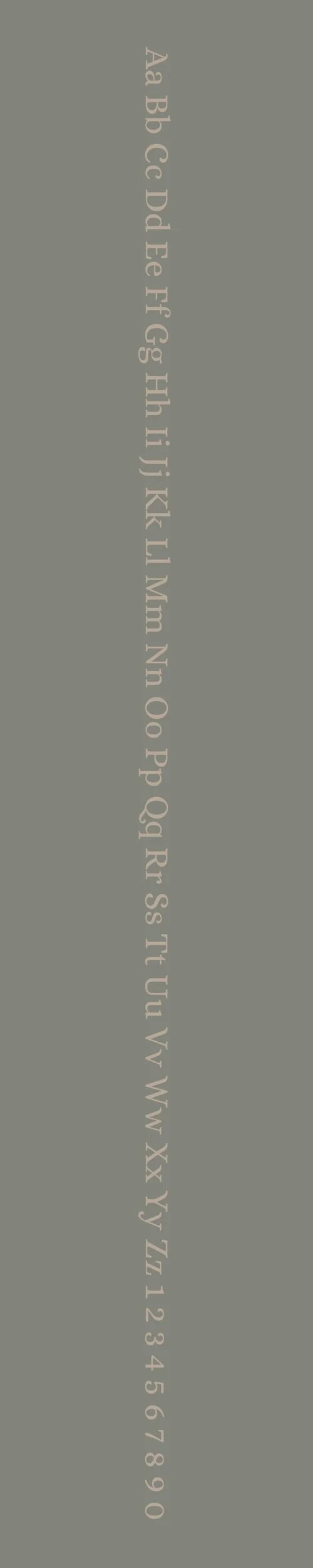
Design: Alice features soft, rounded serifs and a slightly condensed letterform that provides a unique yet familiar look. Its moderate x-height enhances legibility, while its subtle curves add a touch of elegance and friendliness.
Usage: Perfect for body text in books and articles, Alice is also suitable for invitations, branding, and any design where a warm and inviting typographic style is desired. Its balanced proportions work well in both large and small sizes.
Attributes: Highly legible, warm, and inviting, Alice combines classic elements with a modern touch, making it a versatile choice for various design projects.
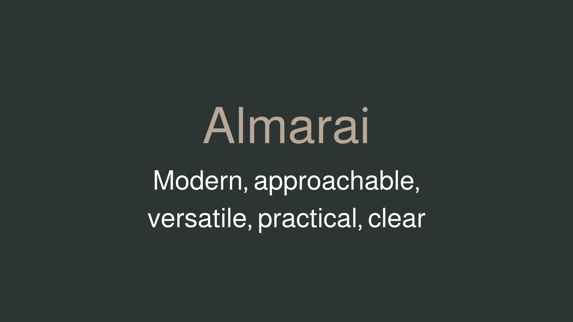
Almarai
Overview:
Almarai is a modern Arabic typeface designed to bring together geometric precision and the fluidity of traditional Arabic calligraphy. It was crafted with an eye for both digital and print design, making it ideal for a variety of applications, from web interfaces to print publications. The typeface features clean lines and subtle curves that make it both legible and visually appealing, while remaining true to Arabic script conventions.
History:
Almarai was created by Juergen Willrodt, who released the font as part of his open-source initiative. Its design was rooted in the desire to bridge the gap between modern Arabic typography and classic calligraphic styles. Almarai’s development is a response to the increasing demand for high-quality Arabic fonts that can also work seamlessly alongside Latin typefaces. The font was designed to retain the essence of Arabic calligraphy while incorporating geometric elements that are commonly found in modern design.
Characteristics:
Design: Almarai features a modern geometric structure, with smooth curves and a balanced proportion that lends it a clean, contemporary appearance. The design focuses on fluidity, which is key to maintaining the harmony of Arabic script.
Usage: Perfect for both web and print applications, Almarai excels in branding, editorial design, and user interfaces, making it suitable for everything from headlines to body text. Its modern style is well-suited for tech companies, digital content, and cultural projects that require a sophisticated and readable Arabic typeface.
Attributes: The font includes four weights, making it versatile for various typographic needs. Its open-source nature and compatibility with Latin typefaces further increase its usability for multi-language projects.


FONT PERSONALITY
-
FONT PERSONALITY -

Why Alice and Almarai are a Match Made in Heaven:
Alice and Almarai create a beautifully balanced font pairing that merges sophistication with modern practicality. Alice, with its elegant and graceful serif design, brings a timeless quality that feels cultured and refined. It’s perfect for settings where a touch of classic sophistication is needed, whether in a logo or headline that seeks to convey beauty and refinement. Almarai, on the other hand, offers a practical counterbalance with its modern, approachable sans-serif style. Its clarity and versatility keep the design grounded, ensuring that the overall look remains accessible and easy to read across various platforms and screen sizes.
This pairing would be perfect for someone who embodies both elegance and approachability—perhaps a lifestyle consultant, interior designer, or creative entrepreneur who values beauty and functionality equally. This person is likely warm and inviting, exuding a sense of refinement but without being intimidating. They appreciate timeless design yet are open to modern ideas, combining an appreciation for art and culture with a keen sense of practicality in their work and personal brand.

CELEBRITY MATCH
-
CELEBRITY MATCH -

The font pairing of Alice and Almarai aligns perfectly with the character of Édith Piaf, as portrayed by Marion Cotillard in the movie "La Vie en Rose (2007)."
Summary: Alice represents Edith Piaf's elegance, sophistication, and timeless presence. Almarai represents Piaf's adaptability, accessibility, and modern appeal, reflecting the practical and relatable aspects of her character. Together, Alice and Almarai create a balanced, complementary relationship much like the multi-faceted persona of Edith Piaf as embodied by Cotillard—both classic and contemporary, graceful and approachable, sophisticated yet grounded.

HIERARCHY
-
HIERARCHY -

Font Hierarchy for Alice and Almarai:
Logo
Usage: Primary logo text, initials, brand name
Alice, Regular or Bold, 48-60pt Adjust based on design (Canva), 48-60pt Adjust based on design (Squarespace)
Heading (H1)
Usage: Main headings on pages, prominent titles
Alice, Bold, 36pt (Canva), 32-36pt (Squarespace)
Subtitle / Secondary Heading (H2)
Usage: Section titles, important subtitles
Almarai, Bold, 28pt (Canva), 24-28pt (Squarespace)
Subheading (H3)
Usage: Subsection headings, less prominent titles
Almarai, Regular, 24pt (Canva), 20-24pt (Squarespace)
Paragraph / Body Copy (P)
Usage: Main body text, paragraphs, descriptions
Almarai, Regular, 16pt (Canva), 16-18pt (Squarespace)

NOW WHAT?
NOW WHAT?
Let’s put your font pairing to work.
For PBS Members:
If you’re already in my Personal Branding Studio:
If this font pairing feels right, then bookmark this page. We’ll revisit it in Part 2 when we dive into designing your logo and personally branded Canva graphics.
If it’s not quite the one, head back to Part 1, Module 4: Design to explore 100+ other font pairings just like this one.
There’s no rush. Choose the one that truly reflects your most authentic future self.
Not yet a PBS Member?
If you’re not in my Personal Branding Studio program and have no clue what it is…
Then you’ve just scratched the surface.
Imagine having access to:
100+ curated font pairings - each with its own personality, vibe, and purpose
Free downloadable fonts
Step-by-step tutorials on how to use your font pairing in Canva and Squarespace
Full brand-building modules to help you design your logo, website, social media, and more
Plus my 3 part process - Align, Curate, Elevate - on how to build an unforgettable personal brand with magnetic messaging, vibrant visuals, and delicious designs
That’s what you get inside Personal Branding Studio.
Your font (and personal branding) journey doesn't have to end here.
Use discount code FONT20 at checkout to get 20% off.