MEET YOUR FONT PAIRING MATCH
This page is your custom breakdown of the font pairing you were matched with from the Find Your Font Quiz. You’ll discover the history, personality, and style of each font—and see how they can come to life in your personal brand.
If you're a Personal Branding Studio member:
Bookmark this page. We’ll return to it in Part 2 when it’s time to use your font pairing to design your logo and create branded Canva graphics.
Not loving this particular combo? No problem. Explore all 100+ font pairings inside PBS - Part 1, Module 4: Design - to find one that feels just right. Click the button below to go there now.
Not yet a Personal Branding Studio member?
(And wondering what Personal Branding Studio even is?)
Start by scrolling through your results below. At the bottom of this page, you’ll find out how to go deeper with your personal brand through my full Personal Branding Studio program.
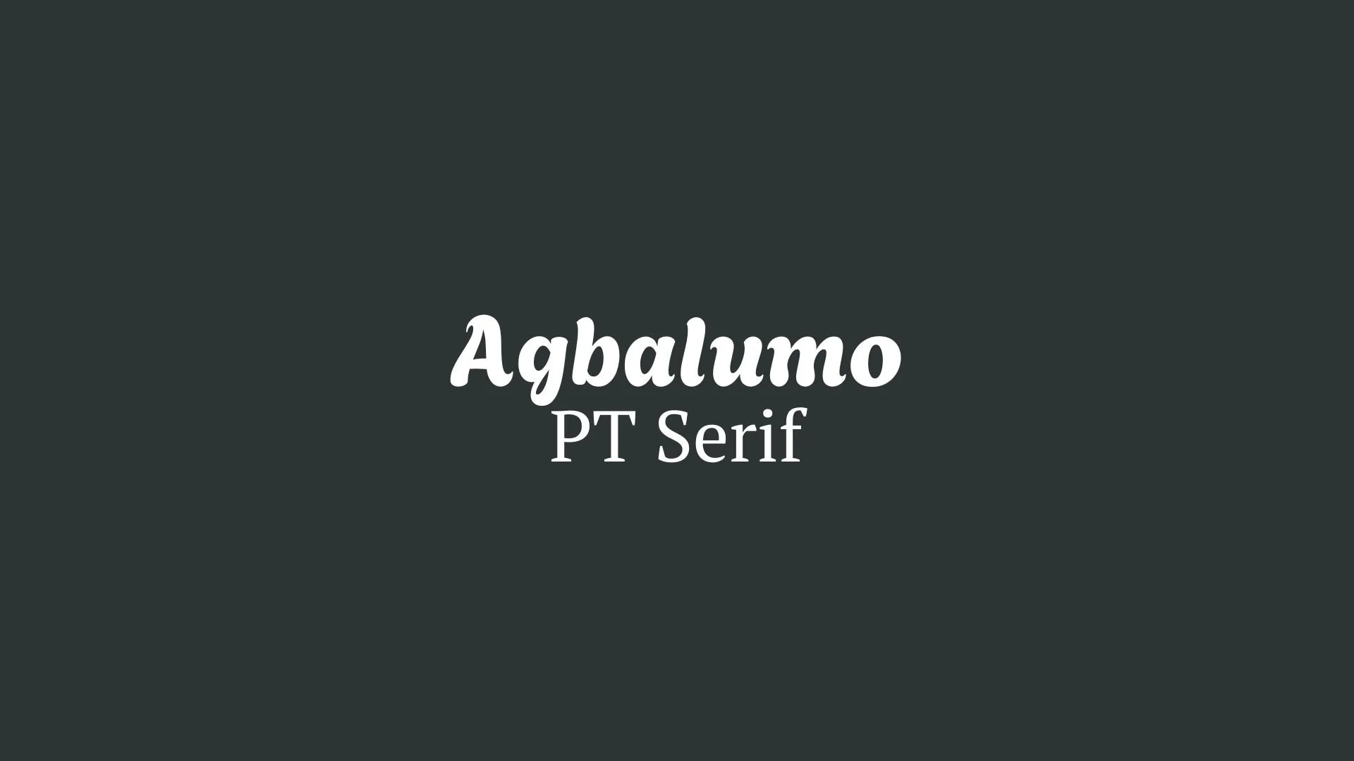
And your aligned font pairing match is…

HISTORY
-
HISTORY -
Agbalumo
Overview:
Agbalumo is a modern, playful, and versatile sans-serif typeface that blends both organic and geometric influences. It has a friendly and approachable design, making it an excellent choice for use in projects that need a sense of warmth and creativity, particularly in digital environments.
History:
Designed by Nigerian-based foundry ColumnType, Agbalumo was released under the SIL Open Font License. The font was inspired by the rich cultural heritage of the African continent, specifically the design of the Agbalumo fruit, which is native to the region. The font aims to capture the fruit's aesthetic qualities, such as its rounded forms and vibrant energy, and make them accessible in a typographic form.
Characteristics:
Design: The font's design is characterized by rounded, soft edges and a geometric structure. It offers a contemporary look, balancing both legibility and a distinct sense of playfulness.
Usage: Ideal for display text, branding, headlines, and digital design, Agbalumo is perfect for projects that require a friendly, approachable tone. It performs well across websites, advertisements, and social media.
Attributes: Agbalumo is notable for its legibility, especially in small sizes, due to its open counters and generous spacing. The font combines simplicity with personality, making it both modern and charming, with a slight touch of African cultural influence.

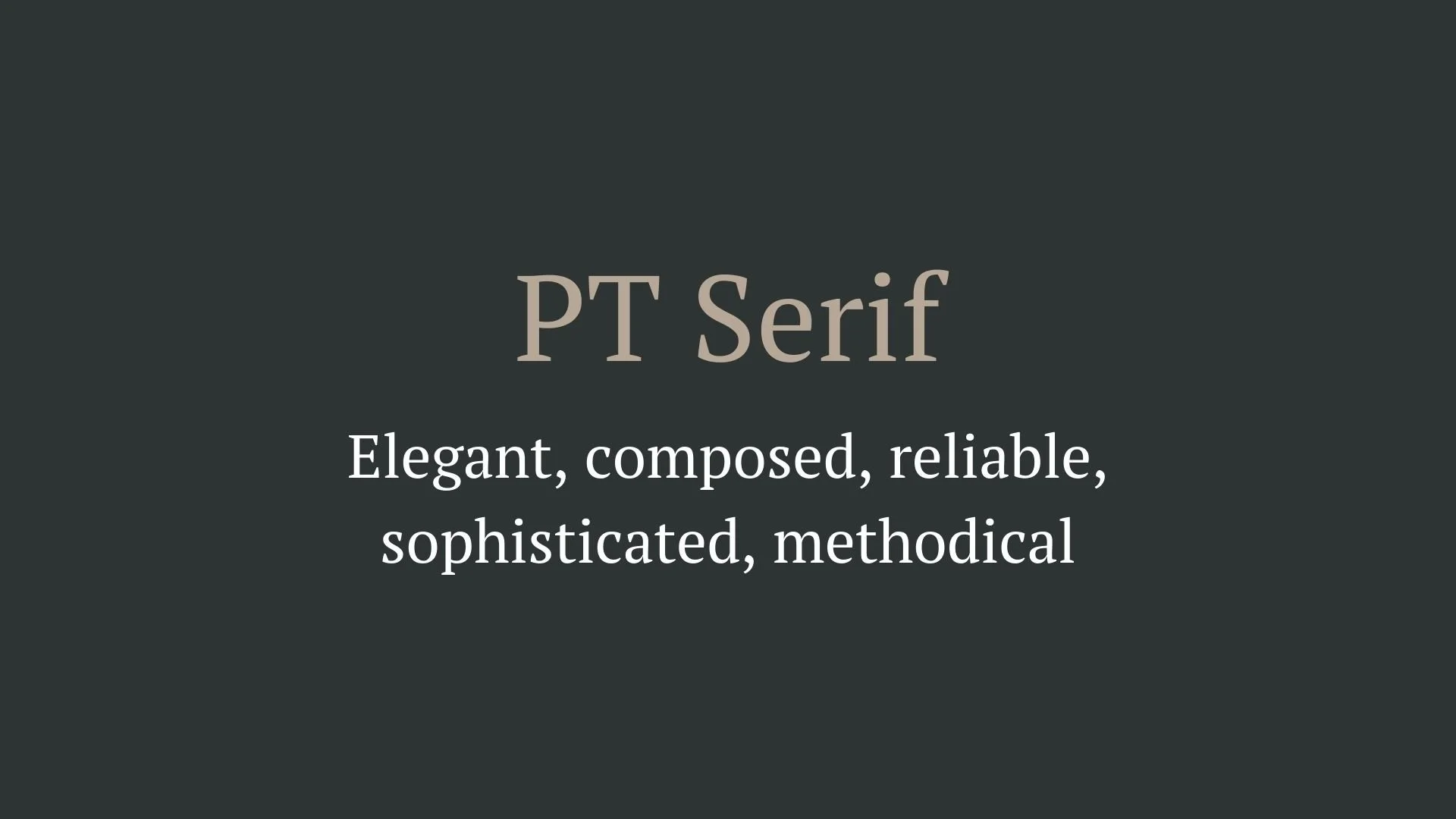
PT Serif
Overview:
PT Serif is a transitional serif typeface designed for clarity and versatility. It combines traditional serif characteristics with modern proportions, making it an excellent choice for both digital and print media, particularly in long-form text and editorial layouts.
History:
PT Serif was created by Alexandra Korolkova, Olga Umpeleva, and Vladimir Yefimov as part of the "PT" (Public Types) project initiated by the Russian government in 2009. The aim was to develop a comprehensive type system that could support the diverse typographic needs of the Russian-speaking population while also being accessible to global audiences. The project sought to revive and enhance the cultural heritage of typography in Russia, promoting readability and elegance in text.
Characteristics:
Design: PT Serif features classic serif forms with a modern touch, characterized by moderate contrast between thick and thin strokes. The serifs are sharp yet not overly aggressive, providing a harmonious balance that enhances readability.
Usage: PT Serif excels in both body text and display settings. Its legibility makes it suitable for books, newspapers, and online content, while its refined appearance allows it to shine in branding and editorial design.
Attributes: Highly legible and versatile, PT Serif conveys a sense of reliability and professionalism. Its blend of traditional and contemporary elements allows it to adapt seamlessly across various design contexts, making it a popular choice for designers seeking a trustworthy serif typeface.

FONT PERSONALITY
-
FONT PERSONALITY -
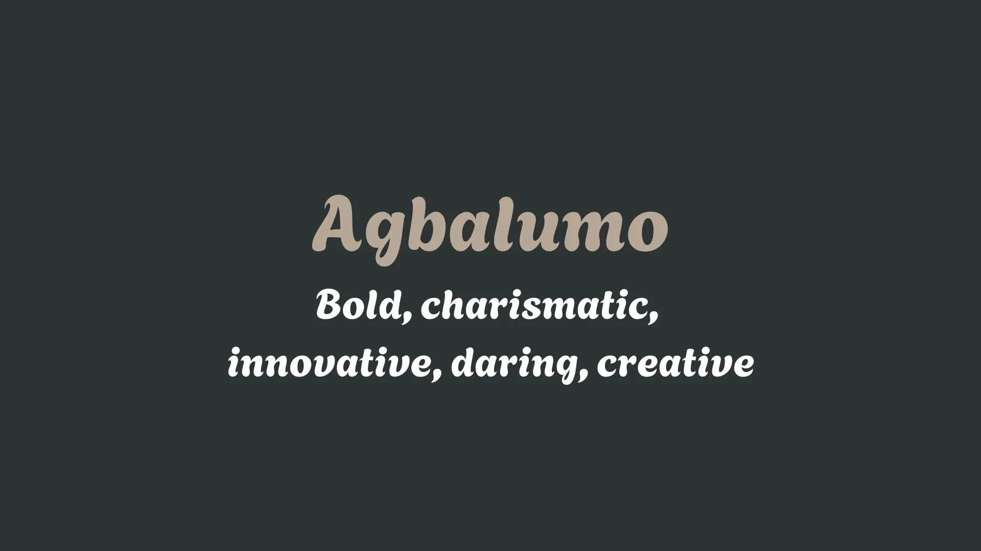
Why Agbalumo and PT Serif are a Match Made in Heaven:
When Agbalumo's bold and charismatic nature meets the composed and sophisticated PT Serif, they create a striking yet harmonious pairing that balances innovation with professionalism. Agbalumo's daring and creative personality makes it perfect for grabbing attention in headlines or logo work, exuding energy and vision. In contrast, PT Serif’s reliable and elegant structure grounds the design, adding an air of trustworthiness and maturity. Together, they provide a visual experience that is both inspiring and credible, making this pairing ideal for brands that want to appear forward-thinking while maintaining a solid foundation of expertise.
This pairing would attract someone who is both visionary and refined—a person who sees beyond traditional boundaries but understands the importance of grounded professionalism. This could be a creative entrepreneur, a thought leader, or an artist-innovator who blends artistic flair with a desire to make a lasting, reliable impact. Their brand is likely a blend of personal boldness with a polished presentation, ideal for someone who wants to inspire others while also being taken seriously as an authority in their field.

CELEBRITY MATCH
-
CELEBRITY MATCH -

The font pairing of Agbalumo and PT Serif aligns perfectly with the character of Anna Kendrick, as portrayed by Beca Mitchell in the movie "Pitch Perfect (2012)."
Summary: The pairing of Agbalumo and PT Serif is well-matched with Anna Kendrick’s role as Beca Mitchell in Pitch Perfect. Beca’s bold, innovative personality reflects the modern and striking nature of Agbalumo, while her journey through the classic, competitive world of a cappella aligns with the elegant and professional qualities of PT Serif. This dynamic combination of modern flair and timeless sophistication mirrors the synergy between the two typefaces, making Anna Kendrick’s role a fitting representation of the font pairing’s characteristics.

HIERARCHY
-
HIERARCHY -

Font Hierarchy for Agbalumo and PT Serif:
Logo
Usage: Primary logo text, initials, brand name
Agbalumo, Regular, 72 pt (Canva), 48 px (Squarespace)
Heading (H1)
Usage: Main headings on pages, prominent titles
Agbalumo, Regular, 48 pt (Canva), 36 px (Squarespace)
Subtitle / Secondary Heading (H2)
Usage: Section titles, important subtitles
PT Serif, Bold, 36 pt (Canva), 30 px (Squarespace)
Subheading (H3)
Usage: Subsection headings, less prominent titles
PT Serif, Italic, 30 pt (Canva), 24 px (Squarespace)
Paragraph / Body Copy (P)
Usage: Main body text, paragraphs, descriptions
PT Serif, Regular, 18 pt (Canva), 16 px (Squarespace)

NOW WHAT?
NOW WHAT?
Let’s put your font pairing to work.
For PBS Members:
If you’re already in my Personal Branding Studio:
If this font pairing feels right, then bookmark this page. We’ll revisit it in Part 2 when we dive into designing your logo and personally branded Canva graphics.
If it’s not quite the one, head back to Part 1, Module 4: Design to explore 100+ other font pairings just like this one.
There’s no rush. Choose the one that truly reflects your most authentic future self.
Not yet a PBS Member?
If you’re not in my Personal Branding Studio program and have no clue what it is…
Then you’ve just scratched the surface.
Imagine having access to:
100+ curated font pairings - each with its own personality, vibe, and purpose
Free downloadable fonts
Step-by-step tutorials on how to use your font pairing in Canva and Squarespace
Full brand-building modules to help you design your logo, website, social media, and more
Plus my 3 part process - Align, Curate, Elevate - on how to build an unforgettable personal brand with magnetic messaging, vibrant visuals, and delicious designs
That’s what you get inside Personal Branding Studio.
Your font (and personal branding) journey doesn't have to end here.
Use discount code FONT20 at checkout to get 20% off.