MEET YOUR FONT PAIRING MATCH
This page is your custom breakdown of the font pairing you were matched with from the Find Your Font Quiz. You’ll discover the history, personality, and style of each font—and see how they can come to life in your personal brand.
If you're a Personal Branding Studio member:
Bookmark this page. We’ll return to it in Part 2 when it’s time to use your font pairing to design your logo and create branded Canva graphics.
Not loving this particular combo? No problem. Explore all 100+ font pairings inside PBS - Part 1, Module 4: Design - to find one that feels just right. Click the button below to go there now.
Not yet a Personal Branding Studio member?
(And wondering what Personal Branding Studio even is?)
Start by scrolling through your results below. At the bottom of this page, you’ll find out how to go deeper with your personal brand through my full Personal Branding Studio program.
And your aligned font pairing match is…


HISTORY
-
HISTORY -
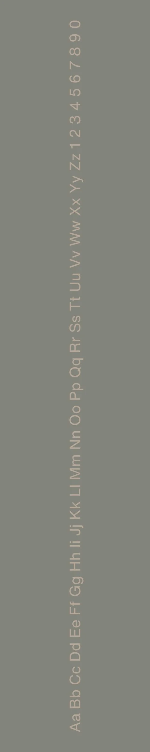
Adobe Caslon Pro
Overview:
Adobe Caslon Pro is a classic serif typeface known for its elegance and versatility. Drawing from the rich history of traditional book typography, it is widely used in both print and digital media, where it conveys a sense of reliability and sophistication.
History:
Adobe Caslon Pro was developed by Robert Slimbach, an accomplished type designer at Adobe, and was released in 2000. It is a revival of the original Caslon typefaces created by William Caslon in the early 18th century. Slimbach's goal was to update Caslon's design for contemporary use while preserving its historical essence. Adobe Caslon Pro incorporates more extensive character sets, including small caps and old-style figures, making it suitable for modern typesetting needs while maintaining the charm of classic typography.
Characteristics:
Design: Adobe Caslon Pro features traditional serif elements, characterized by bracketed serifs and a warm, humanistic design. Its letterforms have a slight contrast in stroke weight, contributing to its elegant and refined appearance.
Usage: This typeface is well-suited for body text in books, editorial designs, and any formal communications. Its classic look also makes it a popular choice for academic publications and historical documents, where readability and formality are essential.
Attributes: Adobe Caslon Pro is highly legible, versatile, and embodies a timeless quality. Its design allows for effective communication while imparting a sense of tradition and authority, making it a favorite among designers seeking a sophisticated serif typeface.

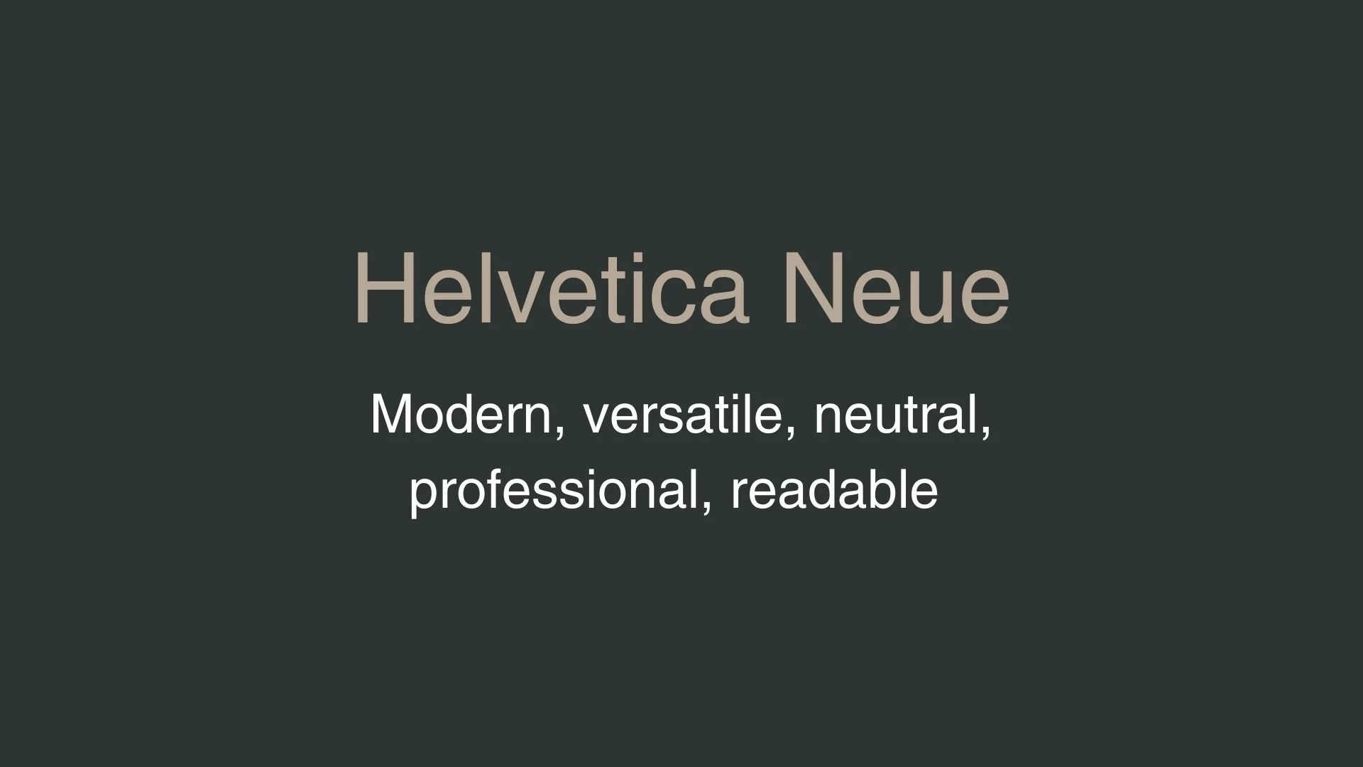
Helvetica Neue
Overview:
Helvetica Neue is a widely recognized and influential sans-serif typeface known for its clarity and neutrality. It offers a modern and refined aesthetic, making it suitable for a variety of design contexts, from corporate branding to editorial layouts.
History:
Helvetica Neue was designed by Max Miedinger and Eduard Hoffmann, released by Linotype in 1983 as a revised version of the original Helvetica typeface, which was created in 1957. The goal was to improve the original font by refining its design, increasing its versatility, and expanding its range of weights and styles. Helvetica Neue aimed to address the needs of contemporary typography while maintaining the timeless appeal of its predecessor.
Characteristics:
Design: Helvetica Neue features a clean and minimalist design with a geometric structure, uniform strokes, and a balanced appearance. The typeface includes a larger x-height compared to the original Helvetica, which enhances legibility.
Usage: This font is commonly used in corporate identities, signage, web design, and print materials. Its versatility makes it suitable for both headlines and body text, ensuring readability in various contexts.
Attributes: Helvetica Neue is characterized by its neutrality, clarity, and modernity. It conveys professionalism and sophistication while maintaining a sense of warmth and approachability, making it a staple in the world of graphic design.

FONT PERSONALITY
-
FONT PERSONALITY -

Why Adobe Caslon Pro and Helvetica Neue are a Match Made in Heaven:
When Adobe Caslon Pro and Helvetica Neue come together, they create a beautifully balanced pairing that combines heritage with modernity. Adobe Caslon Pro, with its elegant and timeless serif structure, lends an air of sophistication and gravitas to a design. This sense of historical depth and grace is expertly balanced by Helvetica Neue’s clean, modern lines and versatile neutrality, which introduce a contemporary feel and visual clarity. Adobe Caslon Pro’s rich details in headlines or titles grab attention with authority and refinement, while Helvetica Neue’s readability and simplicity ensure that body text remains accessible and unintrusive. This combination allows for a dynamic yet harmonious design that appeals to both tradition and functionality.
This pairing would be ideal for someone who values both tradition and modern professionalism—perhaps a person who operates at the intersection of classicism and contemporary thought. This could be an established professional or academic who wants to convey credibility and sophistication while staying approachable and current, such as a thought leader, a lawyer, or a seasoned designer. This individual is likely detail-oriented and appreciates refinement, yet they understand the importance of clear, effective communication. They value the weight of heritage and the clarity of the present, blending old-world charm with a modern outlook.

CELEBRITY MATCH
-
CELEBRITY MATCH -

The font pairing of Adobe Caslon Pro and Helvetica Neue aligns exceptionally well with Cate Blanchett’s portrayal of Katharine Hepburn in The Aviator (2004).
Summary: Cate Blanchett’s portrayal of Katharine Hepburn in "The Aviator" perfectly embodies the dynamic between Adobe Caslon Pro and Helvetica Neue. Hepburn’s sophisticated, classic, and intellectual character traits align with Adobe Caslon Pro’s elegance and tradition, while her modern, adaptable, and stylish aspects resonate with Helvetica Neue’s clarity and functionality. This pairing highlights the balance between the historical and the contemporary, much like Blanchett’s nuanced performance that pays homage to Hepburn’s legacy while bringing a modern touch to the role.

HIERARCHY
-
HIERARCHY -

Font Hierarchy for Adobe Caslon Pro and Helvetica Neue:
Logo
Usage: Primary logo text, initials, brand name
Adobe Caslon Pro, Regular, 80 - 120 px (Canva), 80 px (Squarespace)
Heading (H1)
Usage: Main headings on pages, prominent titles
Adobe Caslon Pro, Bold, 48 pt (Canva), 56 px (Squarespace)
Subtitle / Secondary Heading (H2)
Usage: Section titles, important subtitles
Helvetica Neue, Bold, 36 pt (Canva), 40 px (Squarespace)
Subheading (H3)
Usage: Subsection headings, less prominent titles
Adobe Caslon Pro, Italic, 30 pt (Canva), 32 px (Squarespace)
Paragraph / Body Copy (P)
Usage: Main body text, paragraphs, descriptions
Helvetica Neue, Regular, 16 pt (Canva), 18 px (Squarespace)

NOW WHAT?
NOW WHAT?
Let’s put your font pairing to work.
For PBS Members:
If you’re already in my Personal Branding Studio:
If this font pairing feels right, then bookmark this page. We’ll revisit it in Part 2 when we dive into designing your logo and personally branded Canva graphics.
If it’s not quite the one, head back to Part 1, Module 4: Design to explore 100+ other font pairings just like this one.
There’s no rush. Choose the one that truly reflects your most authentic future self.
Not yet a PBS Member?
If you’re not in my Personal Branding Studio program and have no clue what it is…
Then you’ve just scratched the surface.
Imagine having access to:
100+ curated font pairings - each with its own personality, vibe, and purpose
Free downloadable fonts
Step-by-step tutorials on how to use your font pairing in Canva and Squarespace
Full brand-building modules to help you design your logo, website, social media, and more
Plus my 3 part process - Align, Curate, Elevate - on how to build an unforgettable personal brand with magnetic messaging, vibrant visuals, and delicious designs
That’s what you get inside Personal Branding Studio.
Your font (and personal branding) journey doesn't have to end here.
Use discount code FONT20 at checkout to get 20% off.