MEET YOUR FONT PAIRING MATCH
This page is your custom breakdown of the font pairing you were matched with from the Find Your Font Quiz. You’ll discover the history, personality, and style of each font—and see how they can come to life in your personal brand.
If you're a Personal Branding Studio member:
Bookmark this page. We’ll return to it in Part 2 when it’s time to use your font pairing to design your logo and create branded Canva graphics.
Not loving this particular combo? No problem. Explore all 100+ font pairings inside PBS - Part 1, Module 4: Design - to find one that feels just right. Click the button below to go there now.
Not yet a Personal Branding Studio member?
(And wondering what Personal Branding Studio even is?)
Start by scrolling through your results below. At the bottom of this page, you’ll find out how to go deeper with your personal brand through my full Personal Branding Studio program.
And your aligned font pairing match is…

HISTORY
-
HISTORY -
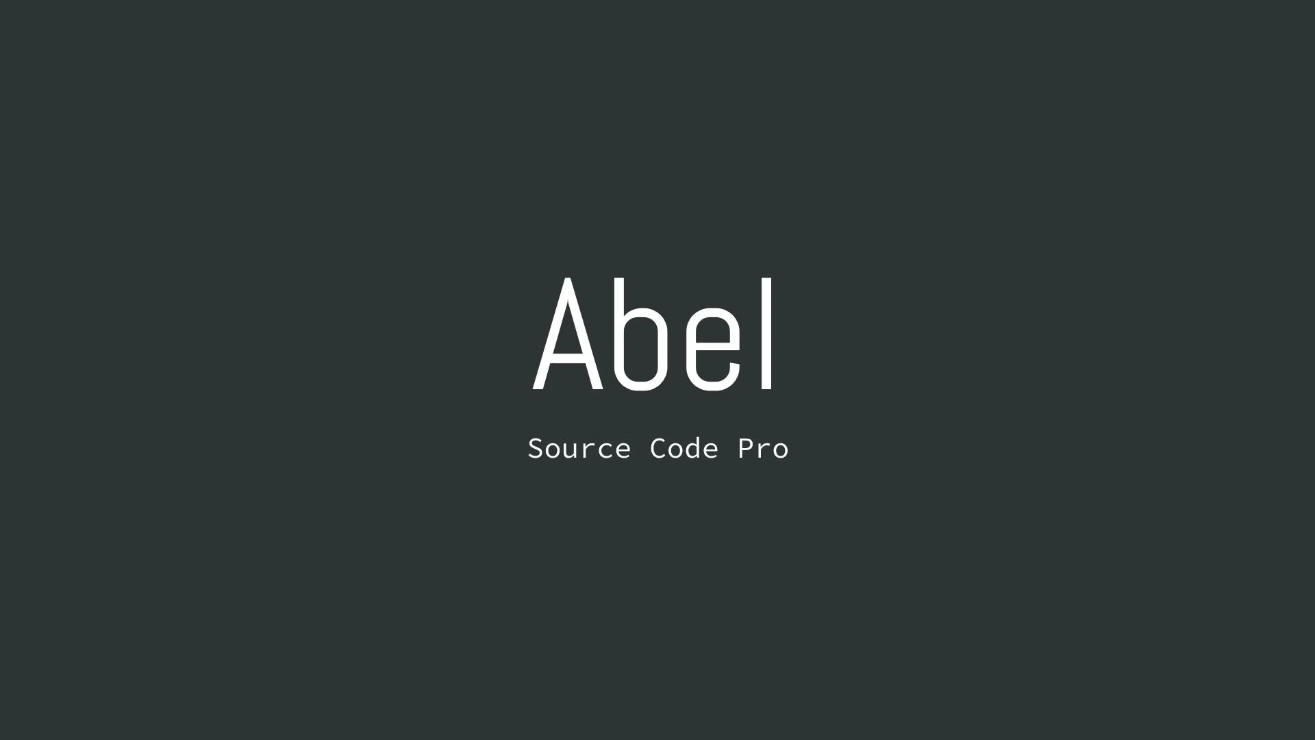
Abel
Overview:
Abel is a modern and versatile sans-serif typeface known for its clean lines and readability. With a balanced and approachable design, it is well-suited for both digital and print applications.
History:
Abel was created by MADType, a digital type foundry led by Matias Romero. Released in 2010, Abel was designed to be a contemporary sans-serif typeface that retains a slight humanistic touch. Its primary purpose was to provide a clean, neutral, and highly legible font that could be used across a wide range of media, making it a popular choice for everything from websites to posters.
Characteristics:
Design: Sleek and geometric with slightly rounded terminals, giving it a soft but structured feel.
Usage: Ideal for headlines, logos, and banners due to its modern and uncluttered appearance.
Attributes: Highly legible, neutral, and versatile with a subtle warmth.

Source Code Pro
Overview:
Source Code Pro is a monospaced typeface designed with a focus on coding and technical documentation. Its fixed-width design makes it highly functional for environments where alignment and clarity are crucial.
History:
Source Code Pro was created by Paul D. Hunt as part of Adobe's open-source typeface initiative. Released in 2012, it was developed specifically to enhance the readability of code, with each character carefully designed to stand out while maintaining a consistent width. This was part of a broader trend in the early 2010s to provide programmers with aesthetically pleasing and functional typefaces that could be used in development environments.
Characteristics:
Design: Monospaced with clean, unambiguous character shapes; optimized for screen display.
Usage: Primarily used in code editors, technical documents, and environments where precision and clarity are paramount.
Attributes: Functional, clear, and consistent with a focus on legibility in technical contexts.


FONT PERSONALITY
-
FONT PERSONALITY -


Why Abel and Source Code Pro are a Match Made in Heaven:
When the personalities of Abel and Source Code Pro are combined, the result is a pairing that is both approachable and functional. Abel brings a modern and professional touch with a hint of warmth, making it suitable for headlines and logos that need to be both eye-catching and versatile. On the other hand, Source Code Pro’s precise and technical nature grounds the pairing, ensuring that the overall design remains clear and unambiguous, especially in detailed or complex content.
Together, these fonts would appeal to a person who is both practical and modern—a tech-savvy individual who values clarity and precision but also appreciates subtle design aesthetics. This person might be someone who works in a creative tech industry, blending innovation with functionality, such as a designer-developer hybrid who values both form and function in their work.

CELEBRITY MATCH
-
CELEBRITY MATCH -
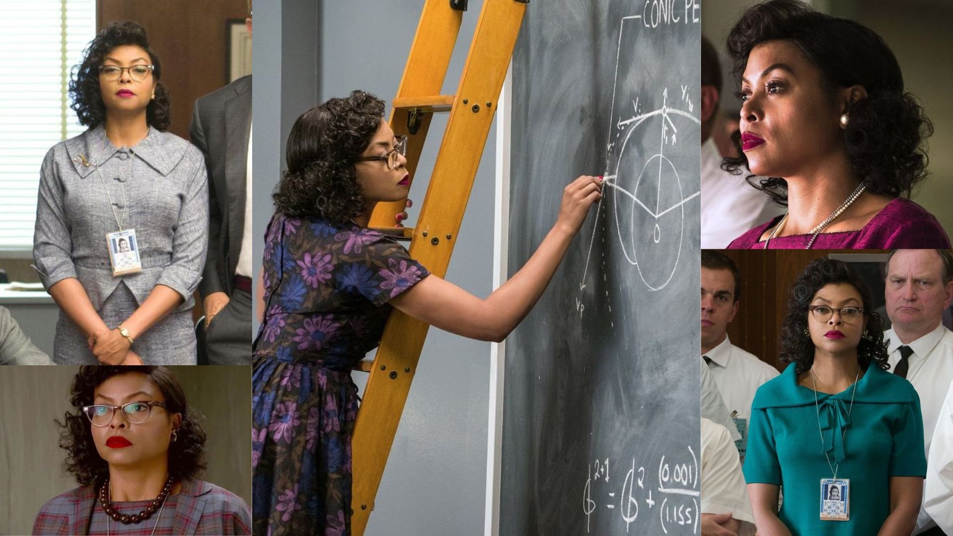
The font pairing of Abel and Source Code Pro aligns perfectly with the character of Katherine Johnson, as portrayed by Taraji P. Henson in the movie "Hidden Figures".
Organized and Precise: Katherine Johnson, a brilliant mathematician, is known for her meticulous calculations that were crucial for NASA's early space missions. Her work required extreme precision, much like Abel's methodical and detail-oriented nature.
Clear Communicator: Katherine Johnson's ability to convey complex mathematical concepts in a clear manner was what made the space missions a success. She ensured that there was no ambiguity in her calculations, similar to how Source Code Pro font ensures clarity and reduces errors with its distinct characters.
Summary: Taraji P. Henson's portrayal of Katherine Johnson in "Hidden Figures" embodies the characteristics of Abel and Source Code Pro fonts remarkably well. Both Katherine Johnson and this font pairing are known for their precision, clarity, versatility, community orientation, and inclusive approach. They represent dedication to excellence in their respective fields, ensuring that their contributions are impactful and widely appreciated.

HIERARCHY
-
HIERARCHY -
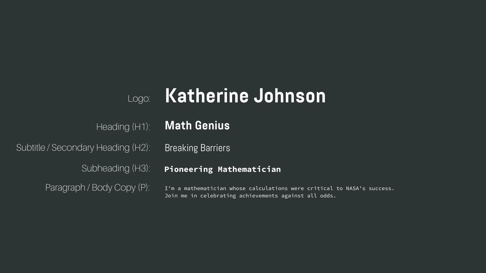
Font Hierarchy for Abel and Source Code Pro:
Logo
Usage: Primary logo text, initials, brand name
Abel, Bold, 48-60 px (Canva), 4.5-6 rem (Squarespace)
Heading (H1)
Usage: Main headings on pages, prominent titles
Abel, Bold, 36 px (Canva), 3 rem (Squarespace)
Subtitle / Secondary Heading (H2)
Usage: Section titles, important subtitles
Abel, Regular, 30 px (Canva), 2.5 rem (Squarespace)
Subheading (H3)
Usage: Subsection headings, less prominent titles
Source Code Pro, Bold, 24 px (Canva), 2 rem (Squarespace)
Paragraph / Body Copy (P)
Usage: Main body text, paragraphs, descriptions
Source Code Pro, Regular, 16 px (Canva), 1 rem (Squarespace)

NOW WHAT?
NOW WHAT?
Let’s put your font pairing to work.
For PBS Members:
If you’re already in my Personal Branding Studio:
If this font pairing feels right, then bookmark this page. We’ll revisit it in Part 2 when we dive into designing your logo and personally branded Canva graphics.
If it’s not quite the one, head back to Part 1, Module 4: Design to explore 100+ other font pairings just like this one.
There’s no rush. Choose the one that truly reflects your most authentic future self.
Not yet a PBS Member?
If you’re not in my Personal Branding Studio program and have no clue what it is…
Then you’ve just scratched the surface.
Imagine having access to:
100+ curated font pairings - each with its own personality, vibe, and purpose
Free downloadable fonts
Step-by-step tutorials on how to use your font pairing in Canva and Squarespace
Full brand-building modules to help you design your logo, website, social media, and more
Plus my 3 part process - Align, Curate, Elevate - on how to build an unforgettable personal brand with magnetic messaging, vibrant visuals, and delicious designs
That’s what you get inside Personal Branding Studio.
Your font (and personal branding) journey doesn't have to end here.
Use discount code FONT20 at checkout to get 20% off.